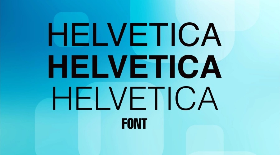
In the decades since it was released, the Helvetica font has been one of the most popular typefaces.
It is common for people to name Helvetica if asked to name one font because not all fonts have the same degree of visibility and beauty as Helvetica.
A font can be shabby and robotic. But the Helvetica font, on the other hand, stands out from the crowd. Our goal today is to learn about the Helvetica font and where you can get it.
So, let’s dive into it.
Origins and history of the Helvetica font
The typeface Helvetica draws inspiration from Akzidenz Grotesk, an 1896 typeface. In 1956, Eduard Hoffmann, the managing director of the Haas’sche Schriftgiesserei (Hass Type Foundry) in Switzerland, pondered how to compete with a popular typeface designed by the company’s competitors. In response, he instructed Max Miedinger to produce a font that would fulfill his request. Max did as Hoffmann instructed and designed an original sans-serif typeface in 1957.

Max named this typeface “Neue Haas Grotesk,” which means “New Haas Sans Serif” in English. Despite its benefits, the creation had a few flaws. It had the company’s name in the title. Moreover, the Stempel type foundry, the German-based parent company of Haas, found it challenging to market a newly developed typeface in Germany under Haas’ name.
Later, Stempel and Haas decided to name Miedinger’s font “Helvetica,” which is close to the Latin name of Switzerland, Helvetia. In 1960, Linotype licensed the typeface. It is one of the most popular typefaces of the mid-20th century. In addition to being neutral, the font did not have any intrinsic meaning, so it could be used for various signage applications. When the typeface was presented at Graphic 57 in Lausanne, Switzerland, it was an instant success.
A brief description of Helvetica font characteristics
Due to the font size, it is easy to read the font at a distance despite the tight spacing between letters. As a neo-grotesque typeface, Helvetica has an oblique style instead of an italic style.
It has wide capitals of uniform width, a square-looking “s,” a bracketed top flag of “1,” a rounded off square tail of “R,” and a concave curved stem of “7.” It can be difficult to read onscreen and in small print sizes due to its narrow apertures and lack of visible difference between upper-case and lower-case letters.
What is the current use of the Helvetica font?
It has been more than 60 years since Helvetica became the world’s favorite typeface for graphic designers. Modern taste and attention to detail are reflected in its excellent balance and ease of use. It is an easy-to-read font from a distance, up close, or on the go. This typeface has become an unmatched achievement in visual culture, from street signs to literature to marketing communications.
Helvetica, the iconic font, has been effectively used in various modes of transport, including the New York City Subway map by designer Massimo Vignelli and airline logos. Its timeless design conveys mood, atmosphere, and ideas, inspiring a generation of creative typefaces and remaining a favorite in the 21st century. It is considered the city’s perfume by Lars Muller, and its significance and influence have remained strong. Graphic designers, trendsetters, and innovators continue to use it as a modern Swiss classic.
Helvetica is currently used in a variety of fields, including but not limited to:
- Logos and brand identities often use Helvetica as a corporate typeface.
- In graphic design, the font is frequently used on posters, brochures, and packaging.
- In marketing, flyers, billboards, and magazines are among the most commonly used materials.
- A clean, legible design makes Helvetica popular for websites and digital applications.
- In public transportation systems, such as subways, trains, and airports, Helvetica is often used in signage and branding.
- The font is commonly used for user interfaces and software applications on smartphones and computers.
- Helvetica is used for directional signs, building names, and architectural signage in architecture.
The Helvetica font is used in various fields and applications where legible typography is required.
Helvetica font in use – Gallery


Helvetica Font Generator
How does the Helvetica font influence modern design?
Helvetica has significantly impacted modern design and continues to influence it in several ways.
All fonts do not have the same degree of visibility and beauty. It is straightforward in looks but attracts the eyes with its clean, no-nonsense shapes.

Helvetica is the most used sans-serif typeface in the world among all sans-serif typefaces. Not only is the font’s structure unique, but its variants are equally readable despite having different weights and widths.
The characters in Helvetica are large in height and nearly spaceless. In other words, Helvetica characters are dense and solid. The density of the font is more of a blessing than a disadvantage.
Even in low light, the Helvetica font is easy to read and understand. This is why it is considered the most suitable font for text-based projects. Helvetica is a game-changer in upgrading simple text compared to other dense fonts.
Due to its clean appearance, Helvetica once held a prominent position at NASA. Renowned companies like Toyota, Mitsubishi Electric, Panasonic, Motorola, American Apparel, Microsoft, Lufthansa, and BMW have incorporated this font into their corporate logos.
Various weights, widths, and sizes of the Helvetica font are regularly released. Additionally, they have released many popular fonts that are not Latin. In short, Helvetica has significantly impacted modern design and continues to influence it.
“Helvetica” – a film about type
Gary Hustwit directed a 2007 film about the font “Helvetica”. The film features over 20 of the world’s most famous type designers sharing their thoughts and opinions about the font. The film is dynamic and captures the different views of the designers, creating a space for the viewer to form their own opinion about typeface as a whole.
Helvetica vs. Arial
Helvetica and Arial are two popular typefaces that don’t have serifs. Even though Arial font was made a cheaper alternative to Helvetica, the letter shapes, spacing, and overall design of the two fonts are different enough to tell them apart. Helvetica has more even stroke widths and a more classic, timeless look, while Arial has more different stroke widths and a more modern feel. Helvetica has a broader range of weights and styles than Arial, which has fewer options.
Font variations
Helvetica has several variations that have been developed over the years, including:

Helvetica Neue: A revision of the original Helvetica font, Helvetica Neue has improved letter spacing, refined curves, and more consistent typography.

Helvetica Now: A revised version of the classic font, Helvetica Now features updated versions of the original character sets and expanded language support.

Helvetica World: A font version that supports many international languages, including Greek, Cyrillic, and Hebrew.

Helvetica Inserat: A variation of the font designed specifically for advertising and marketing materials.
These are just a few of the many variations of the Helvetica font that have been developed over the years. Each of these variations provides designers with different tools to create unique and impactful designs.
Helvetica Font: Free Alternative
There are many popular free alternative versions of these fonts available. Check out the following list:
- For Helvetica Regular, use Free Sans Regular – Download
- For Helvetica Ultra Light, use Nimbus Sans Ultralight – Download
- For Helvetica Thin, use Pragmatica Extra Light – Download
- For Helvetica Light, use Nimbus Sans Light – Download
- For Helvetica Bold, use Free Sans Bold – Download
- For Helvetica Black, use Nimbus Sans Becker – Download
- For Helvetica Italic, use Work Sans Thin Italic – Download
The font family includes
Helvetica’s full font family has 43 styles.
- Helvetica Neue Regular
- Helvetica Neue 66 Medium Italic
- Helvetica Neue Black
- Helvetica Neue Black font
- Helvetica 25 UltraLight Regular
- Helvetica 25 UltraLight Regular font
- Helvetica 35 Thin Regular
- Helvetica 35 Thin Regular font
- Helvetica 45 Light Regular
- Helvetica 45 Light Regular font
- Helvetica 55 Roman Regular
- Helvetica 55 Roman Regular font
- Helvetica 65 Medium Regular
- Helvetica 65 Medium Regular font
- Helvetica 25 UltraLight Italic
- Helvetica 25 UltraLight Italic font
- Helvetica 35 Thin Italic
- Helvetica 35 Thin Italic font
- Helvetica 45 Light Italic
- Helvetica 45 Light Italic font
- Helvetica 55 Roman Italic
- Helvetica 55 Roman Italic font
- Helvetica 65 Medium Bold
- Helvetica 65 Medium Bold font
- Helvetica 65 Medium Bold Italic
Helvetica font pairing
It works well with the following fonts:
In conclusion,
People from all walks of life and all countries have appreciated Helvetica. It combined classics and modernity, lightness and elegance, all at once. The font becomes an identifiable, recognizable attribute of Swiss craftsmanship, culture, and style.
If you like our content, please feel free to comment. You can also contact us with any of your suggestions or opinions.
You should also check out other reputable font options that may help you get your project done, such as Papyrus, Poppins, Futura, Montserrat, and Impact Font.
Please Rate The Font

I am part of the Free Fonts Vault team, dedicated to providing you with the best experience in finding free fonts for your needs. Our team works together to ensure that we offer well-researched information on free fonts or similar alternatives. If you have any queries, please do not hesitate to contact us through our Contact page. Note: We called ourselves “The A team”.