Types of Fonts
“If you have good and perfect handwriting, you’d get help in securing better grades!”- almost everyone has heard this type of sentence while studying at school. What do you think this emphasis on so-called good handwriting was put for? The answer turns out to be pretty vivid if you mull it over more deeply in terms of typography. And from that perspective, good and bad handwritings are just relative terms. Because everyone wants good handwriting or a well-arranged one when going for a formal presentation like the one in school, however, it’s no exception for the photogenic graffiti’s that we see more often to be written in a much more randomized style-the so-called bad style. And yet the writing style in school and the ones in case of graffiti’s still stand out in their respective areas. So, all it comes down to be that representation of different things through writing has its very own unique styles. You can’t write on exam papers the way you write on the wall while making graffiti as graffiti better suits with a randomized and urban style of writing rather than the formal style. It all is nothing but the use of the perfect font for the respective tasks, presentations, and messages.
To communicate through your writing and send your message across so effectively as possible, the knowledge of font classifications and their uses can play an inarguably significant role in:
Branding – Considering that 4.2 billion people are on the internet, you can’t miss out on the opportunities of branding or marketing online. And the accurate use of typography-the choice of “just-right” typefaces in your websites and advertisements- helps level up the game. By using decisive typefaces you can create interest in your advertisement, making the advertisement more easily engaging. This can truly be a viable way to make readers take the notice of the advertisement making them more likely to read what you want to show them, and become your client or recommend others as well.
Suiting the Perfect Mood – With a view to having your message stood out and be sent across, you have to make sure there is a perfect choice of typefaces made. Different typefaces suit different moods. Should your typefaces fail to reflect the mood you want in your target audience, you’re surely destined to throw in the towel in this competitive era.
Facilitate Scanning – With some researches done, it’s apparent that readers do follow some scanning method (eye-tracking) while going through content or seeking information online. By using the right typefaces, you are in control of what and how you want your readers to see, what is important for them. A good choice of fonts for the hierarchical presentation of the contents can meet the need and boost up customer satisfaction and a higher engagement rate.
Type Classifications
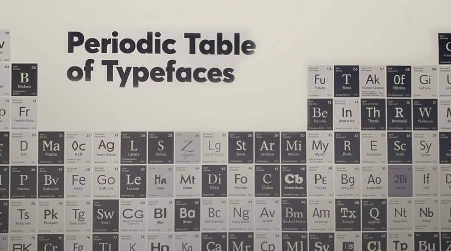
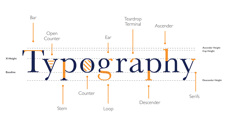
Undoubtedly, there are thousands of distinguishable typefaces and fonts available to designers, printers, publishers, artists as well as writers to date. Most of them can be found in digital format and can easily be harnessed with the help of modern technology. But, it’s nearly impossible to classify all the possible variations into types and make the right choice among them. That’s why, to streamline the classification of the font types, typography scholars and forerunners have narrowed down the list to the most basic level which encompasses the prerequisites of font types as well as facilitates a better understanding of the typography universe. Let’s have a basic and effective rundown of font types to help you make the right choice for the right purpose. (Bonus: I’ve attached a picture showing the typography anatomy pretty perfectly to help you figure out terminologies better.)
‘Calligraphy’ is composed of two Greek words-‘Kallos’ (beauty) and ‘Graphein’ (to write). Calligraphic letters can be categorized as Chancery, Etruscan or Uncial. Chancery letters include moderately sloping narrow letters and were important in the development of serif italics. Notably Etruscan typefaces don’t have lowercase letters, and they are based on an early configuration of Roman calligraphy. The Celtic style, as well as Uncial letters, are produced from holding the brush very close to the horizontal line. Despite having one case in Uncial designs, they became the foundation for the development of the roman lower case.
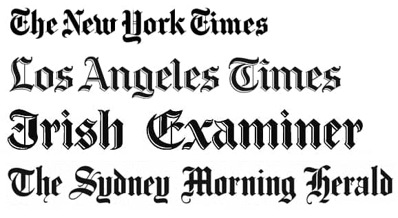
Blackletter typefaces, also known as Gothic or Old English, were used all over Europe from the middle ages to the Renaissance. These typefaces are usually characterized by thick and thin strokes and sometimes manifests swirls in serifs.The main classifications include Textura, Schwabacher, Cursiva and Fraktur.Textura is the most closely related to the calligraphic style and often includes a large number of ligatures. Fraktur is the most common form of Blackletter and is characterized by broken strokes.
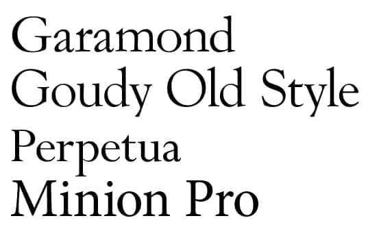
Old Style is a style of serif font developed by Renaissance typographers in the 15th century. Some Old Style examples include Perpetua, Berling, Calisto, Goudy Old Style, Granjon, Palatino, etc. Many of the letterforms were based initially on pen-drawn strokes. This typeface is more often found to be used heavily in newspapers, magazines books.They can also work well on the web. The Old Style fonts share some characteristics:
•Low contrast between thick and thin strokes.
•Lowercase ascenders taller than the height of capital letters, and small X-heights.
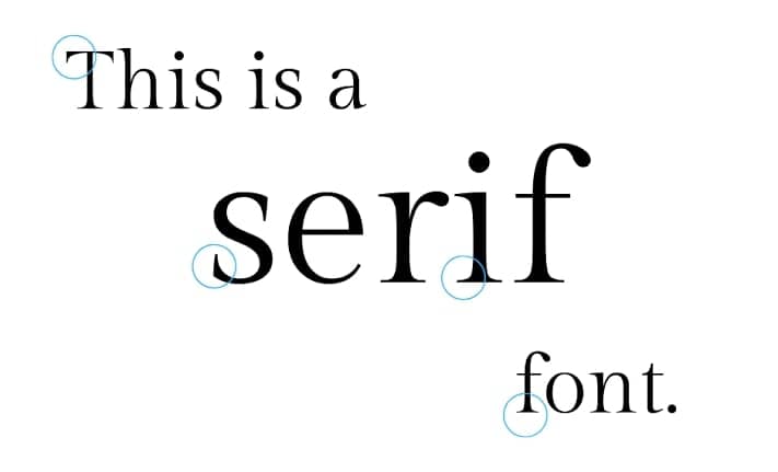
From the typographic POV, a serif is a slight projection finishing off a stroke of a letter. Some classifications of serifed fonts include Grecian, Latin, Scotch, Scotch Modern, French Old Style, Spanish Old Style, Clarendon, and Tuscan. In a few instances, serifs have the potential to help increase readability. Most books, newspapers, and magazines use serif fonts for their legibility.
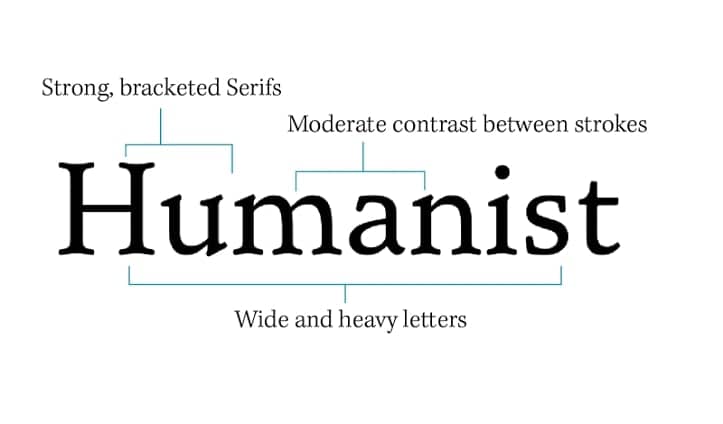
Humanist typefaces are also known as Venetian or old-style. Some typographical characteristics these typefaces tend to have: loose later spacing, low contrast between thick and thin strokes, and so on. These designs of these typefaces are good matches for small texts making them more legible, so they’re often used in government, education, or finance work. Example: Gill Sans.
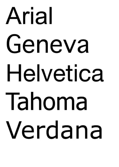
Typefaces falling into this category are regarded as more modern than serif typefaces. As they lack the projections in vertical and horizontal strokes seen in Serif, the french word ‘Sans’ meaning ‘without’, implies it all. These typefaces are often found to be used to denote clarity, friendliness, and minimalism. Examples include Helvetica, Avant-Garde, Arial, and Geneva.
7. Transitional
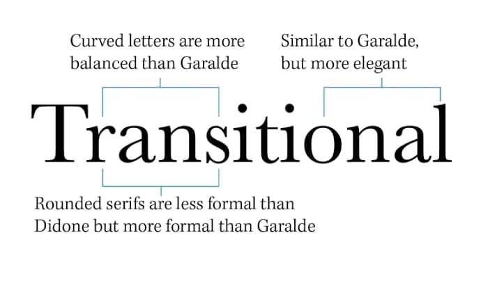
As its name suggests, it has been named “TRANSITIONAL” because of its intermediate position between old style and modern. The most notable representative fonts of the Transitional Age were Baskerville and Fournier. Some of the notable characteristics it has are A greater contrast between thick and thin strokes; wider, gracefully bracketed serifs with flat bases; larger x-height, etc.

The term ‘Modern’ refers to fonts created in the eighteenth century or the style of that time. Thin, long horizontal serifs, and clear-cut thick/thin transitions in the strokes-a few properties that help recognize these typefaces. The stress is vertical, i.e. there is no slant on the letters. Examples: Bodoni, Didot (the first Didone font), Bernhard Modern Roman, etc.
Some basic geometric shapes-circle, triangle,square-are the building blocks that construct these types. Geometric fonts first attained popularity in the 1920s allegedly aided by the ‘Bauhaus Movement’.With their somewhat cool and formal feature, as well as technical, modern, and in some cases futuristic flair, geometric fonts are still used for current, trendy, and contemporary designs.
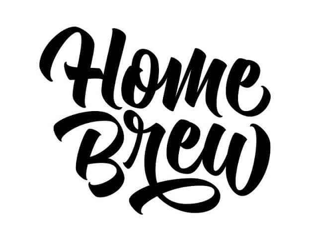
Script fonts are designed to capture the flourish and artistry of traditional hand lettering and calligraphy, usually as if written with a pen, brush, or marker. Formal script typefaces are derived from writing styles of the 17th and 18th centuries. Also, nowadays we see a wide range of brands flying their flags through Script fonts. Most Script fonts have strokes connecting one letter to the next and have elegant alternate swash options.
11. Decorative
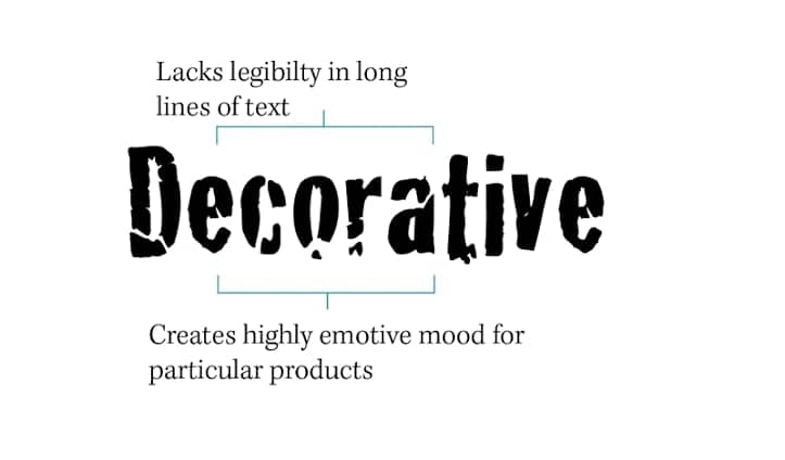
In the nineteenth century, decorative fonts were popular and were widely used on posters and advertisements. Extremes in x-height, descenders, or ascenders, as well as fonts that incorporate graphic elements, swashes, and flourishes, are characteristics of decorative type. As their name suggests, decorative typefaces should be used for decorative or ornamental purposes.
12. Pixel
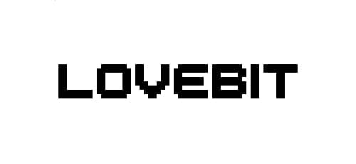
These typefaces were developed from the invention of computers and the way pixels are displayed on their screens.
While we look out for grammatical errors most of the time in our advertisements and publications, the lack of a better understanding of typographic classifications might be the reason you are likely to lag behind in the long run. As told earlier, there are thousands of typefaces, and classifying them all together in one guide is nearly impossible, no matter how hard you try to put them all in one place. In this article, I’ve tried to cover the most basic typefaces available and useful out there to level up your typography game and get a tighter grip on the classifications associated. I hope this guide would help you get a better understanding of making the right choice of typefaces for your business or any purpose.
Reviewed font examples to compare
Classification becomes clearer when you compare real letterforms. These ten locally reviewed family pages document the exact included file, visible design traits, source, license and practical limits. Open two contrasting examples, enter the same words, and judge spacing and readability at the size your project needs.
- Abel — a condensed flat-sided sans for compact labels.
- Young Serif — a warm old-style serif for editorial display.
- Alex Brush — a controlled connected brush script.
- Dancing Script — a livelier casual script with a bouncing baseline.
- GNUTypewriter — a distressed mechanical typewriter texture.
- Changa One Italic — a compact slanted headline face.
- Trueno Round Bold — a rounded geometric display cut.
- akaPosse — a condensed Western poster serif.
- Hussar Gothic Oblique — an ultra-black historical-style display sans.
- err0r — a deliberately broken glitch alphabet.
Use the examples as a starting point, not as a license shortcut. Each family page records the terms attached to its reviewed binary, and those terms remain the authority for font-file redistribution or modification.
More reviewed font examples to compare
These ten additional family pages were reviewed as a small, source-backed expansion rather than a bulk directory release. Each page identifies one mapped local file, records its primary project and license links, and explains what to test before using the typeface in a design.
- Satisfy — reviewed source, file, and practical-preview details.
- Permanent Marker — reviewed source, file, and practical-preview details.
- Metal Mania — reviewed source, file, and practical-preview details.
- Orbitron Medium — reviewed source, file, and practical-preview details.
- Bentham — reviewed source, file, and practical-preview details.
- Mina — reviewed source, file, and practical-preview details.
- Argentum Novus SemiBold — reviewed source, file, and practical-preview details.
- Semplicit? — reviewed source, file, and practical-preview details.
- Some Time Later — reviewed source, file, and practical-preview details.
- Booyakasha — reviewed source, file, and practical-preview details.
Compare a few contrasting examples with the same words and at the same size. A preview helps with visual selection, while each linked license record remains the place to review permissions for the font family.


