You’re looking for The Office Font, aren’t you? You’ve come to the right place. As most of you are aware, The Office is a popular comedy TV series. It depicts the everyday lives of office workers at a fictional company located in Scranton, Pennsylvania. Greg Daniels created the show, which is an American adaptation of the British sitcom of the same name.
The show has a distinctive logo that uses a serif typeface. We are going to cover all of the answers to this font in this article. So, let’s get started.
What font is the office logo?
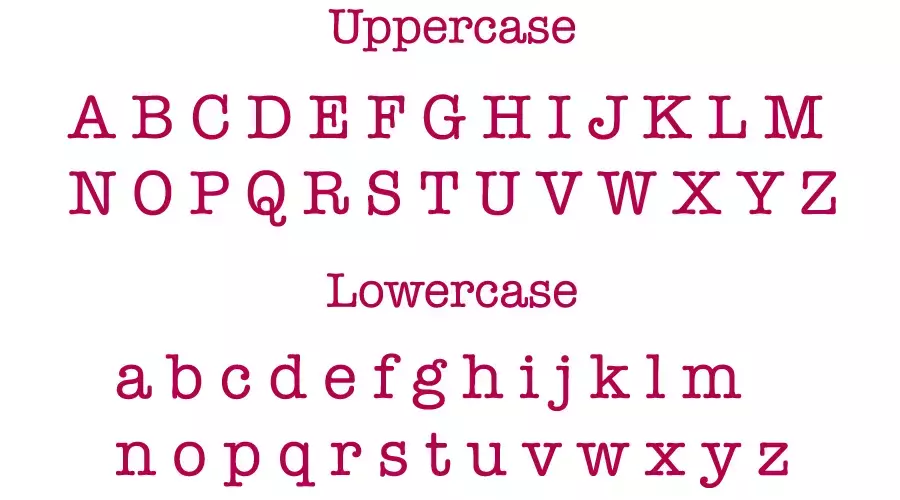
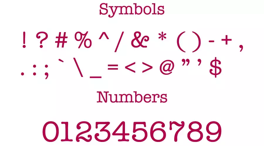
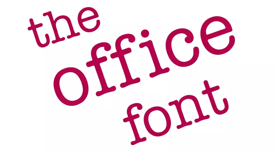
The font used for the office logo is American Typewriter Regular.
In 1974, ITC published the font that Joel Kaden and Tony Stan created. Generally, it is classified under the slab serif category, which means it has thick and blocky serifs at the ends of each letter. Slab serif fonts are often used to create a sense of stability, authority, and professionalism.
The American Typewriter Regular font has a vintage and retro feel, evoking the look of typewriters from the past. The font also has some quirky features, such as uneven strokes, rounded corners, and slightly tilted letters. These features add some personality and charm to the font, making it suitable for a comedy show like The Office.
The Office Font Generator
The Office Font Generator
Preview and download fonts
American-Typewriter-Regular
How do I use the Office font?
The Office font can be used for logos, headlines, posters, banners, invitations, labels, and other things. The font can also be paired with other fonts to create contrast and harmony.
For example, you can combine American Typewriter Medium with a sans-serif font like Helvetica or Arial for a modern and clean look. Or you can use it with a script font like Brush Script or Zapfino for a more playful and creative look.
Alternatively, you can use some free fonts that are similar to American Typewriter Medium. For example,
- Courier New: This is a classic monospaced typewriter font that comes pre-installed on most computers. It has a simple and clean appearance, but lacks some of the quirks and details of American Typewriter Medium.
- Special Elite: This is a free Google font that resembles an old typewriter with worn-out keys. It has more texture and variation than Courier New, but it may be harder to read at smaller sizes.
- Rockwell: This is another slab serif font that has a strong and geometric look. It has more uniformity and elegance than American Typewriter Medium, but it may be less playful and expressive.
About the Office Font Web Series
An American mockumentary sitcom called The Office is on television. From March 24, 2005, through May 16, 2013, nine seasons of it were shown on NBC. Greg Daniels adapted it for American television based on the Ricky Gervais and Stephen Merchant-created 2001–2003 BBC series of the same name.
Throughout its brief first season, the series received a variety of reviews. Yet the succeeding seasons got a lot of praise from television critics. It received multiple honors.
The Office was listed as one of the top 100 television programs of 2016 by Rolling Stone. Daniels’ Deedle-Dee Productions and Reveille Productions, which became Shine America, worked with Universal Television to make the show.
Conclusion
The Office Font is an example of how typography can enhance the identity and mood of a TV show. By using the American Typewriter Medium font, The Office creates a contrast between its modern setting and its vintage logo. It also conveys humor, nostalgia, and irony through its choice of font.
Furthermore, you can also choose from other fonts including Wednesday font, Playboy font, Weezer Font, Spiderman Font, Supreme Font, Baby Shark Font, and Winnie the Pooh Font.
Thanks
I am part of the Free Fonts Vault team, dedicated to providing you with the best experience in finding free fonts for your needs. Our team works together to ensure that we offer well-researched information on free fonts or similar alternatives. If you have any queries, please do not hesitate to contact us through our Contact page. Note: We called ourselves “The A team”.


