“Spiderman Font” refers to typography styles inspired by the Spider-Man franchise.
Spiderman Font
Homoarak
| ReplicaAmazing Spider Man Slant
| SimilarEasy Speech Free
| SimilarFar From Homecoming Updated
| SimilarGood Times Rg
| SimilarVeto Sans Bold
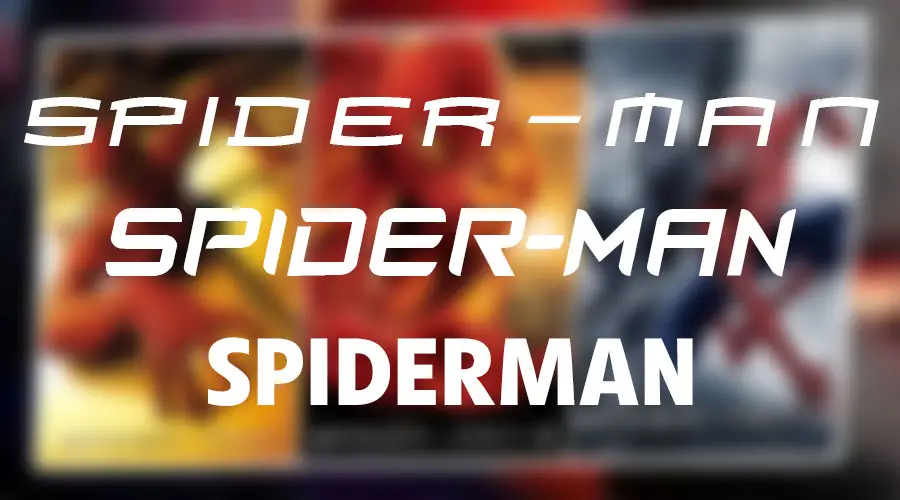
| SimilarSpider-Man is one of the most popular and iconic superheroes in the world. He has appeared in various media, such as comics, cartoons, video games, and movies. One of the distinctive features of Spider-Man is his logo, which consists of a stylized spider inside a red oval. Various movies of Spider-Man have used the logo in different ways throughout history.
One of the aspects that affects the appearance and impression of the logo is the font that is used for the title of each Spider-Man movie. Different fonts can convey different moods, themes, and tones for each movie. In this article, we will explore some of the fonts that have been used for Spider-Man’s logo in various media, from 2002 to 2021.
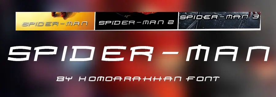
Spiderman movie trilogy (2002-2007)
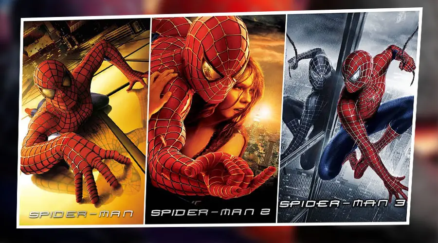
The first Spider-Man movie trilogy (2002-2007), directed by Sam Raimi, used a custom font that is similar to the font called Homoarakhan for its titles. Only capital letters, numerals, and limited punctuation are available in this Techno font. The font matches well with the action-packed and dark tone of Raimi’s movies.
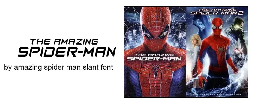
The Amazing Spider-Man series (2012-2014)
The second Spider-Man movie series (2012-2014), directed by Marc Webb, used a font called Amazing Spider-Man Slant for its titles. P. A. Vannucci created this font. It has a slanted and italicized style that gives it a sense of movement and speed. It also has some curves and rounded edges that make it more friendly and playful than Homoarakhan. The font reflects well the youthful and adventurous spirit of Webb’s movies.
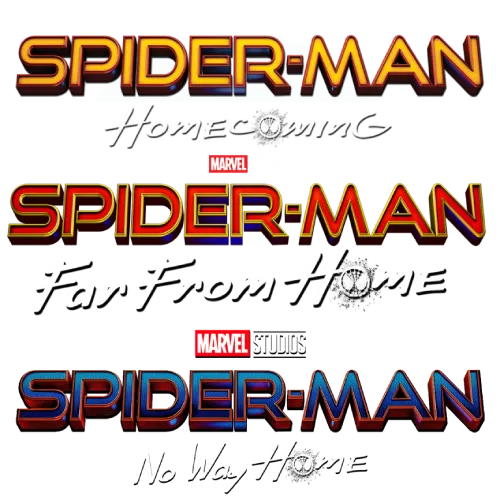
MCU Spider-Man Movies Font
The next three movies we will discuss are part of the Marvel Cinematic Universe (MCU), which features Spider-Man as one of the main heroes. These movies are Spider-Man: Homecoming (2017), Spider-Man: Far from Home (2019), and Spider-Man: No Way Home (2021).
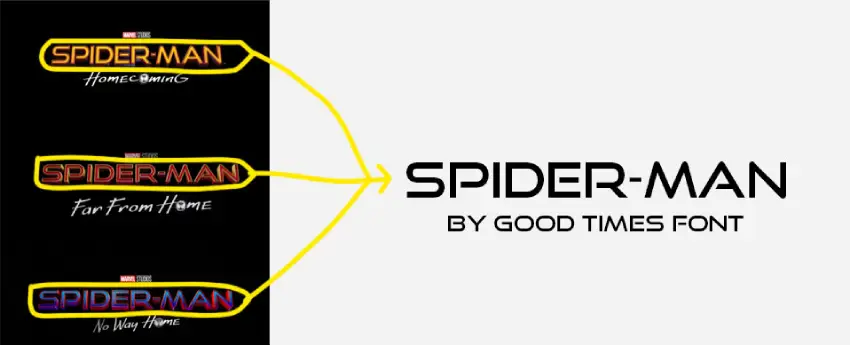
For these movies, the logo uses two different fonts for the words “Spider-Man” and the subtitle. The word “Spider-Man” is written in Good Times Font. Typodermic Fonts published it. It is a 1980s techno headline typeface inspired by the lettering used on Pontiac cars from 1989-1994. This font gives a futuristic and sleek look to Spiderman’s name, suggesting his high-tech gadgets and suits.
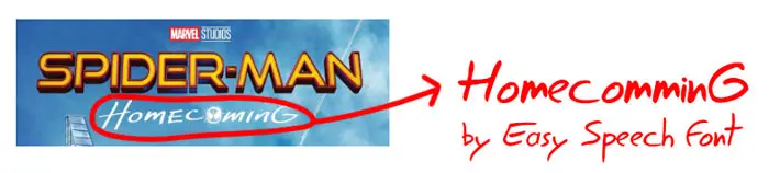
The subtitles for each movie are written in a different font that reflects its theme. For Spider-Man: Homecoming, the subtitles are written in Easy Speech Font by Jean-Jacques Morello, which is a hand-drawn font inspired by his own writing. This font gives a casual and friendly feel to the subtitle, suggesting Spider-Man’s youthful and humorous personality.
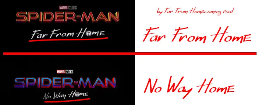
For Spider-Man: Far from Home and Spider-Man: No Way Home, the subtitles are written in Far From Homecoming Font by Kade Fisher, which is based on the font used in the subtitles and marketing for these movies. This font has a more angular and sharp look than Easy Speech Font, suggesting Spiderman’s challenges and dangers in these movies. The font also has some variations in thickness and spacing, giving it a dynamic and energetic feel.
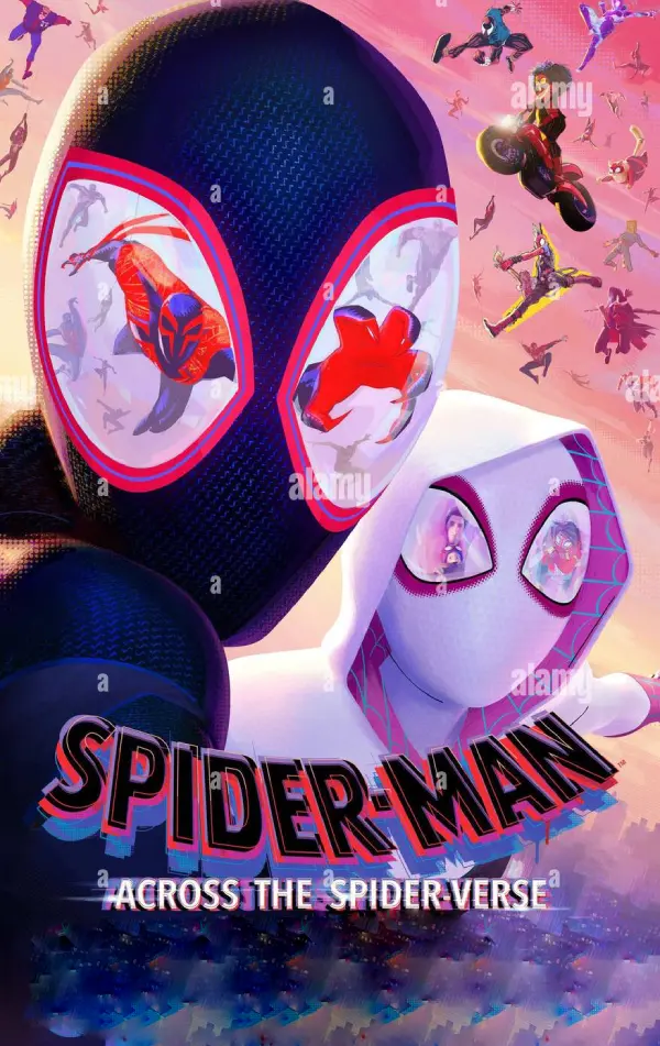
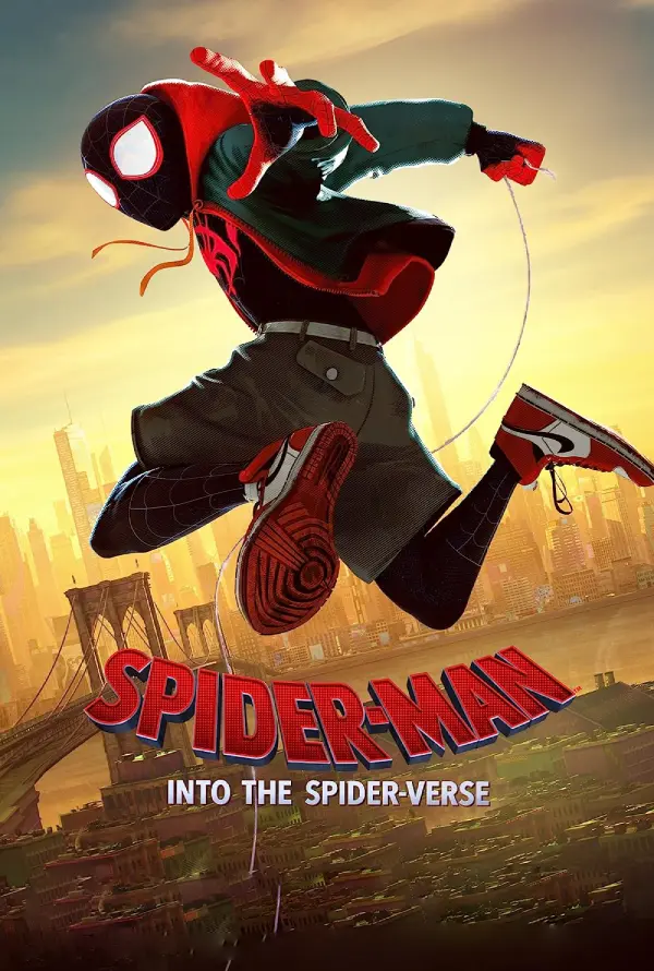
Spider-Man: Into the Spider-Verse (2018)
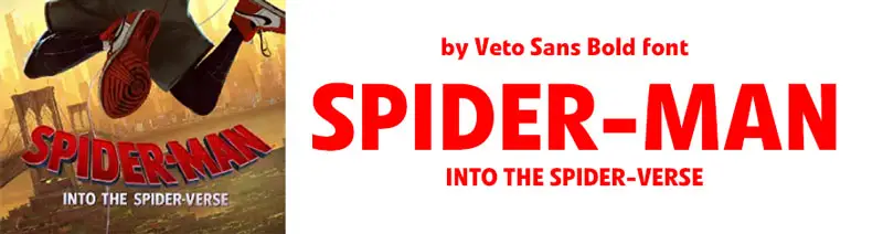
The animated Spider-Man movie (2018), directed by Bob Persichetti, Peter Ramsey, and Rodney Rothman, uses a font similar to Veto Bold for its title. Veto Bold is a sans-serif font designed by Linotype that has a simple and clean appearance. It also has some subtle variations in thickness that give it some character and flair. The font suits well with the colorful and vibrant style of the animation.
Conclusion
As you can see, each Spider-Man movie uses a different font to create its own identity and atmosphere. Which one is your favorite? Do you have any other suggestions for Spider-Man fonts? If you found this post engaging and informative, feel free to leave a comment and share your thoughts. Your feedback is greatly appreciated!
You can download more fonts from our website, such as Aquaman, Nimbus Roman No. 9 L, Avatar: The Way Of Water, Chick-fil-A, Cloudsters Regular, and Manofa Font.
“Thanks a lot!”
I am part of the Free Fonts Vault team, dedicated to providing you with the best experience in finding free fonts for your needs. Our team works together to ensure that we offer well-researched information on free fonts or similar alternatives. If you have any queries, please do not hesitate to contact us through our Contact page. Note: We called ourselves “The A team”.


