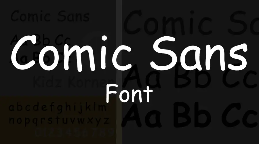
Vincent Connare designed Comic Sans font, and Microsoft Corporation released them in 1994 for use with Microsoft Windows. Vincent Connare is an American graphic designer and typographer who became popular today for his innovation of the Comic Sans font. He introduced his new font to the typographic world while employed by Microsoft, the largest software company.
What is Comic Sans font?
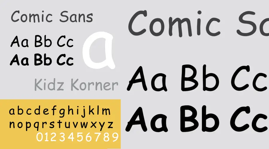
Comic Sans font was designed to purely model the typography in historical comic books. It was designed for ‘Bob’, a virtual assistant that would help kids and beginner users launch programs and do simple tasks.
Those who have problems in reading become comfortable for its irregular composition and the disparity in letter height in this typography.
Common Usages
Initially, this sans serif typeface was simply designed for comic books only. However, officials and young professionals have been using it to create office flyers, documents, logos, etc. since its release.
A study concluded, school students spent more time digesting the information when printed in the irregular set of fonts and were subsequently far more likely to remember it in the future. The study also tested how the readability of fonts affected school children’s retention of information.
This typography is also spacious and gives readers the chance to distinguish the letters. That’s why designers consider Comic Sans the best of the bunch for mainstream typefaces.
If the goal is a more compact, playful display face rather than Comic Sans’s everyday informal tone, compare the Noot font guide; the relationship is mood and use case, not typeface origin.
Comic Sans Font Generator
Do you want to make a design but don’t want to download it? Then you can use our font generator! This Comic Sans Font text generator will allow you to design from the web. You can choose the text and background color and adjust the text size. So, what are you waiting for? Try it out now!
Comic Sans Font Generator
Preview and download fonts

Comic-Sans-MS
Comic-Sans-MS-Italic
Comic-Sans-MS-Bold
Comic-Sans-MS-Bold-italic
Comic-Sans-MS-3
Comic-Sans-MS-Graffiti
Why Is Comic Sans Disliked So Much?
Many people hate Comic Sans because it is childish, ugly, unprofessional, or overused. Some of the reasons why people dislike Comic Sans are:
- It must be better designed and requires consistent letter shapes, kerning, and spacing.
- It does not match the tone or message of many texts that use it, such as serious or formal documents.
- It must be less casual and informal for many situations, such as academic papers or official signs.
- It is overused and ubiquitous, which makes it dull and annoying to see everywhere.
- It is associated with low quality, amateurism, or lack of creativity.
Some websites and campaigns aim to ban Comic Sans or educate people about its proper use. Some people strongly react emotionally to Comic Sans and consider it a sign of disrespect or incompetence. Others may care little about fonts or find Comic Sans harmless or even charming. However, Comic Sans is widely regarded as one of the most hated fonts in the world. You can watch the video to learn more about it.
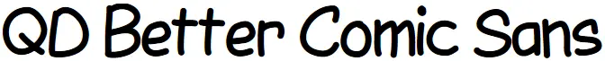
Similar Font
QD Better Comic Sans Font by Quinn Davis Type
LDF Comic Sans Font by Jake Luedecke Motion & Graphic Design
To Conclude
Some distinguished typographers said Comic Sans font is neither complicated nor even sophisticated. It is also not the same as the old text used in newspapers. Because of its history and usefulness, people love it a lot.
For more design inspiration, you may also check our other fonts in the same category, including Wild Words, papyrus, Among Us, Mardi Gras, Avatar The Way Of Water, and Taylor Swift Font.

I am part of the Free Fonts Vault team, dedicated to providing you with the best experience in finding free fonts for your needs. Our team works together to ensure that we offer well-researched information on free fonts or similar alternatives. If you have any queries, please do not hesitate to contact us through our Contact page. Note: We called ourselves “The A team”.


