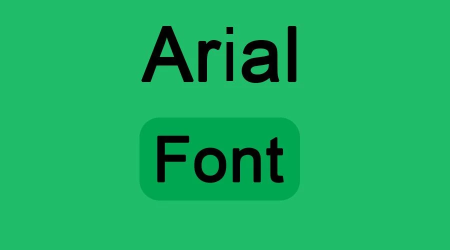
Arial Font is a sans-serif typeface created by Monotype Imaging, Inc. It was designed by the highly acclaimed designers Robin Nicholas and Patricia Saunders and released in 1982. It was intended to be a more humane alternative to the harsh appearance of typographical designs from the past. The letters are simple and clean and come in italic and bold styles. Arial has an easy-to-read yet modern design suitable for all text types.
Arial Font


The Arial font was originally intended as a similar typeface to the Helvetica font, another popular Sans-serif typeface. Instead of purchasing Helvetica’s license, the Arial font was metrically matched with it. It has more open forms than Helvetica does. It is an elegant nineteenth-century font that you can use for various purposes.
With 38 individual styles, it has 144 language support capabilities (please note that not all languages are available for all formats). Another significant thing is that the styling of Arabic glyphs in this font comes from Times New Roman. Many fonts, such as Adagio Sans, Calibri, and Cartogothic, look like the Arial font. Arial is not difficult to read, though it’s less aesthetically pleasing than other fonts.
History and Origin
Historically, it has a controversial reputation among graphic designers. It was created to be metrically identical to Helvetica. This means that if you typed a document in Helvetica, you could switch the font to Arial, and the line breaks and spacing would not change.
This was done so that IBM (and later Microsoft) could offer a font that looked and behaved like the incredibly popular Helvetica without paying license fees to Linotype (the owners of Helvetica). Because Microsoft included Arial as a core font in Windows 3.1 (1992), it became ubiquitous globally.
Arial vs. Helvetica
While they look nearly identical at a glance, there are distinct differences:
- The Cut (Terminals): Helvetica’s strokes end horizontally or vertically (flat). Arial’s strokes usually end at an angle. (Look at the top of the letter t).
- The “G”: The capital G in Helvetica has a spur at the bottom right; Arial does not.
- The “R”: The leg of the capital R in Arial flows downward and outward diagonally; in Helvetica, it is more vertical with a curved “kick.”
- The “a”: The tail on the lowercase a curves out in Helvetica; in Arial, it is simpler and lacks the tail.
Usage
The Arial font is a well-known and widely used font. It is ideal for official documents due to its user-friendly typeface. It is an extra-wide, lightweight typeface used in many books containing small caps. Aside from its lettering and stylistic reasons, it is also known for its design. When writing in Arial, you want to make sure your text is still legible to your target audience. It is also the most common family name for commonly used fonts.
Its simplicity is both its strength and its weakness. The Arial font is easy to read on screens. However, because the sans-serif typeface has a lower quality, some people find it difficult to tell which letters are on the screen because they look different from each other.
In addition to official work, you can also utilize it for unofficial work. Because of the styles in this font, it is handy for designers. You can create logos, banners, business cards, brochures, presentations, posters, and many more. You can also create websites and games using this font. As a result, this font is straightforward to use in almost all situations.
A free download is available. Download it for free by clicking the font download button below.
Font View

Font Family
- Arial® Light
- Arial® Light Italic
- Arial® Regular
- Arial® Italic
- Arial® Medium
- Arial® Medium Italic
- Arial® Bold
- Arial® Bold Italic
- Arial® Extra Bold
- Arial® Extra Bold Italic
- Arial® Black
- Arial® Black Italic
- Arial® Condensed Light
- Arial® Condensed
- Arial® Condensed Bold
- Arial® Condensed Extra Bold
- Arial® Light
- Arial® Monospaced Regular
- Arial® Monospaced Oblique
- Arial® Monospaced Bold
- Arial® Monospaced Bold Oblique
- Arial® Narrow Regular
- Arial® Narrow Italic
- Arial® Narrow Bold
- Arial® Narrow Bold Italic
- Arial® Narrow Inclined
- Arial® Narrow Bold Inclined
- Arial® Rounded Bold
- Arial® Rounded Light
- Arial® Rounded Regular
- Arial® Rounded Extra Bold
Conclusion
Arial endures as a cornerstone of digital typography not through novelty, but through its reliable neutrality. Designed for universal legibility and metric compatibility with Helvetica, it became the invisible workhorse of screens and print, proving that accessibility and functionality often outweigh aesthetic prestige. While newer typefaces offer stylistic refinement, Arial remains a testament to how technical pragmatism shapes global visual language.
Thanks.

I am part of the Free Fonts Vault team, dedicated to providing you with the best experience in finding free fonts for your needs. Our team works together to ensure that we offer well-researched information on free fonts or similar alternatives. If you have any queries, please do not hesitate to contact us through our Contact page. Note: We called ourselves “The A team”.


Comments are closed.