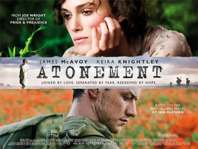
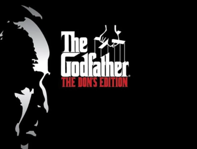
Akzidenz Grotesk font, a seminal sans-serif typeface, originated in the late nineteenth century in Germany. Since its release in 1898 by the Berthold Type Foundry, it has become a cornerstone of modern typography, influencing countless other fonts and adorning countless logos, headlines, and body text.
Historical Significance
Akzidenz Grotesk was one of the first widely-used sans-serif fonts, appearing at a time when serif fonts dominated the landscape. Its clean, unadorned lines and geometric forms offered a modern and functional alternative, perfectly capturing the spirit of the industrial age.
In the 1950s Günter Gerhard Lange, then art director at Berthold, began a project to enlarge the typeface family, adding a larger character set, but retaining all of the idiosyncrasies of the 1898 face. Under the direction of Günter Gerhard Lange, Berthold added AG Medium Italic (1963), AG ExtraBold (1966), AG Italic (1967), AG ExtraBold Condensed & Italic (1968), AG Super (1968).
Variations and Alternatives
Throughout its history, Akzidenz Grotesk has seen numerous variations and revivals, each offering a unique interpretation of the original design. Some notable examples include:
- Akzidenz-Grotesk Next: a contemporary interpretation by Berthold Type Foundry, offering a wider range of weights and optical sizes.
- Helvetica: arguably the most famous descendant of Akzidenz Grotesk, designed by Max Miedinger in 1957.
- Aktiv Grotesk: a modern reinterpretation by Dalton Maag, combining the clean lines of Akzidenz Grotesk with contemporary sensibilities.
Some Facts About Akzidenz-Grotesk
- Uncertain Designer: The designer of Akzidenz-Grotesk remains unknown. For a time, it was attributed to Ferdinand Theinhardt, but recent research has disproved this.
- Historical Context: The first sans serif typeface was published in England around 1816, and the style gradually gained popularity. Germany’s first sans serif was introduced in 1833 by Eduard Haenel’s Magdeburg printing-house.
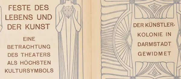
- First Sans Serif Book: In 1900, the first book entirely composed in upper and lowercase sans serif types was published, designed by Peter Behrens. This marked a significant step in the evolution and acceptance of sans serif types for more extensive texts.
- Development of Akzidenz-Grotesk: The font’s first weight was jointly published in 1898 by Bauer & Co. in Stuttgart and Berthold in Berlin. The design originated from the Schattierte Grotesk typeface, a drop-shadowed design, by removing the shadow effect.
- Evolution and Misattribution: Akzidenz-Grotesk evolved over time, with new weights and styles added. There was a common misattribution of the typeface to Ferdinand Theinhardt, which has been corrected by recent research.
- Impact and Legacy: The influence of Akzidenz-Grotesk on later typefaces, particularly its role in inspiring neo-grotesques and its relationship to Helvetica and Univers font.
- Typography in Marketing: The typeface was introduced in the U.S. market as “Standard” by Amsterdam Continental, reflecting marketing strategies adapting to linguistic and cultural contexts.
Design Characteristics

The Akzidenz Grotesk font is characterized by:
- Uniform stroke width, giving a flat appearance.
- Closed apertures in letters like ‘c’ and ‘e’.
- Simplified, unadorned letterforms for clarity.
- Horizontal and vertical terminals in letters.
- Variations in character shapes across different weights.
- Square dots over ‘i’ and ‘j’.
- Slightly rounded curves in letters like ‘o’ and ‘b’.
- Moderate x-height for readability.
Akzidenz Grotesk Font Generator
Our Akzidenz Grotesk font generator lets you preview the font and download it. You can also download a preview of the selected font in PNG format for your convenience. Try it now and see what you can create.
FAQs
Ans: Yes, It is 100% safe to download for both PC and MAC.
Ans: Yes, you can use Akzidenz Grotesk font on the online platform.
Akzidenz Grotesk font design reflects the practical and functional ethos of the late 19th and early 20th centuries, embodying clarity and straightforwardness. It has been used widely in various contexts, from print to digital media, and continues to be a popular choice for designers seeking a classic, timeless look.
Thanks for reading.

I am part of the Free Fonts Vault team, dedicated to providing you with the best experience in finding free fonts for your needs. Our team works together to ensure that we offer well-researched information on free fonts or similar alternatives. If you have any queries, please do not hesitate to contact us through our Contact page. Note: We called ourselves “The A team”.
