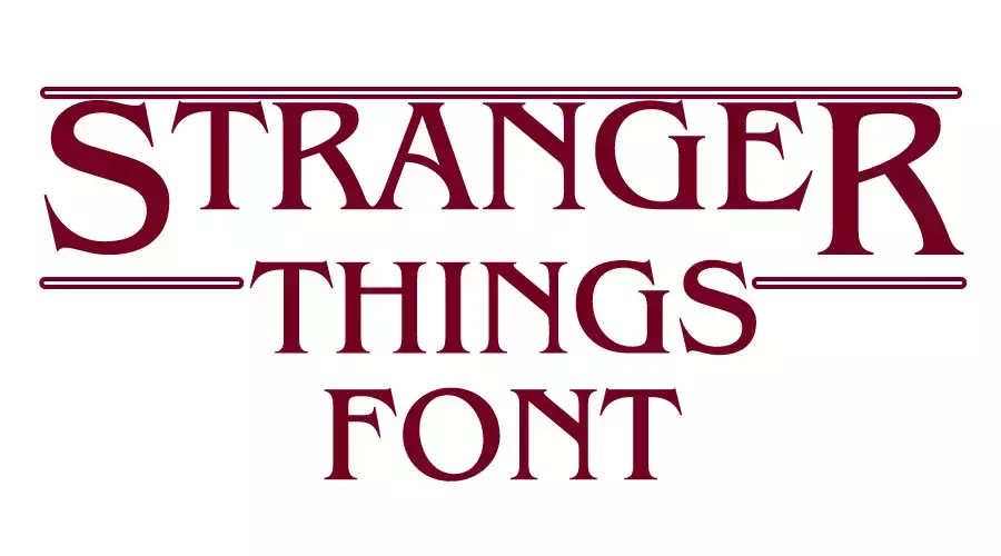
Stranger Things Font comes from the title logo of the popular TV series “Stranger Things” uses a modified version of the ITC Benguiat font. However, it’s important to note that the show logo lettering is slightly different from the original font. ITC Benguiat Bold Condensed Look very similar to the logo.
The font was designed by Ed Benguiat in 1977 and is characterized by its decorative serifs and high-waisted capitals, which contribute to its distinctive look.
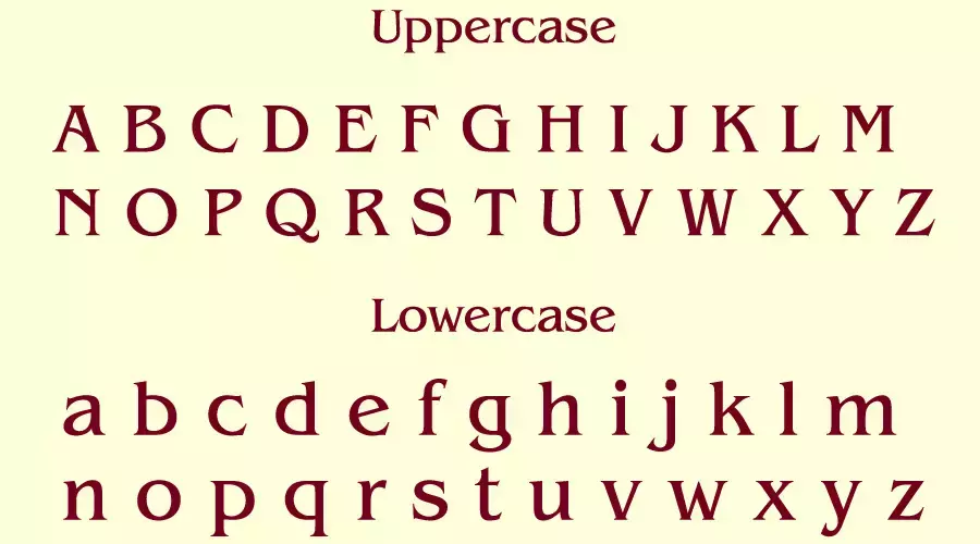
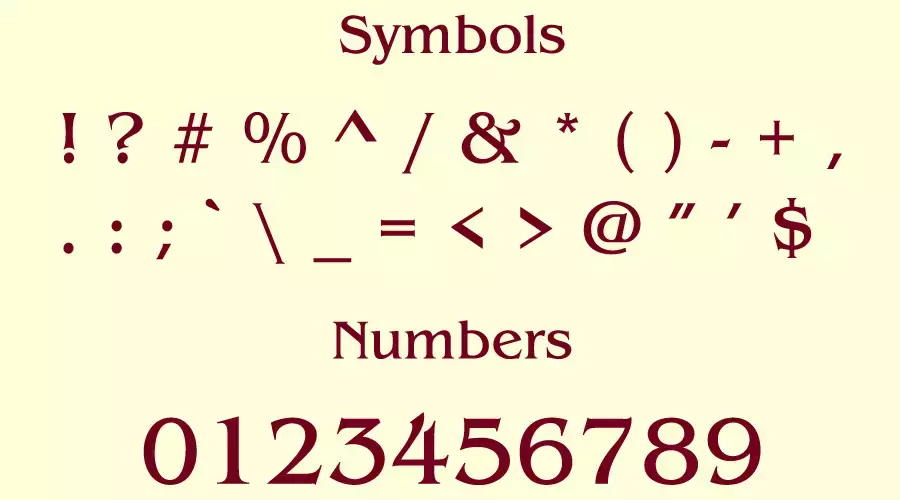
Stranger Things Fonts
Except ITC Benguiat font we found some free fonts that look similar to the Stranger Things font. Like
Brian James Condensed Bold Font
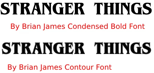
If you check the font closely It has very similarities with the Stranger Things font. This font is free for personal use.
Optie dwallian Extra Bold Font
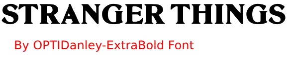
Another free similar logo font that you can try.
Young Serif Regular Font
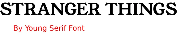
This is a google font 100% free that also look similar to the logo.
What other fonts are used?
Stranger Things show also uses several other fonts inside the show besides ITC Benguiat.
Bookman Swash Font: This font is used for the branding of Scoops Ahoy and has a playful yet old-timey feel.
Krazy Knacks Font and Laser Font: These are the fonts used in the logo of Surfer Boy Pizza, which only exists in the Upside Down.
Kimberly font: It is used in the Hawkins Light and Power logo, which has a sci-fi feel and a machine-made aesthetic inspired by 1970s corporate/industrial logotypes.
Helvetica: The show’s opening credits and on-screen graphics used the font.
Souvenir: This font was used in the credits of some of the show’s earlier seasons.
Franklin Gothic: This font was used in the episode titles in the show’s opening credits.
Most of these fonts are free, allowing designers to recreate the show’s iconic aesthetic in their projects.
In Conclusion
The fonts used in Netflix’s Stranger Things have become an integral part of the show’s iconic aesthetic and have gained a fanbase of their own. From the spooky Benguiat bold font used in the main title to the playful Bookman Swash used in the Scoops Ahoy branding, these fonts are now available for download, making it possible to recreate the famous Stranger Things look in your own projects.
So, whether you’re looking to add a touch of nostalgia to your designs or create a sci-fi-inspired look, these fonts are a great place to start. Download them today and let your creativity run wild!
If you’re looking for more font options, there are plenty of other fonts to choose from like Peppa Pig, Lilo and Stitch, Superman Font, Winnie the Pooh and The Simpsons font.
I am part of the Free Fonts Vault team, dedicated to providing you with the best experience in finding free fonts for your needs. Our team works together to ensure that we offer well-researched information on free fonts or similar alternatives. If you have any queries, please do not hesitate to contact us through our Contact page. Note: We called ourselves “The A team”.


