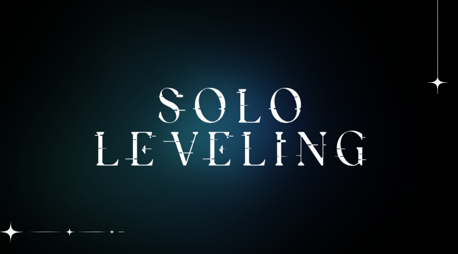
Quick answer: The English Solo Leveling title is best treated as custom production lettering. Eternal is a useful visual alternative for the sharp main-title look, but we found no public credit from the anime production confirming it as the official font. The other fonts in the preview target game and interface moods rather than one universal logo.
Solo Leveling appears across a web novel, webtoon, anime, and games, and those products do not all use the same typography. This guide labels each preview by the visual role it can approximate instead of presenting a mixed group of fonts as one official family.
Preview Solo Leveling-style fonts
Start with Eternal for an angular title. Use Metal Mania for a dramatic “ARISE” treatment, and compare the rounded sans-serif options when recreating system panels, labels, or game-interface text.
Solo Leveling Font
Matched or Identified Fonts
Eternal
| FG Studios title-style alternativeMetal Mania Regular
| Fantasy display alternativeTrueno Round Bold
| Rounded UI alternativeCirce Rounded Extra Bold
| Rounded UI alternativeLato Regular
| Readable UI alternativeCarossoft bold
| Rounded UI alternativeWhat font is used in the Solo Leveling logo?
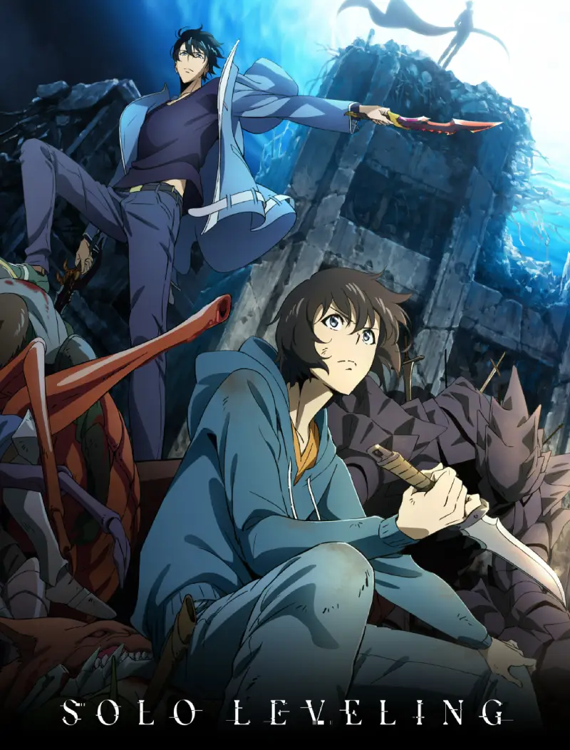
The official anime site displays a narrow, sharp English title lockup with carefully fitted letterforms and a separate subtitle treatment. It also credits the production partners and animation team, but it does not provide a retail font name for the logo.
Eternal resembles the main title because of its pointed construction and dramatic display proportions. That similarity makes it a strong generator option, not proof of production use. For interface-style text, cleaner rounded families such as Trueno Round, Circe Rounded, Lato, and Carossoft produce a more believable hierarchy than forcing the logo display face into every label.
What the Solo Leveling comparison proves
| Candidate | Evidence status | What matches | Where it differs |
|---|---|---|---|
| Official anime title artwork | Primary visual reference; no public retail-font credit found | Narrow, sharp silhouette and fitted lettering | Not supplied as a public type family |
| Eternal | FG Studios visual alternative | Angular display construction | Not credited by the anime production |
| Metal Mania | OFL display alternative | High-energy pointed details | Wider and more decorative than the title |
| Rounded UI group | General interface alternatives | Readable system-panel hierarchy | Not evidence of an official Solo Leveling UI family |
Eternal’s embedded name table credits FG Studios and marks the file all rights reserved; FG Studios provides separate commercial licensing. Metal Mania’s embedded data instead records the SIL Open Font License. Those alternatives therefore need different licence descriptions even though both can be previewed here.
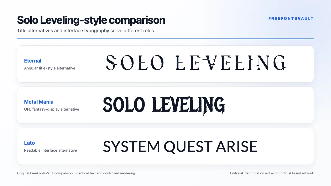
Inspect the stored Eternal record and Metal Mania record, then compare them with the official artwork before choosing a direction.
Eternal
A close visual alternative for the main title’s sharp fantasy-action silhouette. Keep the wording short and compare the S, O, L, E, and G shapes carefully.
Metal Mania Regular
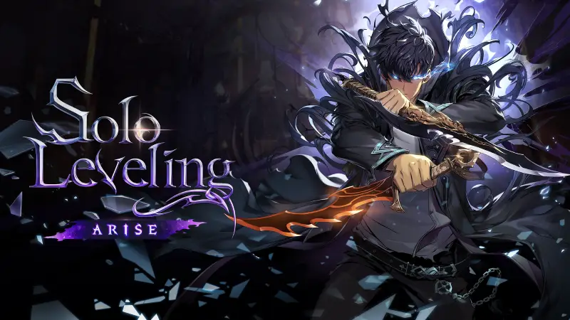
A high-energy display option for “ARISE” and other dramatic callouts. It is an alternative treatment, not the confirmed font for the anime or game logo.
Rounded interface alternatives
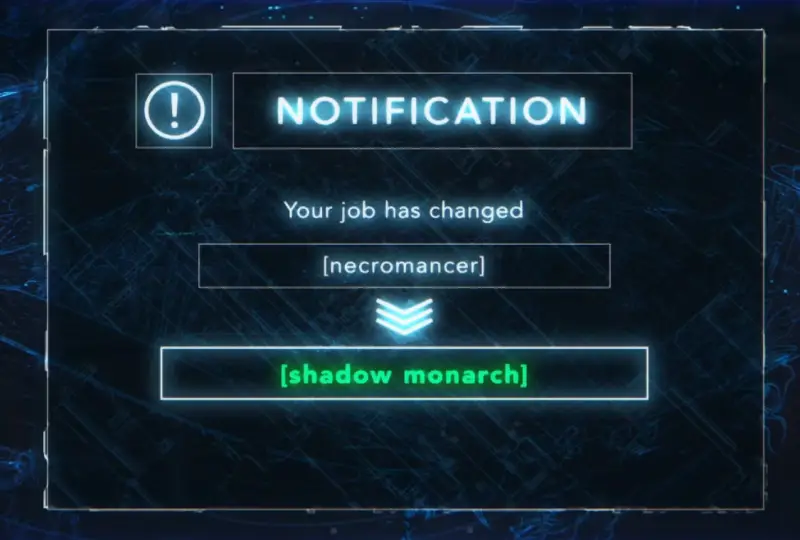
Trueno Round, Circe Rounded, Lato, and Carossoft are more suitable for readable system panels and game-like labels. They represent a UI direction rather than a single official Solo Leveling type family.
How to build a Solo Leveling-style graphic
- Choose whether you are recreating the anime title, an “ARISE” callout, or a game-interface panel.
- Use Eternal for the title or a rounded sans serif for small interface text.
- Keep title tracking compact and preserve the narrow silhouette.
- Use dark navy or black with cool blue, violet, or pale highlights for a shadow-themed palette.
- Export the title and UI text separately so each can use the right contrast and size.
Do not describe an exported image as official Solo Leveling artwork. For original projects, change the wording, palette, composition, and effects rather than copying a complete title lockup.
Continue with FreeFontsVault tools
Build a finished PNG, WebP, or SVG in the Font Generator & Logo Text Studio, compare the alternatives side by side in Compare Fonts, and inspect a downloaded file’s name tables, glyph coverage, and embedding flags with the Font License & Health Checker.
Related font guides
- Jujutsu Kaisen Font — compare supernatural anime title lettering
- Black Clover Font — explore gothic fantasy alternatives
- Omori Font — compare a game identity with custom in-world typography
License and usage notes
Each preview font can have different terms. Check the original license for desktop use, web embedding, apps, games, merchandise, and redistribution; a download button is not a blanket commercial license.
Solo Leveling names, logos, character art, and interface assets are protected separately. A permitted font does not grant permission to copy the franchise identity or sell branded fan merchandise.
Sources checked
- Official Solo Leveling anime website and title artwork
- Official anime staff and production information
- FG Studios source for the Eternal visual alternative and its separate commercial terms
- Google Fonts source and OFL record for Metal Mania
- Google Fonts source and OFL record for Lato
Frequently asked questions
The title is best treated as custom production lettering. Eternal is a close visual alternative, not a publicly confirmed official font.
No official anime source we found credits Eternal. Use the wording “similar” or “inspired” rather than “official.”
Rounded sans-serif options in the preview are better for readable system panels, while Eternal and Metal Mania are display choices.
Only when the individual font license covers your intended use. Franchise branding permission is a separate requirement.
The anime, webtoon, games, and interface graphics use different visual roles. The gallery separates title, callout, and UI alternatives rather than claiming one official family.




