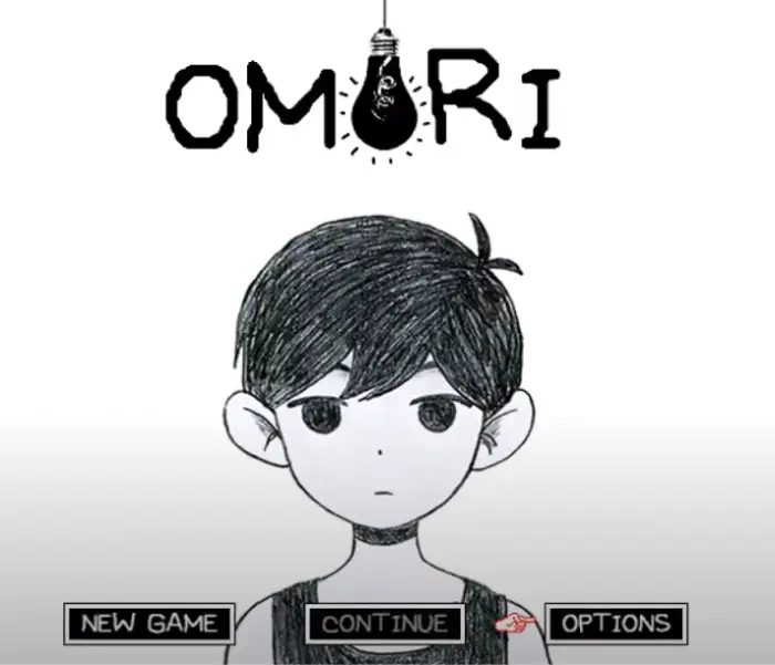
Quick answer: OMORI uses distinctive handwritten game lettering associated with OMOCAT’s visual identity. The OMORI-1 and OMORI-2 files in this preview reproduce two familiar in-game text moods, but game-bundled assets are not automatically open fonts for unrestricted commercial use.
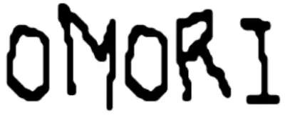
The two styles serve different emotional purposes: one reads like casual handwritten dialogue, while the more unstable treatment supports darker scenes. That contrast is central to the game’s visual storytelling and is more useful than treating “the OMORI font” as a single neutral typeface.
Preview OMORI-1 and OMORI-2
Enter the same sentence in both styles. Compare readability, spacing, and emotional tone before choosing one; the darker style can become difficult to read in long passages or at small sizes.
Omori font Generator
Preview and download fonts
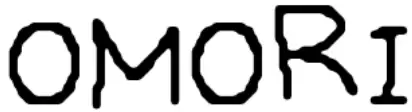
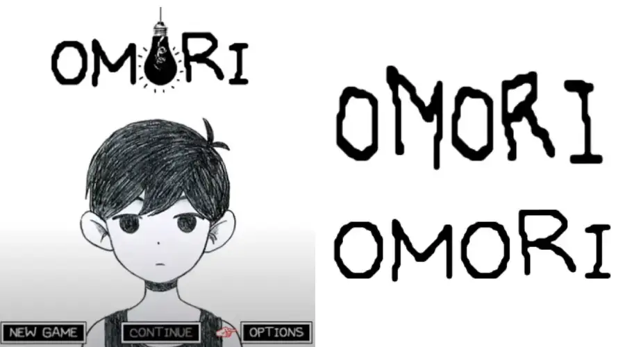
OMORI-1 | Game-associated clear dialogue style
OMORI-2 | Game-associated distorted style
How OMORI uses typography
OMOCAT’s official portfolio identifies OMORI as a game designed, written, illustrated, programmed, and produced by OMOCAT. The handwritten lettering fits that authored, illustrated world and helps text feel like part of the artwork rather than a generic interface layer.
The standard style works best for dialogue, captions, and friendly scenes. The distorted alternative is more effective as an occasional accent for fear, instability, or Black Space-inspired compositions. Using it everywhere removes the contrast that makes it powerful.
A note about the two OMORI font files
The filenames are potentially confusing: OMORI-GAME.ttf reports the internal family OMORI_GAME2, while OMORI-GAME2.ttf reports OMORI_GAME. Both files credit OMOCAT, LLC in their embedded copyright records. This guide therefore identifies them by visible role—clear dialogue lettering and distorted horror lettering—rather than treating the filename order as authoritative.
| Stored file | Internal family | Role in this guide |
|---|---|---|
| OMORI-GAME.ttf | OMORI_GAME2 | Clearer dialogue-style lettering |
| OMORI-GAME2.ttf | OMORI_GAME | Distorted horror-style lettering |
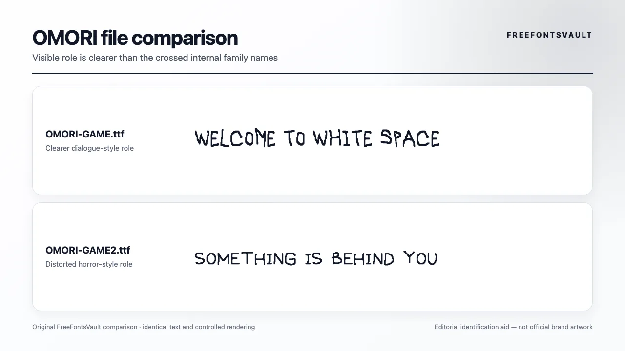
Embedded authorship is not the same as a public project-use licence. Inspect the stored clearer OMORI record and distorted OMORI record, and verify the intended use independently.
OMORI-1
The clearer handwritten option for short dialogue, headings, and fan-made mockups. Keep line lengths modest because irregular handwritten spacing can tire readers in dense paragraphs.
OMORI-2
The more unsettling alternative for horror-oriented words or short effects. Use it sparingly and test every character because distortion can reduce legibility.
How to create an OMORI-style text panel
- Choose OMORI-1 for normal dialogue or OMORI-2 for a deliberately unstable moment.
- Use short sentences and a generous font size so the handwriting remains readable.
- Try dark text on white for ordinary scenes and reversed or high-contrast colors for darker scenes.
- Leave more line spacing than you would with a regular sans serif.
- Export a test image and inspect punctuation, numbers, and uncommon characters before final use.
The generator is useful for private mockups and comparison. It does not convert game assets into a public-domain or open-source font.
Continue with FreeFontsVault tools
Build a finished PNG, WebP, or SVG in the Font Generator & Logo Text Studio, compare the alternatives side by side in Compare Fonts, and inspect a downloaded file’s name tables, glyph coverage, and embedding flags with the Font License & Health Checker.
Related font guides
- Persona 5 Royal Font — compare another game with strong interface typography
- Splatoon Font — explore playful custom game lettering
- Solo Leveling Font — compare title and game-interface font roles
License and usage notes
The previous page claimed the fonts were suitable for personal and commercial projects without presenting a reliable license. That claim has been removed. Treat extracted or recreated game type assets as restricted unless the rights holder or an accompanying license explicitly permits your use.
OMORI artwork, names, characters, and visual identity remain protected separately. For commercial work, choose an independently licensed handwritten alternative or obtain permission rather than relying on a file found inside or copied from a game package.
Sources checked
Frequently asked questions
OMORI uses custom handwritten game lettering. OMORI-1 and OMORI-2 reproduce two recognizable text moods used by the game community.
One style is clearer and friendlier, while the other is distorted for darker or more unsettling scenes.
Do not assume so. Game assets and community-circulated files require explicit permission or a reliable license for commercial use.
OMORI-1 is generally better for dialogue and longer text. OMORI-2 works best for short dramatic accents.
Personal fan art may be tolerated in some contexts, but font-file permission and franchise rights still apply. Follow the rights holder’s policies and avoid presenting work as official.

I am part of the Free Fonts Vault team, dedicated to providing you with the best experience in finding free fonts for your needs. Our team works together to ensure that we offer well-researched information on free fonts or similar alternatives. If you have any queries, please do not hesitate to contact us through our Contact page. Note: We called ourselves “The A team”.



