Are you fascinated by space wonders and NASA achievements? Do you want to use a font that reflects the spirit of exploration and discovery? Then take a look at NASA font. NASA font is a term that refers to the typefaces used by the National Aeronautics and Space Administration (NASA) in its logos, signs, documents, and other materials. NASA has used different fonts throughout its history. And today we will tell you about NASA, about NASA Font, and why NASA logo is so iconic. We want you to stay with us until the end.
What is NASA?
NASA is the acronym for the National Aeronautics and Space Administration. This is a U.S. government agency that oversees civilian activities related to space exploration, aeronautics research, and space science. Nasa was established in 1958, replacing the National Advisory Committee for Aeronautics (NACA), and since then it has been involved in many groundbreaking missions and discoveries in space and on Earth.
Some of Nasa’s most notable achievements include:
- Launching the first American astronaut, Alan Shepard, into space in 1961.
- Sending the first humans, Neil Armstrong, and Buzz Aldrin, to land on the Moon in 1969 as part of the Apollo program.
- Developing the Space Shuttle, which flew 135 missions from 1981 to 2011 and carried astronauts, satellites, and scientific instruments to low Earth orbit.
- Operating the International Space Station (ISS), a permanent orbiting laboratory that hosts crew members from various countries and conducts experiments in various fields.
- Exploring the solar system with robotic spacecraft, such as Voyager, Pioneer, Cassini, Galileo, Juno, New Horizons, and Perseverance.
- Observing the universe with telescopes and observatories, such as Hubble, Chandra, Spitzer, Kepler, and James Webb.
- Studying the Earth and its climate with satellites and instruments, such as Landsat, Terra, Aqua, Aura, and GRACE.
- Advancing aeronautics research and technology with aircraft and flight tests, such as X-15, X-43A, X-59 QueSST, and Ingenuity.
NASA also has a large collection of images and videos from its missions and activities available to the public on its website. Users can search for images by keywords, categories, dates, resolutions, and metadata. Users can also download images in various formats and sizes and see the source and license information. NASA also has an image of the day feature that showcases a different image every day with a brief explanation. Now let’s talk about NASA font.
NASA Fonts
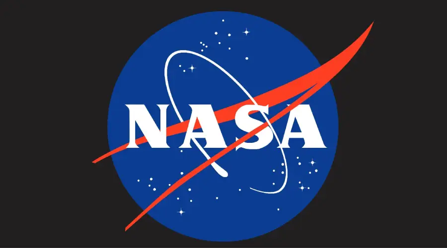
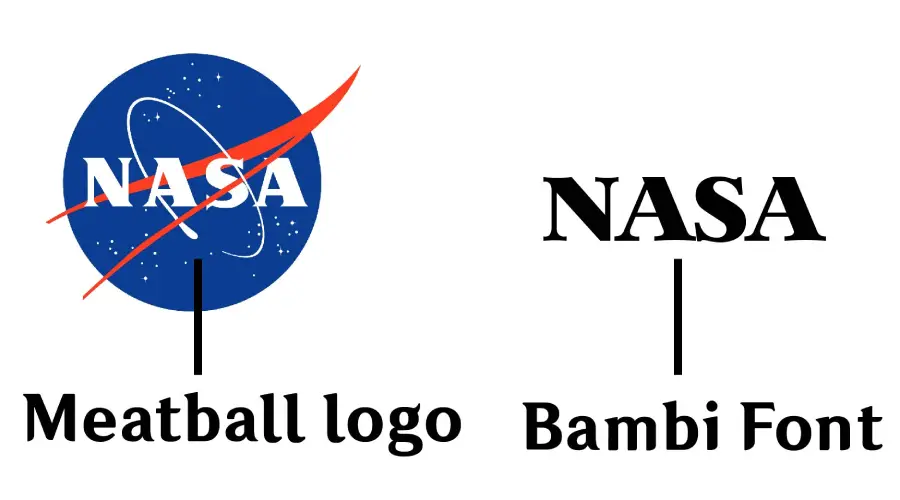
NASA font is not available because NASA has used different fonts throughout its history. NASA’s first logo is called the Meatball because it looked like one and so the name stuck. The logo was designed by James Modarelli, a Nasa employee, in 1959. The logo has four main elements: a blue sphere that represents a planet, white stars that represent space, a red chevron that symbolizes aeronautics, and a white orbit that symbolizes space travel. The logo also has the word “NASA” in white serif letters.
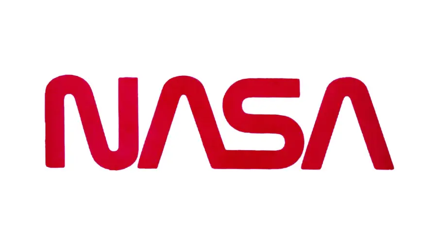
NASA then introduced its famous “worm” logo, consisting of the word “NASA” in red letters in 1975. Worm was a nickname for the NASA logotype, which is a red, stylized rendering of the letters N-A-S-A. Everyone called it worm because it looked like a worm. The logo was designed by Richard Danne and Bruce Blackburn, who wanted a modern and futuristic look for the agency. The logo was used until 1992 when NASA switched back to its original “meatball” logo.
Helvetica is a classic sans-serif font created in 1957 by Swiss designers Max Miedinger and Eduard Hoffmann. NASA made Helvetica their default typeface for office documents. It is known for its simplicity, clarity, and versatility. They used Helvetica in some of its materials, such as the space shuttle, signage, and printouts.
NASA has also used some other fonts for its project. For example, Futura is a font that NASA has used in its space shuttle signage, the printouts of the Apollo Guidance Computer, and the plaque that was left on the Moon by the Apollo 11 astronauts.
Nasalization
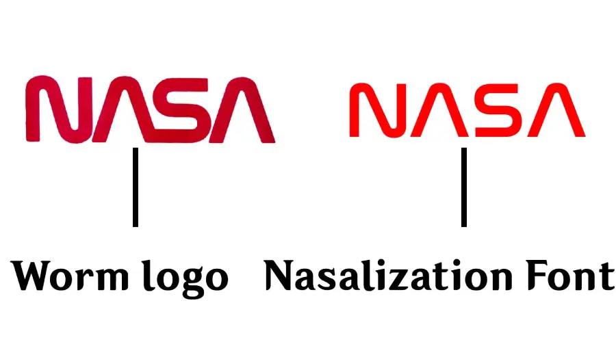
Nasalization is a display font created in 2005 by Ray Larabie, a Canadian designer who runs Typodermic Fonts. It is inspired by the NASA worm logo but with modifications and additions. It has sharp edges, geometric shapes, and diagonal cuts that give it a space-age feel. It comes in six weights: thin, light, regular, bold, heavy, and extra heavy. Nasalization is suitable for headlines, logos, posters, banners, and other eye-catching designs.
Bambi Bold
Another font that resembles the NASA worm logo is Bambi Bold, created in 2010 by Gaut Fonts. It is a replica of the font used in the NASA meatball logo. It has rounded corners, smooth curves, and thick strokes that create a friendly and playful impression. Bambi Bold is also suitable for headlines, logos, posters, banners, and other eye-catching designs.
NASA Font Generator
If you want to check all the NASA-related fonts before downloading them, you can check out our NASA font generator. Our font generator is handy when customizing text. You can type your text in the generator box, choose the font style (Helvetica, Nasalization, or Bambi Bold), and adjust the size, color, and background of your text. You can download the preview and the NASA font from there.
Similar Fonts
If you’re looking for similar to NASA font then check out these fonts below:
Why is NASA Logo So Iconic?
NASA logos are so iconic because they represent the agency’s mission and vision, which is to explore space and advance science and technology. Logos also have a history and meaning behind their design, which reflects different aspects of NASA’s activities and achievements.
NASA has used only two logos in its existence. The first logo is called Meatball and the second one is called Worm. A NASA employee designed this logo. As it represents the agency’s mission to explore the universe and outer space. It’s beloved among NASA engineers as an icon and as nostalgia while reminding them of their mission.
The Worm was created when the agency wanted a more modern and futuristic logo. It is red, stylized lettering of NASA words. It has sharp edges, geometric shapes, and diagonal cuts. The worm symbolizes innovation and creativity for NASA, and it was used from 1975 to 1992. But in 2020 NASA brought back the worm logo for some missions and products, such as the SpaceX Crew-Demo 2 Mission. And this marked the return of human spaceflight on American rockets on American soil. They also confirmed that they would use it as their secondary logo in various projects and missions.
Conclusion
NASA has used two fonts for its logo. They are popularly known as Worm and Meatball. And NASA also uses Helvetica for official documents. In addition, we have two fonts that look like NASA’s logo. Nasalization and Bambi Bold are two of them. So, if you’re planning for exploration designs or NASA-themed designs then you should definitely check them out now!
