In the world of fast food, McDonald’s is easily recognizable. Its iconic golden arches and red-and-yellow color scheme. But what font does McDonald’s use for its logo and website? And how can you use it for your own design projects? In this article, we will explore McDonald’s font history and characteristics. We will also explore some alternatives and similar fonts that you can download for free.
The History of the McDonald’s Font
The McDonald’s logo has gone through several changes since its inception in 1940, when brothers Richard and Maurice McDonald opened their first restaurant in San Bernardino, California.
In 1953, they hired architect Stanley Meston to design their new restaurant buildings, which featured two golden arches on each side of the roof. These arches became a distinctive feature of the McDonald’s brand, and were incorporated into the logo in 1961 by Jim Schindler, who merged them into a single “M” shape. He also added a line below the arches that read “McDonald’s”, using a sans-serif font similar to Helvetica.
In 1968, the logo was simplified again by removing the line and leaving only the arches. This logo version is still used today, although it has been modified slightly over the years. The current logo was introduced in 2003 and features a gradient effect on the arches and a slight tilt to the right.
McDonald’s Fonts
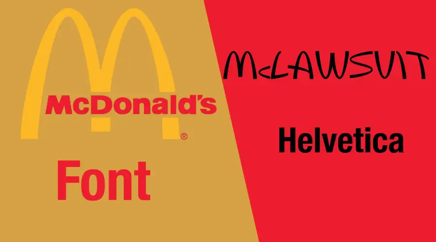
The font that is used for the word “McDonald’s” below the arches is not a standard font that you can find online. It is a custom-made font that is exclusive to the company. However, there are some fonts that are very similar to it and can be used as substitutes.
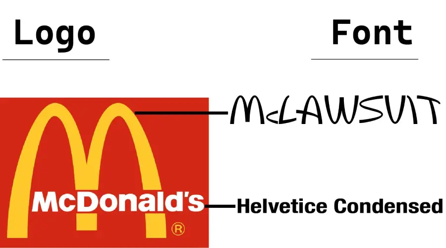
McLawsuit
One of these fonts is McLawsuit, which was designed by Jesse Burgheimer. It is a free font that mimics the shape and style of the McDonald’s arches. It is available in uppercase letters only.
Helvetica Black
Another font that is close to the McDonald’s font is Helvetica Black, which is a bold version of the popular Helvetica font family. It has a similar sans-serif style and proportions as the McDonald’s font, but it lacks the curved edges and angles of the arches.
Lovin’ Sans
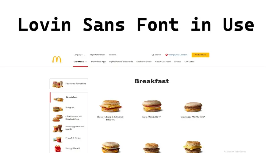
The font that is used for the McDonald’s website is also not a standard font. It is called Lovin’ Sans, and it is a customized version of Colfax, a geometric sans-serif font designed by Process Type Foundry. McDonald’s long-term communication partner Leo Burnett adapted it with Brian Loehr’s help. It is not available for public use, but you can see it on McDonald’s website.
The McDonald’s Font Generator
Similar Fonts
If you are looking for some alternative or similar fonts, here are some suggestions:
- Arial: This is a classic sans-serif font that is widely used on the web and in print.
- Futura: This is another geometric sans-serif font that has a modern and futuristic look.
- Speedee: This is a font that was used for the original McDonald’s logo in 1948.
Conclusion
McDonald’s font is a unique and recognizable part of the brand’s identity and has a long and interesting history. It is not a standard font that you can easily find online, but there are some similar fonts that you can use as substitutes. You can also use an online tool to generate your own text with the McDonald’s font style. Whether you are a fan of McDonald’s or not, you can appreciate the design and impact of this font.
In addition, if you would like to download other similar style fonts, then you can try our other font offerings, like: Avatar: The Last Airbender, Cyberpunk 2077, High on Life, Grand Theft Auto, Witcher and Disney Font.
Thanks
