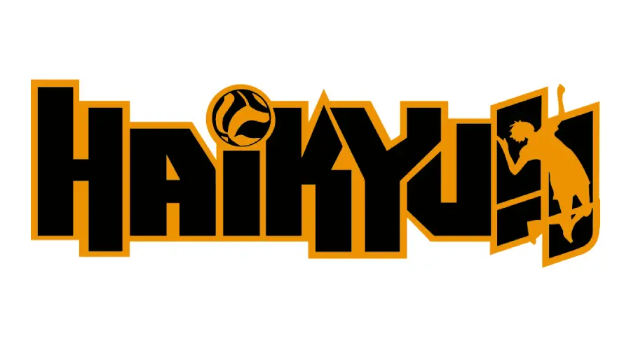
Short answer: the official Haikyu!! portal displays the series title artwork but does not credit Dimitri—or another retail typeface—as the logo font. Dimitri is a close visual alternative for the uppercase roman lettering, not a confirmed official font.
Haikyu Font Generator
Preview and download fonts
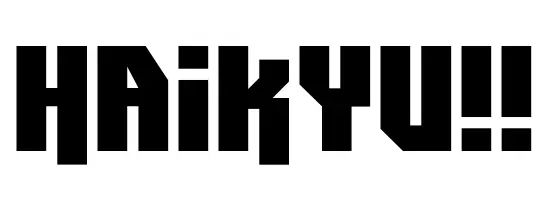
Dimitri | Visual alternative
Which Haikyu logo is being compared?
Haikyu!! artwork changes across Japanese and international releases, seasons, anniversary campaigns, and merchandise. This page compares the compact, blocky roman-letter treatment shown in the preview with the branding on the official anime portal. It does not claim that every version uses one typeface.
Why Dimitri looks similar
Dimitri has narrow uppercase forms, hard corners, and distinctive cuts through letters such as A, K, and Y. Those traits can reproduce the energetic sports-title mood. The punctuation, spacing, and individual letter shapes still need to be compared against the exact logo asset; similarity alone is not an official design credit.
Creator and license evidence
Font Bros lists Dimitri as a one-style commercial family by Fontalicious. The Dimitri.ttf preview file also contains “Dimitri ©2000, Font•a•licious Fonts” in its metadata, but it includes no license text or license URL. That confirms attribution, not permission to share the file. Use the creator’s licensed source for published work and do not republish the raw TTF without written permission.
Preview and related anime lettering
Test your own wording above or build a graphic in the font generator. For other evidence-labeled anime comparisons, see the Jujutsu Kaisen font guide and Demon Slayer lettering guide, or browse the logo-font hub.
Sources checked
- Official Haikyu!! anime portal for the visual identity reference.
- Font Bros: Dimitri by Fontalicious for family attribution and licensed purchase route.
I am part of the Free Fonts Vault team, dedicated to providing you with the best experience in finding free fonts for your needs. Our team works together to ensure that we offer well-researched information on free fonts or similar alternatives. If you have any queries, please do not hesitate to contact us through our Contact page. Note: We called ourselves “The A team”.



