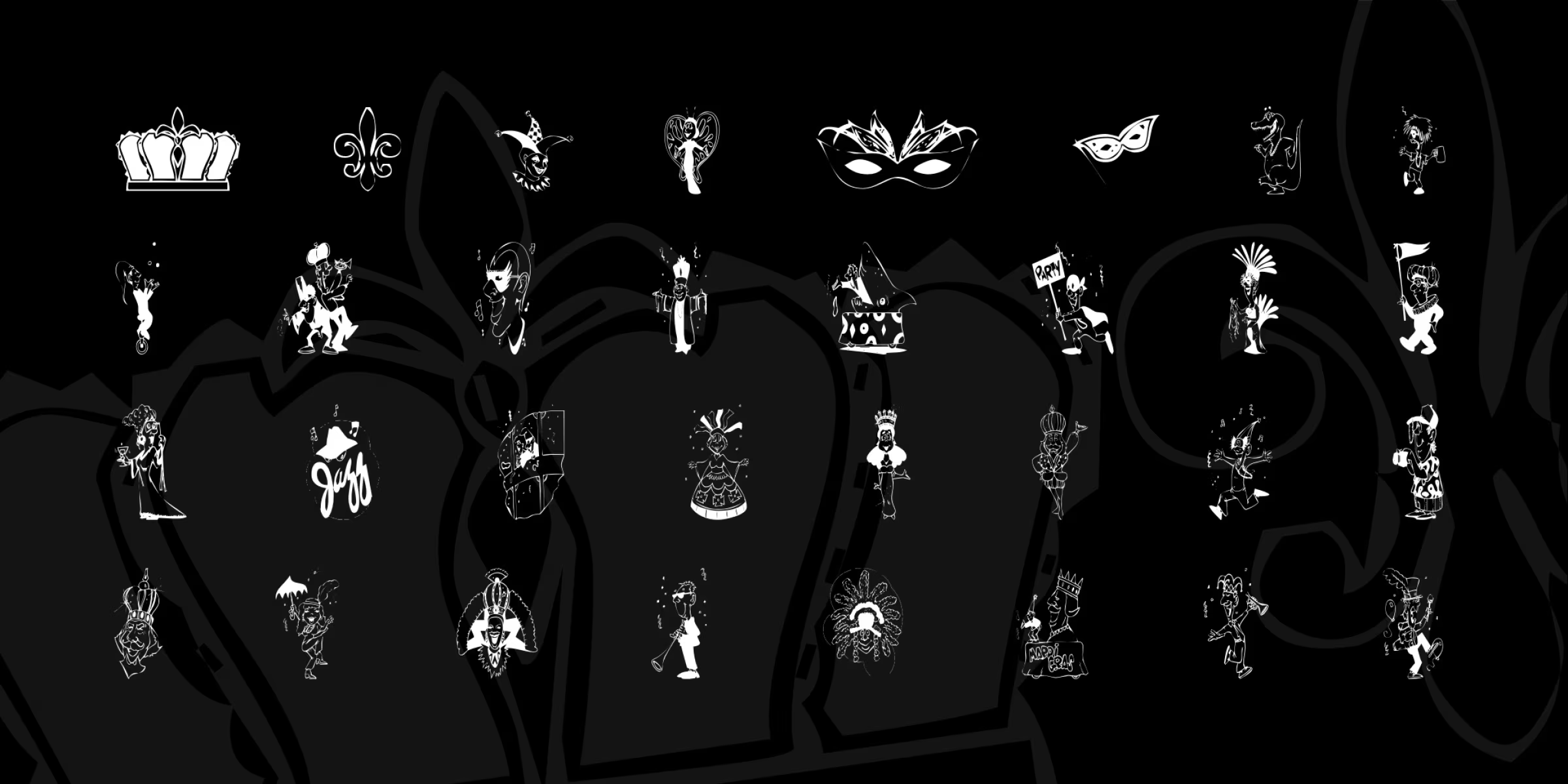
When the streets of New Orleans fill with purple, green, and gold, when masks shimmer and brass bands pulse, Mardi Gras isn’t just a festival—it’s a sensory explosion. And in the digital age, that spirit extends to typography. The Mardi Gras font isn’t a single design, but a vibrant genre of lettering that captures the playful, ornate, and slightly chaotic energy of Carnival. From swirling serifs to jester-like flourishes, these fonts let designers sprinkle a little Fat Tuesday magic onto posters, invitations, branding, and social graphics.
Mardi Gras Fonts Generator
Mardi Gras Personal Use
| OriginalMardi Gras by Scratchones
| OriginalMardigras Alltype
| OriginalMardi Gras Regular
| OriginalKr Mardi Gras
| OriginalLet’s explore six distinct interpretations of the Mardi Gras aesthetic, each crafted by different designers to evoke the joy, mystery, and revelry of the season.
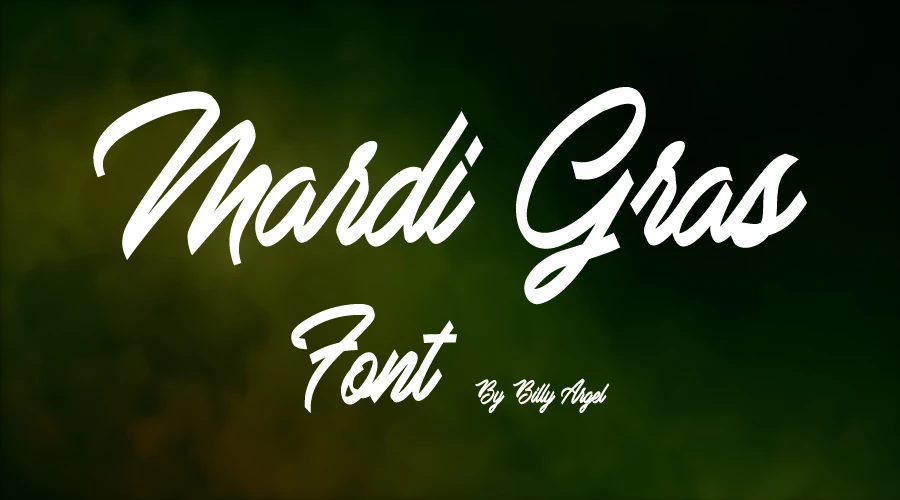
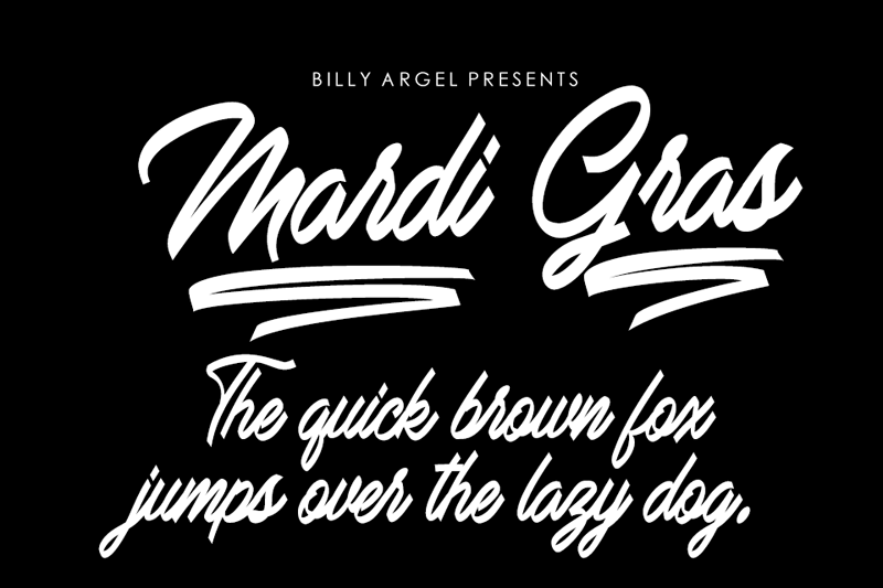
1. Mardi Gras by Billy Argel Fonts
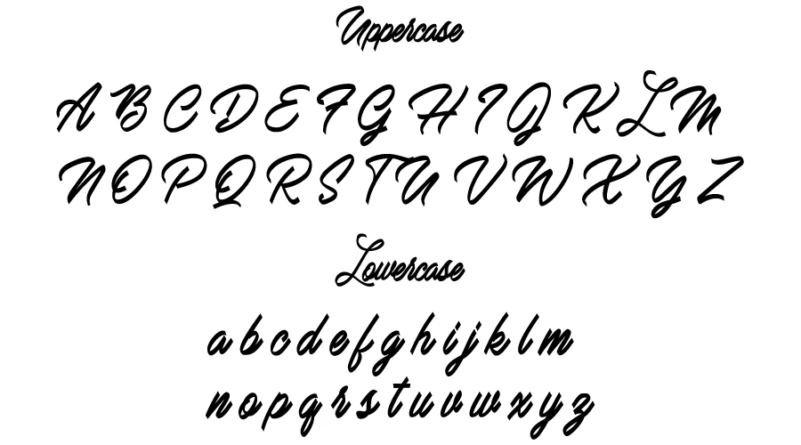
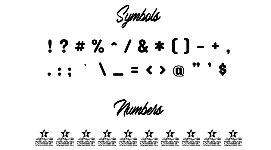
Style: Romantic, Hand-drawn Elegance
Billy Argel is known for fonts that feel deeply human—like ink spilled from a passionate pen. His Mardi Gras leans into flowing script with dramatic swashes and irregular baseline movement. Letters twist like ribbons in a parade, with a touch of Victorian flourish meets Bourbon Street whimsy. Perfect for vintage-style Mardi Gras posters or elegant masquerade invitations, this font balances chaos with grace, embodying the “laissez les bons temps rouler” (let the good times roll) ethos in every curve.
Best For: Event branding, luxury Carnival-themed designs, lyrical quotes.
2. Mardi Gras by Scratchones
Style: Raw, Grungy, Streetwise Carnival
If Mardi Gras had a gritty, back-alley cousin, this would be it. Scratchones’ Mardi Gras embraces imperfection—rough edges, ink splatters, and uneven letterforms mimic hand-painted signs weathered by rain and revelry. It’s less bead necklace, more peeling poster on a French Quarter brick wall. The texture screams authenticity, making it ideal for designs that want to feel spontaneous, underground, or nostalgically analog.
Best For: Indie event flyers, street-art-inspired campaigns, retro poster collages.
3. MardiGras Regular by MIKE (Published by ALLTYPE)
Style: Bold, Festive, and Readable
This is Mardi Gras for the masses—clear, celebratory, and highly functional. With thick strokes, rounded terminals, and a balanced rhythm, MardiGras Regular shouts “PAR-TAY!” without sacrificing legibility. The uppercase letters flare like flambeaux torches, while subtle inline details hint at mask filigree. Published by ALLTYPE, it’s optimized for both print and screen, making it a go-to for parade float graphics, restaurant menus, or community festival branding.
Best For: Practical yet festive designs, large signage, family-friendly Mardi Gras promotions.
4. Mardi Gras Font by Font Craft Studio
Style: Ornate, Decorative, and Highly Thematic
Font Craft specializes in thematic display typefaces, and their Mardi Gras leans hard into visual symbolism. Expect fleur-de-lis terminals, jester cap flourishes, and beads disguised as punctuation. Letters twist like doubloons tossed from floats, and every character feels costumed. It’s unapologetically maximalist—ideal when you want the typography itself to be part of the spectacle.
Best For: Theatrical posters, themed party materials, over-the-top social media graphics.
5. Mardi Gras Font by BA Graphics
Style: Classic Carnival with Clean Structure
BA Graphics offers a refined take: bold, condensed letterforms with sharp serifs softened by festive curves. Think of it as Mardi Gras tailored in a purple suit jacket—structured enough for professional use, yet dripping in festive color potential. The design integrates subtle references: the crossbar of a ‘t’ might curl like a mask ribbon; the ‘&’ could resemble a charm bracelet link. It’s versatile, scalable, and full of restrained joy.
Best For: Restaurant logos, merchandise (t-shirts, mugs), clean event branding.
6. KR Mardi Gras by Kats Fun Font
Style: Playful, Whimsical, Kid-Friendly Carnival
Kats Fun Font lives up to its name with KR Mardi Gras—a bubbly, rounded typeface dripping with cheer. Letters bounce like thrown beads, with exaggerated terminals and a cartoonish warmth. The lowercase ‘g’ might sport a spiraling tail like a doubloon; ‘o’s glow like lanterns. This font leans into the fun of Fat Tuesday, making it perfect for children’s events, family parades, or any design aiming for pure, uncynical delight.
Best For: School projects, family festival ads, social media reels, whimsical branding.
Why Mardi Gras Fonts Matter?
These typefaces do more than spell words—they perform them. Like a Zydeco rhythm or a Mardi Gras Indian chant, they carry cultural weight through form. Using a Mardi Gras font isn’t just design; it’s participation. It signals: “We’re here to celebrate, not just communicate.”
Whether you’re designing a Krewe’s invitation, a jazz club’s seasonal menu, or a social post shouting “Throw me somethin’, Mister!”, the right font transports your audience straight to the heart of the festivities.
Tips for Using Mardi Gras Fonts Authentically
- Pair with Purpose: These fonts shine solo. Avoid cluttering them with competing typefaces. A simple sans-serif (like Montserrat) in neutral tones creates elegant contrast.
- Color Like Carnival: Embrace purple (justice), green (faith), and gold (power). Gradient fills or glitter textures can amplify the effect.
- Use Sparingly for Impact: Best for headlines, logos, or accents. Too much ornate type can overwhelm like a 6 a.m. King Cake binge.
- Respect the Culture: Mardi Gras is rooted in Louisiana history. Use these fonts to honor, not appropriate—context matters.
In Conclusion
Mardi Gras fonts are more than decorative lettering. They’re cultural ambassadors, emotional amplifiers, and tiny time machines back to a Tuesday of glitter and abandon. Whether you choose the romantic swirl of Billy Argel, the gritty charm of Scratchones, or the joyful bounce of Kats Fun, you’re not just picking a font—you’re choosing how your message feels under the flashing lights of Carnival.
So go ahead: type your joy loud, proud, and a little bit messy. After all—laissez les bons temps rouler isn’t just a saying. It’s a design philosophy. You can also check out the Vegan Style font for similar vibe.

I am part of the Free Fonts Vault team, dedicated to providing you with the best experience in finding free fonts for your needs. Our team works together to ensure that we offer well-researched information on free fonts or similar alternatives. If you have any queries, please do not hesitate to contact us through our Contact page. Note: We called ourselves “The A team”.


