So, what font is used in the Nintendo logo?
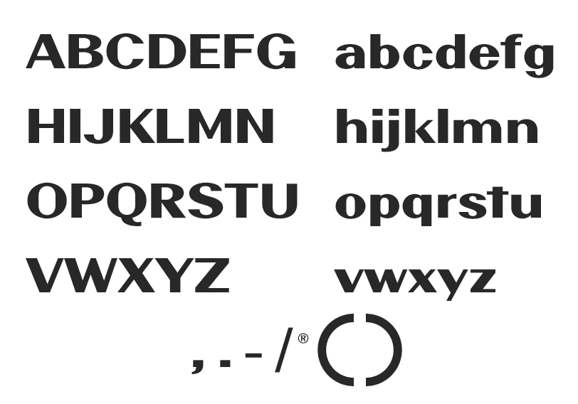
Today we want to talk about Nintendo Font. The font used by the Nintendo logo is known as the “Pretendo” typeface. It is a unique and thin-cornered font that contains over 361 special and thin-cornered characters, including alphabets, punctuation marks, numbers, etc. The font’s clean and modern design complements the overall design of the Nintendo logo and is commonly used in large projects and official documents.
The “Pretendo” font is a perfect fit for the Nintendo logo, as it complements the clean and modern design of the logo. The font is easy to read, making it ideal for use in large projects. If you’re looking to create a similar design, you can use online generators to generate a similar font.
In addition to being used in the Nintendo logo, the “Pretendo” font is also commonly used in a range of other documents, such as certificates, reports, and diplomas. The font’s clean and modern design makes it the perfect choice for any official document.

Nintendo Font Generator
Download
You can download the free version of this font from our site in zip format and use it in any software for any required projects.
About Nintendo Company and its Logo
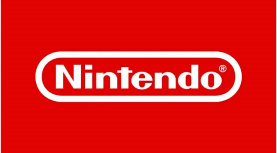
Nintendo is a leading Japanese manufacturer of video games, consoles, and other entertainment products. Founded in 1889, the company started as a maker of playing cards and children’s toys before entering the consumer electronics market in 1978. The Nintendo logo has undergone several changes over the years, but the most recognizable version features the word “Nintendo” in a rounded sans serif font with a small horizontal stroke at the “t”. The color of the logo has varied, with the most recent version being white with a red rectangle frame. The Nintendo brand is known for its action-packed games and innovative console designs, and its logo is a symbol of the company’s commitment to providing fresh and exciting experiences for gamers.
The Nintendo logo has undergone several changes throughout its history. In the early years, the logo featured Japanese characters that read “nin,” “ten,” and “do.” In the 1950s, the logo featured the English word “NINTENDO PLAYING CARD CO” and a pike symbol. In the 1960s, the logo featured the word “Nintendo” in calligraphic script with a small star above the “i.”
In 1975, the company introduced a black version of the “Nintendo” text logo, which was the only logo used until 1977. In 1977, the logo was placed in a rectangle with rounded edges, and in 1983, the logo was changed to red. In 2006, the logo was changed to gray, and in 2016, it was changed to white with a red rectangle frame.
Logo font and colors
The Nintendo logo features a personalized font with rounded sans-serif letters and a small horizontal stroke at the “t.” Throughout the years, the logo has been primarily featured in red and white but has also appeared in black, gray, and various other colors. The word “Nintendo” is based on three hieroglyphs that translate to “the temple of free hanafuda,” referencing the company’s first product, a type of playing card deck.
Alternatives of Nintendo Font
- Primetime Font.
- Couture Font.
- FF Mark Font.
- Comic sans.
To conclude,
Nintendo Font is a unique and thin-cornered typeface that is used in the Nintendo logo and other official documents. The font is called Pretendo. The font’s clean and modern design matches the Nintendo logo and is suitable for large projects. The font can be generated online using online generators. The “Pretendo” font is also a popular choice for certificates, reports, and diplomas, as it gives a professional and elegant look to any document.

I am part of the Free Fonts Vault team, dedicated to providing you with the best experience in finding free fonts for your needs. Our team works together to ensure that we offer well-researched information on free fonts or similar alternatives. If you have any queries, please do not hesitate to contact us through our Contact page. Note: We called ourselves “The A team”.


