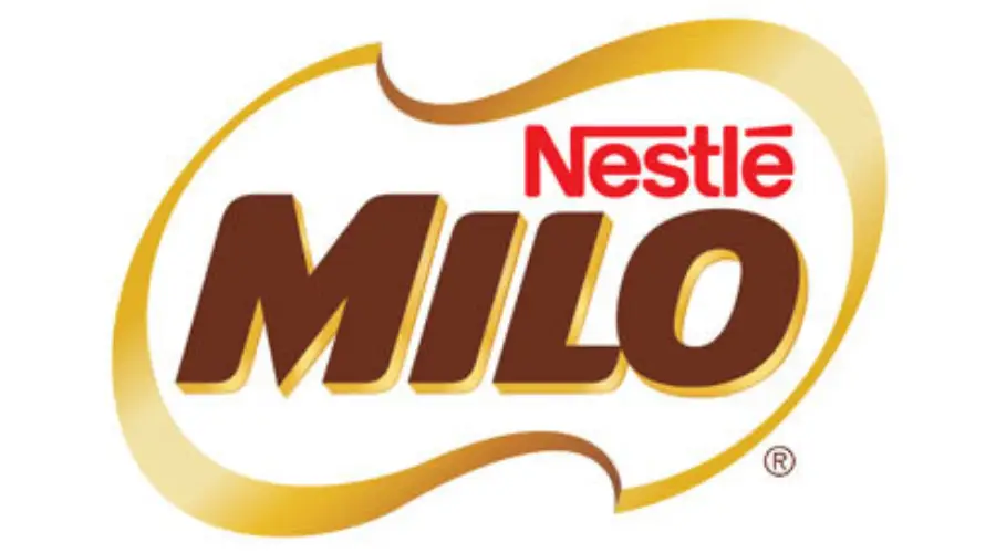
The Nestlé Milo Font is a distinctive typeface associated with the iconic chocolate malt drink, MILO, by Nestlé. Known for its energy-boosting and nutritious qualities, MILO has become a global favorite. The font used in its logo plays a crucial role in its branding, exuding a sporty, energetic, and modern vibe.
Nestle Milo Font

While Nestlé has not officially released the exact font used in the MILO logo, design experts have identified Hussar Gothic Oblique by Robert Jablonski as the closest match. This font captures the bold, dynamic, and slightly slanted style of the MILO logo, making it a popular choice for recreating its look.

Similar Fonts to Nestle Milo Font
If you’re looking for fonts with a similar aesthetic, here are some great alternatives:
- Hussar Gothic Oblique by Robert Jablonski – The most similar font to the MILO logo.
- Helvetica Pro Rounded Bold by Linotype – Offers a clean, rounded, and modern feel.
- Swiss 721 Bold Rounded by Bitstream – Shares a bold and sporty vibe.
These fonts are excellent for projects that aim to replicate the energetic and youthful spirit of the MILO brand.
Best Font Pairings for Nestle Milo Font
Poppins is the best font to pair with the Nestle Milo font style.
Here is why:
- Poppins matches the energy of Milo. Milo has a bold, sporty, and modern look. Poppins is also modern and clean, but simple enough to balance Milo’s strong style.
- Poppins is easy to read. You can use Poppins for body text, descriptions, or smaller details. It keeps everything clear while Milo stands out in headlines.
- They work well together. Milo is the star. Poppins supports it without competing for attention.
Second-best choice: Montserrat. It is similar to Poppins and also works well if you want a slightly different feel.
Simple rule: Use Milo (or Hussar Gothic Oblique) for titles and big text. Use Poppins for everything else.
Conclusion
The Nestlé Milo Font is a custom, proprietary typeface owned by Nestlé and not publicly available. The closest alternative is Hussar Gothic Oblique, a bold, slanted, and energetic font that captures Milo’s sporty character. For best design results, pair it with Poppins. Use Milo for headlines and Poppins for body text to create a balanced, modern, and highly readable look.
Thanks.
I am part of the Free Fonts Vault team, dedicated to providing you with the best experience in finding free fonts for your needs. Our team works together to ensure that we offer well-researched information on free fonts or similar alternatives. If you have any queries, please do not hesitate to contact us through our Contact page. Note: We called ourselves “The A team”.


