Tags
What font is used in the Keep On Truckin’ logo?
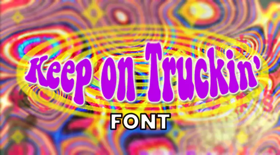
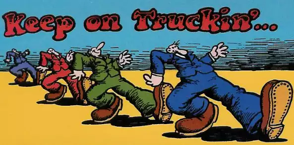
It is not specified which font was used in the original Keep On Truckin’ logo created by Robert Crumb in the early 1970s. The logo is a stylized image of a man in motion, rather than a font. However, the phrase “Keep On Truckin” is often associated with the Keep On Truckin FW font, which is a retro-style font designed by Brain Eaters Font Co. that is inspired by the counterculture movement of the 1960s and 1970s.
Keep on Truckin’ FW font is ideal for adding a nostalgic touch to your creative projects. The font features a comic, groovy, and bubble letter style and is known for its large, heavy textures and irregular serifs. These design elements give the font a resilient retro look that is perfect for scrapbooking, cardmaking, home decor, clothing and accessories, invitations, party decorations, and more.
Font Custom preview
Keep On Truckin Font Generator
Preview and download fonts
Keep on Truckin
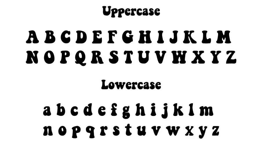
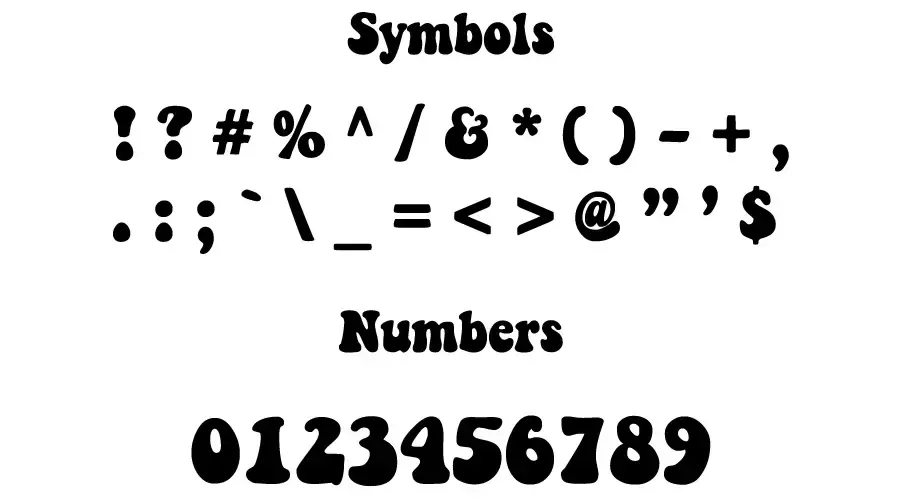
Font at a Glance
| Font Family Name | Keep on Truckin |
| Font Type | Fancy |
| Units per EM | 1000 |
| Designed by | B.O.Nelson |
| Designer URL | BrainEaters.com |
| Version | v 1.000 |
| Release date | 2003 |
| Glyph count | 128 |
| Character count | 127 |
| File type | TrueType |
| License | Free for personal uses |
| Copyright | 2003 B.O.Nelson |
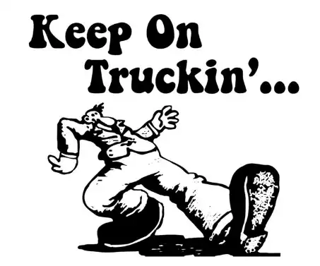
Where did the Keep On Trucking logo come from?
The Keep On Truckin logo features a man on the move, one arm extended and the other holding a cane or a stick. The logo was created by artist Robert Crumb in the early 1970s and was featured in his underground comic book, “Zap Comix.” The comic strip was a visual burlesque of the lyrics of the Blind Boy Fuller song “Truckin’ My Blues Away,” which featured an assortment of men drawn in Crumb’s distinctive style, strutting confidently across various landscapes.
The comic and its catchphrase, “Keep On Truckin,” quickly became popular among hippies and were much imitated and displayed during the hippie era. The phrase “Keep on Truckin” was also used on posters, patches, buttons, and bumper stickers and became a popular motivational message. The Keep On Truckin’ logo is made up of a variety of different colors, such as maroon, silver, black, and purple. The logo was also adopted by counterculture bands like the Grateful Dead and Phish, and it has become a symbol of the counterculture movement of the 1960s and 1970s.
What did “Keep on Truckin” mean?
“Keep on truckin'” is a phrase of encouragement that means to keep going or persisting with something. The origin of the phrase is uncertain, but it was first heard in the 1930s in jazz music. It gained popularity in the 1970s and became a popular catchphrase, particularly in the counterculture movement. The phrase may have also been influenced by the lyrics of the Grateful Dead song “Truckin,” which include the lyrics “Keep truckin’ and keep truckin’ on.” The phrase is often used to convey the idea of getting back up after being knocked down. The phrase is also associated with the cartoonist R. Crumb, who used it in his comic strip.
Thanks
I am part of the Free Fonts Vault team, dedicated to providing you with the best experience in finding free fonts for your needs. Our team works together to ensure that we offer well-researched information on free fonts or similar alternatives. If you have any queries, please do not hesitate to contact us through our Contact page. Note: We called ourselves “The A team”.


