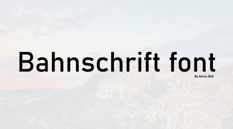
Bahnschrift font is Microsoft’s modern variable-font implementation of the classic DIN 1451 standard, designed by Aaron Bell of Saja Typeworks. Released in 2017, it’s a clean, technical sans-serif optimised for contemporary digital use.
Bahnschrift font

Bahnschrift
| OriginalBahnschrift 1
| OriginalBahnschrift 2
| OriginalBahnschrift 3
| OriginalBahnschrift 4
| OriginalBahnschrift 5
| OriginalBahnschrift 6
| OriginalBahnschrift 7
| OriginalBahnschrift 8
| OriginalBahnschrift 9
| OriginalBahnschrift 10
| OriginalBahnschrift 11
| OriginalBahnschrift 12
| OriginalBahnschrift 13
| OriginalBahnschrift 14
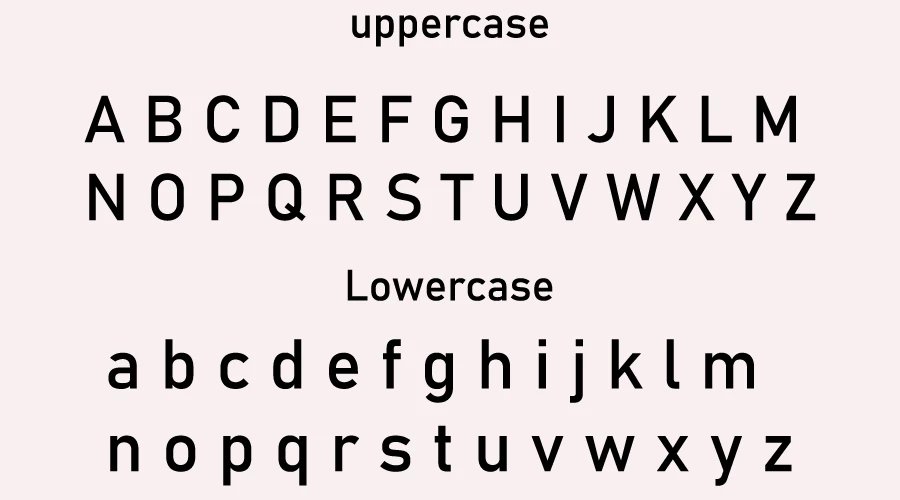
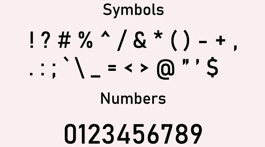
| OriginalCore Characteristics
Variable Font Technology
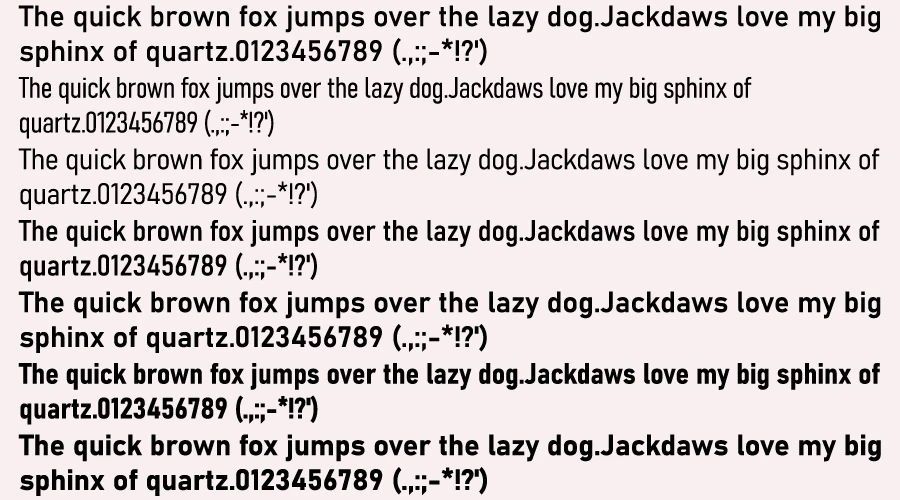
- Microsoft’s first variable font with continuous control over weight and width axes
- Five preset weights (Light to Bold) and three widths (Condensed to Regular) in a single file
- Enables infinite custom variations without increasing file size
- Fully supported in modern applications; some older software may only show “Regular” style
Design Heritage
- Based on DIN 1451, the German standard for traffic signs and technical drawings since 1931
- Mechanically/engineered appearance with high legibility and simplicity
- No italic styles, purely upright design (for italics, consider the related Grandview font)
Technical Features
Duplexing
- Revolutionary feature where character width remains identical across all weights
- Text doesn’t reflow when changing weight, perfect for tabular data and UI design
- Each letter occupies the same space, whether Light or Bold
Language & Rendering Support
- Over 200 Latin languages, including Vietnamese
- Greek and Cyrillic scripts with localized forms
- Manual TrueType hinting for sharp rendering on low-resolution screens
Availability & Licensing
- Included free with Windows 10 Fall Creators Update (2017) and later versions
- Licensed for personal and commercial use through Microsoft
- Also available as an Office Cloud Font for Microsoft 365 subscribers
Known Limitations
- PDF Export Issues: Adobe PDF doesn’t fully support OpenType variable fonts. When saving from Office, styles may revert to Regular. Workaround: Use Print to PDF instead of Save As PDF
- Legacy Software: Some older design applications may not recognize variable font axes, showing only the default style
Common Uses
- User interface design and software
- Technical documentation and data displays
- Corporate branding and signage
- Digital products requiring high legibility at small sizes
Bahnschrift successfully merges mid-century German engineering standards with 21st-century font technology, making it both highly functional and remarkably flexible.
Font View
Conclusion
Bahnschrift is Microsoft’s versatile variable-font interpretation of the classic DIN 1451 standard, offering designers a single, compact file with infinite weight and width variations, superior screen legibility, and the rare advantage of identical character spacing across all weights, making it an exceptional choice for modern interface design, technical documentation, and data visualization.

I am part of the Free Fonts Vault team, dedicated to providing you with the best experience in finding free fonts for your needs. Our team works together to ensure that we offer well-researched information on free fonts or similar alternatives. If you have any queries, please do not hesitate to contact us through our Contact page. Note: We called ourselves “The A team”.


