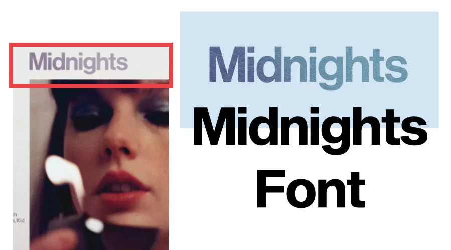
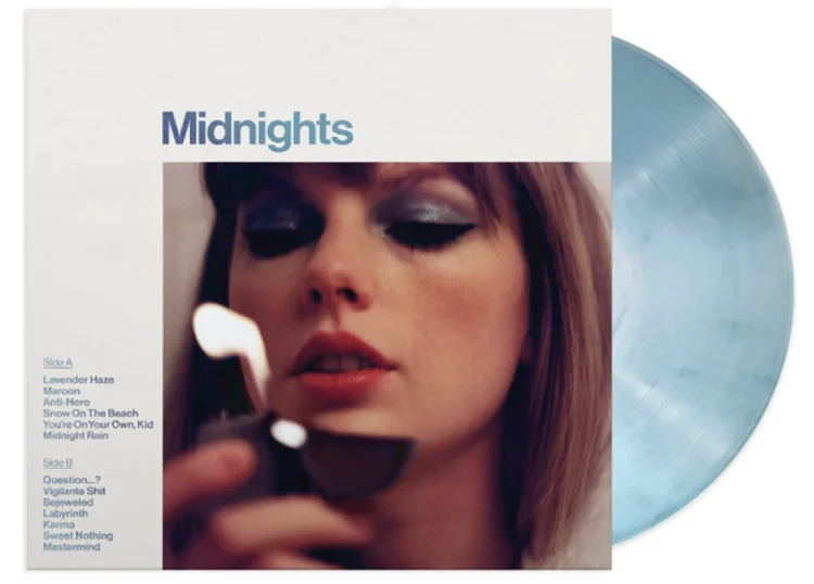
The choice of font is one of the most important aspects of creating an album for artists like Taylor Swift. Swift’s “Midnights” album is shrouded in mystery, but its font plays an important role in capturing the essence of her music and engaging audiences.
Taylor Swift Midnights font remains a mystery, but several similar fonts have caught the attention of fans and designers.
Loading Fonts…
Taylor Swift Midnights font Generator
Preview and download fonts
Grotesk-Medium
| Similar
0
Similar
Access:
site-served download; project license is separate. Recorded terms:
Similar
Grotesk-Medium
Neue-Haas-Display-Mediu
| Replica
0
Personal use only
Access:
site-served download; project license is separate. Recorded terms:
Commercial Type Font Software End User License Agreement PLEASE READ THIS DOCUMENT CAREFULLY and we recommend that you keep a copy for further reference. This End User License Agreement (the "Agreement" "EULA," "License," "Agreement" or "License Agreement") is a legal agreement between you and Schwartzco, Inc., d/b/a Commercial Type, a/d/b/a St. Bride Type Foundry (collectively, "Commercial Type") and becomes a binding contract between you and Schwartzco. This Agreement governs the terms of use the Font Software and the design of the Fonts embodied therein (collectively, "Font Software"), together with any media, printed materials, electronic documentation, updates, add-ons, artwork, web services and any other material that may be associated with the product now or in the future. This Agreement becomes effective (a) when you "ACCEPT LICENSE AGREEMENT," or (b) if you are acquire and accept the Font Software on a Compact Disc or Digital Video Disk (CD, DVD), or (c) when you open the compressed electronic file in which the Font Software is contained. If you do not wish to enter into this Agreement, do not purchase, access, download and/or install or otherwise use the Font Software. 1. Upon payment in full, Commercial Type will grant you a non-exclusive terminable License to the Font Software that accompanies this EULA. Use of the Font Software is limited to Personal or Internal Business Use only. For the purposes of this Agreement, "Font Software" shall be defined as the design of the Fonts together with the Font Software which, when used generates the typeface, typographic designs and, if applicable, ornaments or other designs. Personal or Internal Business Use shall mean Use of the Font Software for your customary personal or internal business purposes and, except as may otherwise permitted herein, shall not mean or include the commercial distribution or use of Font Software, the design of the fonts or artwork embodied therein or any component thereof for any commercial use or in any Commercial Product for sale whatsoever. For the purposes of this Agreement, prohibited commercial uses include, by way of example not limitation, T-shirts, third-party software, electronic devices, mugs, animation, etc. and as may be further noted below. If you are unsure whether your use is not permitted, contact Commercial Type. Your failure to contact to seek permission or the lack of a specific prohibition in this Agreement shall not be interpreted or deemed a waiver or permissible use of any kind. You hereby agree that the Font Software shall further comprise all bitmap representations of typeface and typographic designs and ornaments created by or derived from the Font Software. The Font Software shall be deemed to include any upgrades, updates, related files, permitted modifications, if any, permitted copies, and related documentation. 2. If you are a design consultancy, advertising agency or purchasing this license for use by or on behalf of such an entity, the ultimate end user should also purchase a license appropriate for their intended use of the Font Software, if their use of the Font Software is likely to involve uses not permitted under this Agreement. The license granted herein for personal use does not extend to uses by temporary employees or independent contractors using the Font Software as their use may relate to providing professional services or for other professional uses. Under such circumstances an employer and/or the ultimate end user are also required to purchase a license appropriate for their usage. 3. For the purposes of this Agreement, "Commercial Product" shall also mean, among other things, a user editable electronic document created by Use of the Font Software which is offered for distribution to the general public (or to some subset of the general public), in Flash type software distributed or exhibited, in gaming products or software where the extraction of the Font Software or the designs embodied therein may be extracted; or use on goods for sale as a commercial product in exchange for a separate fee or other consideration. However, a document distributed in connection with a commercial transaction in which the consideration is unrelated to such a document (for example, printed advertising, a business letter or a receipt for purchase of tangible goods such as clothing), or as other design materials distributed incidental to the purchase of goods or services, shall not be considered a Commercial Product. 4. a) Except as may be prohibited herein, you are permitted to electronically distribute a ?Personal or Internal Business Use? document (that is, a document other than a Commercial Product as defined above) (i) that is in a static graphic image (for example, a ?gif?) or in an embedded electronic document, and (ii) which is distributed in a format that permits only the viewing and printing (and not the editing, altering, enhancing, or modifying) of such static graphic image or embedded document. Personal or Internal Business Use shall not include any Use of the Font Software by persons that are not members of your immediate household, your authorized employees, or your authorized agents. All such household members, employees and agents shall be notified by you as to the terms and conditions of the Agreement and shall agree to be bound by it prior to use of the Font Software. b) Use of the Font Software in sIFR (Scalable Inman Font Replacement) is permitted. However, the use of Cuf?n or @font-face or other forms of web embedding or web font replacement technologies, (?Font Replacement Technologies?) other than pdf as otherwise expressly permitted herein, each require the purchase of a license upgrade. 5. Commercial Type, its successors and assigns, expressly retain all right and title in and to the Font Software together with the design of the Font embodied therein together with any trademarks used in connection therewith. Except as may be otherwise expressly permitted herein, you agree not to copy the Font Software or create derivative works based upon the design of the Font or the Font Software. You hereby agree that the design of the Font and the Font Software are the exclusive property of Commercial Type and that the unauthorized use of the design of the Font or the Font Software is an infringement of Commercial Type's exclusive rights and causing significant monetary harm. All rights not expressly granted herein are reserved to Commercial Type. Commercial Type's rights and remedies in the event of an infringement shall be cumulative in nature. 6. Except as is prohibited herein, you may install and Use the Font Software on a single file server for Use on a single local area network ("LAN") only when the Use of such Font Software is expressly for and limited to the number of total users disclosed and licensed under this Agreement, i.e., the total number of users who could use the Font Software, not the total number of users who might have access to the Font Software at any one time. 7. Except as may be otherwise expressly permitted herein, you may not alter or copy the Font Software or the designs embodied therein in any manner whatsoever. Reformatting the Font Software into other formats for use in other operating systems is expressly prohibited. Upon payment of an additional fee and a separate written agreement Commercial Type may, if so agreed, provide the Font Software in alternate and/or additional font formats, contact Commercial Type for a quotation. Altering or amending the embedding bits characteristics of the Font Software is expressly prohibited. The Font Software may not be used to create or distribute any electronic document in which the Font Software or any part thereof, is embedded in a manner or format that permits editing, alterations, enhancements, or modifications by the recipient of such document. You may not knowingly transmit any electronic document or the Font Software to any party that intends or is likely to "hack," edit, alter, enhance, or otherwise modify the Font Software or remove the Font Software from any document. 8. You may make one (1) back-up copy of Font Softw
Neue-Haas-Display-Mediu
Sequel-Sans-Semi-Bold-Disp
| Replica
0
Replica
Access:
site-served download; project license is separate. Recorded terms:
Replica
Sequel-Sans-Semi-Bold-Disp
💡
Type your own text above to preview fonts in real-time. Adjust Size & Color to find your perfect match.
/
Font Details
Share
Export Preview
Style Effect
Original▼
Original
Outline
Shadow
Retro 3D
Neon Glow
Fire
Metallic
Glitch
Rainbow
Deep 3D
Format
PNG▼
PNG
WebP
JPG
AVIF
Data URL
Exploring the Similar Fonts
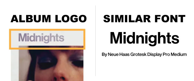
Fonts similar to Taylor Swift’s “Midnights” font include Sequel Sans Display Semi, Neue Haas Grotesk Display Pro Medium, Europa Grotesk SH Medium, and Europa Grotesk No 2 SH Bold. These fonts share an identical style and design, which evokes the sophistication and modernity of the “Midnights” album. These fonts are geometric in nature, with sharp angles and clean lines. In all four fonts, the “M” is very similar.
Let’s know some details about these fonts and also look at the logo versus font image for similarity checks.
Sequel Sans Display Semi
Sequel Sans Display Semi, with its sleek and clean lines, captures the essence of modernity and elegance, making it a suitable alternative to the elusive “Taylor Swift Midnights font.” Its refined curves and balanced proportions make it an excellent choice for conveying the sophisticated atmosphere that “Midnights” Taylor Swift font encapsulates. Try this font on our generator.
Neue Haas Grotesk Display Pro Medium, another font with similarities to the “Taylor Swift Midnights font,” offers a contemporary and bold aesthetic. Its strong and confident letterforms command attention, perfectly complementing the artistic direction of Taylor Swift’s “Midnights” font.
Grotesk Medium share a similar tone to the elusive “Taylor Swift Midnights font.” With their clean and geometric shapes, these fonts evoke a sense of modernity and timelessness, aligning with the themes of Taylor Swift’s “Midnights” font.
Choosing the right font for an album is crucial as it sets the tone and enhances the visual experience. The “Taylor Swift Midnights font” aligns with Taylor Swift’s artistic vision, creating a cohesive and captivating aesthetic for the branding and promotional materials of her “Midnights” Taylor Swift font album. The font choice reflects the artist’s attention to detail and her commitment to creating a holistic and immersive experience for her fans.
Conclusion
Conclusion: Although the exact “Taylor Swift Midnights font” used for Taylor Swift’s album remains a well-kept secret, similar fonts like Sequel Sans Display Semi, Neue Haas Grotesk Display Pro Medium, Europa Grotesk SH Medium, and Europa Grotesk No 2 SH Bold capture the essence and style of the “Midnights Taylor Swift font.” The font choice plays a significant role in conveying the album’s mood and enhancing the overall visual experience, showcasing Taylor Swift’s dedication to creating a cohesive and captivating artistic journey for her fans.
I am part of the Free Fonts Vault team, dedicated to providing you with the best experience in finding free fonts for your needs. Our team works together to ensure that we offer well-researched information on free fonts or similar alternatives. If you have any queries, please do not hesitate to contact us through our Contact page. Note: We called ourselves “The A team”.