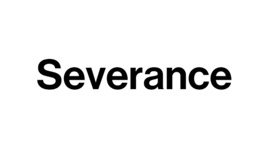
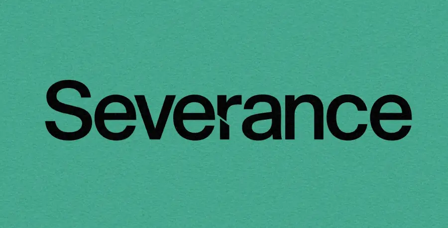
“Severance Font” is the nickname for the custom typeface used in the Apple TV+ show Severance, specifically in the title card, all Lumon Industries branding, signage, documents, and even the computers inside the severed floor.
Severance Font
Neue Haas Grotesk Display 65 Medium
| SimilarDinnext Ltpro Bold
| OriginalIt is not a standard font you can buy under that name. It is a heavily customized version of DIN Next Pro Bold, specifically a heavily customized cut with altered letterforms (most notably the “R”), modified by the show’s graphic designers (most notably by John Clifford and the team at GrandArmy).

Similar Fonts to Severance Font
Neue Haas Grotesk Display Pro 65 Medium by Linotype – A precise match to the font used in the Severance logo.
Best Font Pairings for Severance Font
Optima Font Family: This is the best match. The TV show Severance actually uses Optima for its Compliance Handbook. It creates a clean, professional look with a touch of warmth.
Inter Font: Perfect for digital screens and computer interfaces. It has the same modern, sterile feel that you see on the computers in the Lumon office.
Conclusion
The Severance Font is not a single typeface but a collection of commercial fonts used in the TV series. Most free online versions are unofficial imitations similar to Helvetica. For authentic design, purchase the real fonts or pair a clean, Helvetica-style sans-serif with Optima for the best match.
I am part of the Free Fonts Vault team, dedicated to providing you with the best experience in finding free fonts for your needs. Our team works together to ensure that we offer well-researched information on free fonts or similar alternatives. If you have any queries, please do not hesitate to contact us through our Contact page. Note: We called ourselves “The A team”.


