Okami isn’t just a game – it’s a visual masterpiece inspired by Japanese ink paintings! And the fonts? They’re a huge part of what makes it look so unique. The fonts in its logos and posters mix custom brush styles with clean, modern letters, all picked to match the game’s magical, artistic vibe. Knowing about these fonts helps fans and designers appreciate the awesome creative choices behind Okami’s stunning look!
Okami's Fonts

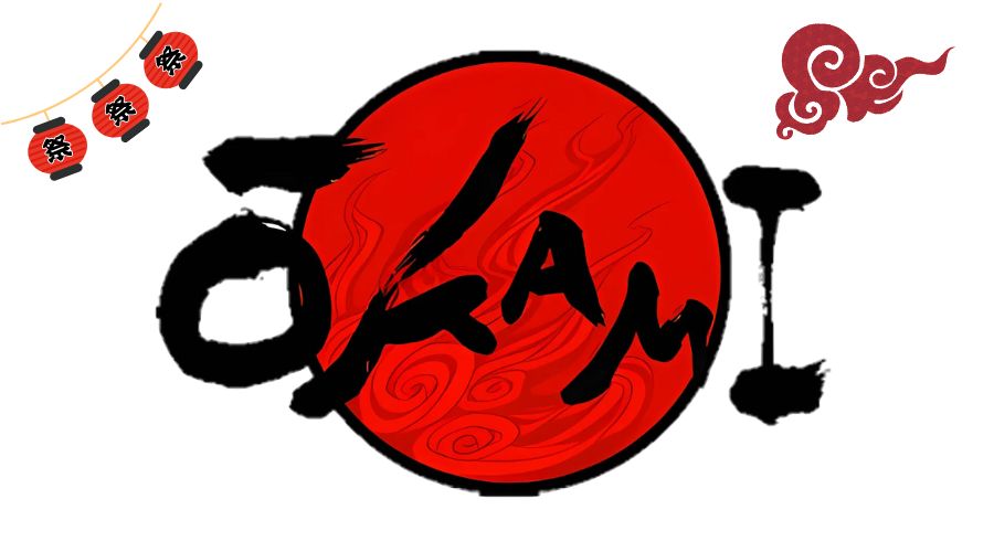
Let’s dive into the cool fonts used in Okami! The main game logo uses a super special brush-style font (often called Okami Brush Script). It feels like real brush strokes flowing across the page, perfectly capturing that ancient, mystical Japanese ink painting vibe. It’s elegant and artistic, setting the tone for the whole adventure!
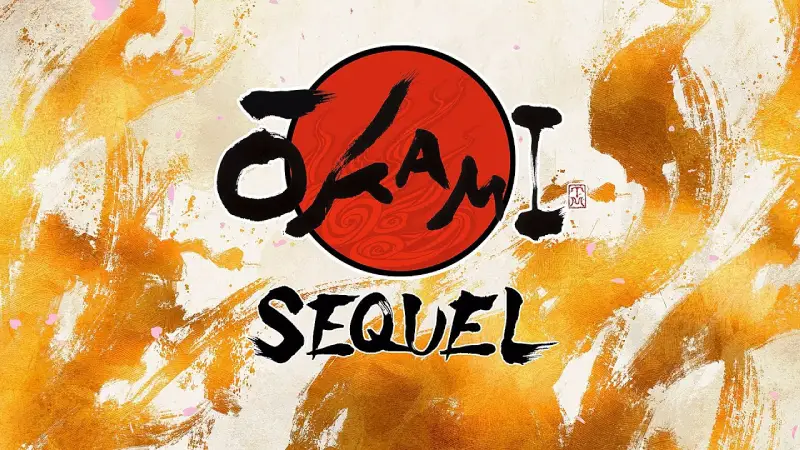
Now, what about the Okami sequel teaser? That uses a “swish” font – super dynamic and flowing, like motion caught in ink! It keeps that traditional brush feel but feels fresh and modern. Sadly, there’s no exact free download for this specific swish style, but it totally matches Okami’s artistic spirit!
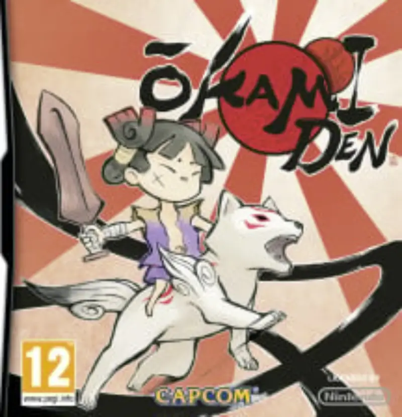
Here’s a neat detail: The “Capcom” subtitle under the Okami logo? That uses a totally different font called Korinth Serial Bold. It’s clean, bold, and modern – like a strong, steady base supporting the wild brush art above. This contrast makes the whole design pop!
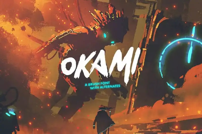
So, what if you want a font like Okami’s iconic brush style for your own projects? While the exact game font isn’t free, you can find the “Okami Brush Script Font” online (like on designshack.net). It’s a great match, perfect for fan art or designs needing that authentic Japanese brush vibe!
So here’s the deal: Okami’s fonts are a perfect team! The main logo uses a custom brush script full of artistic flair, the sequel teaser rocks a dynamic “swish” style (no free version, sadly!), and the Capcom subtitle uses the bold, clean Korinth Serial Bold for balance. Together, they create a look that’s both ancient and modern, totally unique to Okami’s world!


