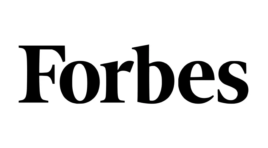
Short answer: no Forbes source reviewed for this guide names a retail typeface for the current masthead. Publico Headline Bold is a close visual match, not a confirmed “Forbes font”; Christel Display Bold is a broader serif alternative.
Forbes Font Generator
Preview and download fonts
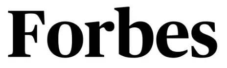
Publico Headline Bold | Close visual match
Christel Display Bold | General alternative
Which Forbes masthead is being compared?
This page compares the black Forbes wordmark in the preview above. Forbes’ own 100-year masthead retrospective shows that the magazine has used several title treatments. It does not credit Publico, Christel, or another retail font as the current master logo. Historical mastheads and regional editions should therefore not be treated as one unchanged typeface.
Why Publico looks close
The preview and Publico share a compact editorial rhythm, strong thick-to-thin contrast, sharp serifs, and rounded lowercase counters. The shapes of the F, r, and terminal of the s still need logo-specific adjustments. Commercial Type describes Publico Headline as a publication face with a sturdy, narrow skeleton and a balance of sharp serifs and softer terminals; visual similarity does not turn it into an official Forbes design credit.
Font sources and licensing
| Preview file | Role | What the license evidence says |
|---|---|---|
Publico-Headline-Bold.ttf | Close visual match | Commercial Type credits Publico Headline to Paul Barnes and Christian Schwartz, with collaborators. The preview file says it is licensed exclusively to Commercial Type and “not to be used for anything other than web font use.” Obtain the font and the license that fits your project from Commercial Type. |
Christel-Display-Bold.ttf | General serif alternative | The binary records Sascha Timplan copyright and “All rights reserved,” with no embedded license. Use its licensed product route; a retail license does not normally permit republishing the raw font file. |
A preview or download button is not a license. These raw font files should not be shared here unless their providers give written redistribution permission; for design work, use the licensed sources above.
Compare magazine and serif lettering
For another high-contrast masthead comparison, read the Vogue typography guide or the Cosmopolitan logo guide. You can test a short title in the font generator and browse more editorial choices in the serif-font hub.
Forbes and its masthead are the property of their respective rights holders. This independent comparison does not imply endorsement.
I am part of the Free Fonts Vault team, dedicated to providing you with the best experience in finding free fonts for your needs. Our team works together to ensure that we offer well-researched information on free fonts or similar alternatives. If you have any queries, please do not hesitate to contact us through our Contact page. Note: We called ourselves “The A team”.



