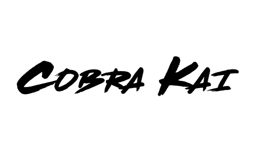
The Cobra Kai font is a bold, brush-style typeface that captures the gritty and rebellious vibe of the popular American martial arts comedy-drama television series, Cobra Kai. This font is prominently used in the show’s logo and promotional materials, giving it a distinctive and edgy look. While there isn’t an official font released specifically for Cobra Kai, the design closely resembles the Dead Stock font by Canadian foundry BLKBK. This hand-brushed, 1980s pulp signage style is often used as a replica for the logo.
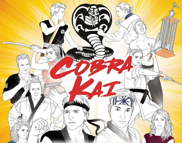
Cobra Kai is a TV show that picks up 30 years after The Karate Kid movie(1984). It follows the same two rivals, Daniel and Johnny, now grown-ups, running rival karate schools.
Three lifelong Karate Kid fans (Josh, Jon, Hayden) asked Sony, “Can we tell the story from Johnny’s side?” Sony said yes and started the show in 2016 to pull people onto YouTube’s new paid service. The first season premiered in May 2018 to strong reviews, but after two seasons, YouTube stopped making scripted series. Sony then sold the show to Netflix in 2020, where it found a much bigger audience and continued for four more seasons.
Cobra Kai Font
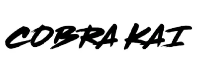
Dead Stock
| ReplicaPeanut
| SimilarFutura Extra Black Condensed Italic
| OriginalCOBRA KAI – MULTI-MEDIA LIST
TV show – 6 seasons, finished early 2025.
Movies – follows Karate Kid 1-3; new movie “Karate Kid: Legends” (May 2025) ties in the 2010 remake.
Music – 80s rock songs plus original scores (on Spotify, Apple).
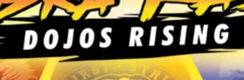
Games – “Cobra Kai: The Karate Kid Saga Continues” (2020) and “Cobra Kai 2: Dojos Rising” (2022).

Comic – a short series that retells the first movie from Johnny’s view.
Similar Fonts to Cobra Kai
If you’re looking to recreate the Cobra Kai style or find something similar, here are the best alternatives:
Dead Stock by BLKBK – This is the closest replica font used in the Cobra Kai logo. It features a rough, hand-brushed style that perfectly matches the show’s aesthetic.
Peanut by fgstudios – Another great alternative, this font offers a similar brush script style with a slightly softer touch.
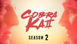
The subtitle “DOJO RISING” in Cobra Kai 2 uses a thick, slanted sans-serif that looks just like Futura Extra Black Condensed Italic.
If you want the same style, grab that font and type your own text, no extra tweaks needed.
These fonts are ideal for designs that require a bold, dynamic, and slightly rugged look, much like the Cobra Kai branding.
I am part of the Free Fonts Vault team, dedicated to providing you with the best experience in finding free fonts for your needs. Our team works together to ensure that we offer well-researched information on free fonts or similar alternatives. If you have any queries, please do not hesitate to contact us through our Contact page. Note: We called ourselves “The A team”.


