Quick answer: Charli XCX’s Brat cover is based on Arial lettering that was deliberately stretched, softly blurred, set in lowercase, and placed off-centre. Arial Narrow is the most practical starting point in this generator; it is a close reconstruction aid, not a separate official “Brat” typeface.
The most important part of the look is the treatment, not simply the font name. The compressed proportions, low-resolution softness, black text, acidic green field, and awkward placement work together. A clean Arial setting without those decisions will not look like the album artwork.
Preview the Brat font style
Type a short lowercase word in the preview below. Start with Arial Narrow Regular, then compare the other Arial cuts. The additional fonts are visual alternatives and should not be described as fonts officially commissioned for the album.
Brat Font Generator
Preview and download fonts
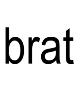
Arial-Narrow-Regular | Practical reconstruction shortcut
Arial | Designer-confirmed base family
What font is used on the Brat album cover?
Designer Brent David Freaney explained that the base of the artwork is Arial and that the team stretched it to give the otherwise ordinary type a distinct personality. That direct design-process account is stronger evidence than trying to identify a perfect, untouched font from a screenshot.
Arial Narrow is useful because its naturally compressed construction gets close to the cover quickly. The final artwork is still customized: proportions, raster softness, spacing, scale, and placement differ from a normal Arial Narrow setting. Treat the generator as a way to build a similar typographic composition, not as a source for the official album master.
Why the evidence points to Arial, not a separate Brat font
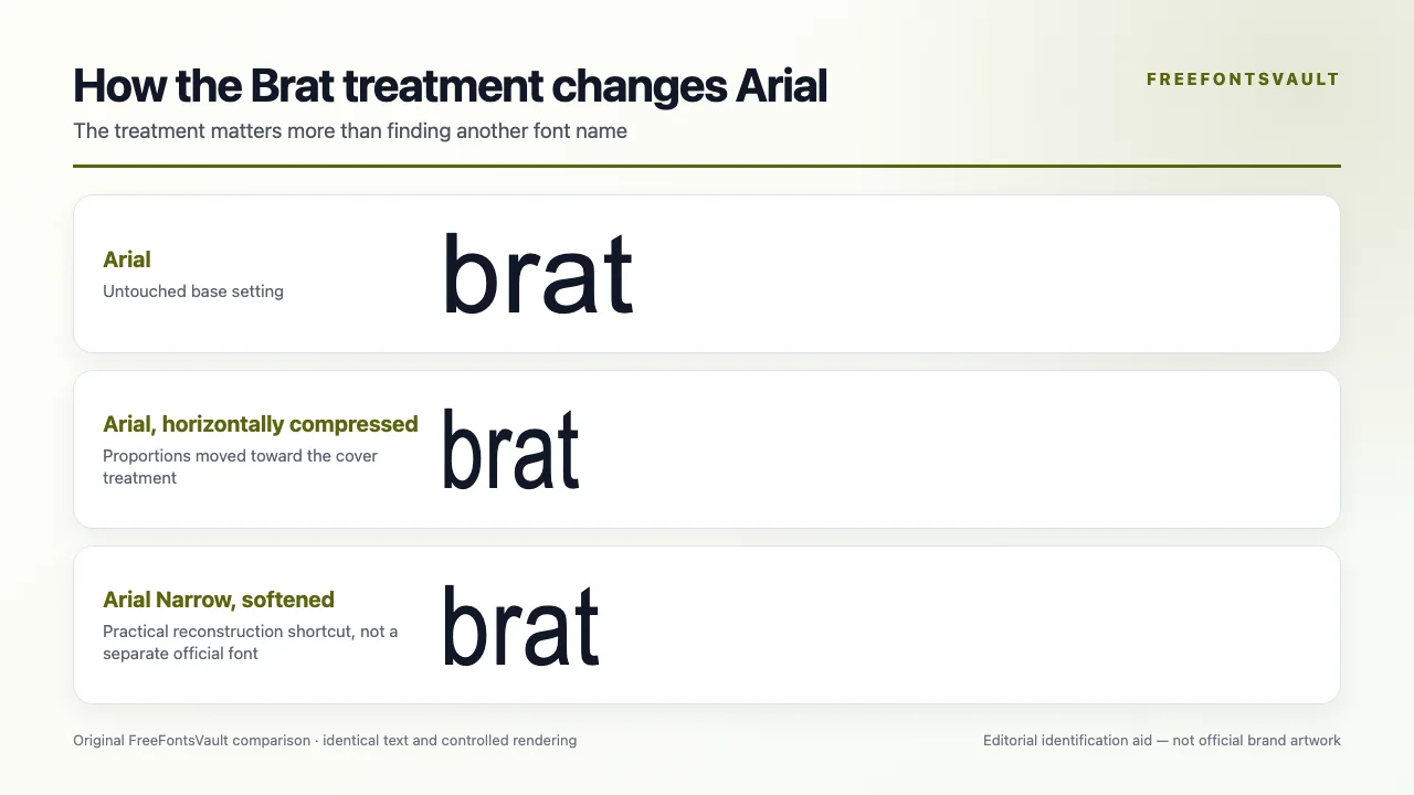
The strongest evidence comes from the artwork’s designer rather than visual guessing. Brent David Freaney described Arial as the base, then identified horizontal stretching, deliberately awkward placement, and enlargement from a very small raster image as the decisions that gave the cover its personality. Arial Narrow is a convenient reconstruction shortcut, not a separately confirmed official font.
| State | What changes | Evidence value |
|---|---|---|
| Arial, untouched | Normal width and clean rendering | Designer-confirmed base family |
| Arial, compressed | Horizontal proportions become more awkward | Reconstruction of the documented treatment |
| Arial Narrow, softened | Compressed starting point plus raster softness | Practical shortcut, not a production credit |
Open the stored Arial record and Arial Narrow record. Download availability on FreeFontsVault does not replace Monotype’s licence for redistribution, webfont, app, merchandise, or template use.
Arial Narrow Regular
The closest ready-to-type base in this preview. Use lowercase text and keep the wording short. Stretching or compressing a font can distort letterforms, but that deliberately awkward distortion is part of this particular art direction.
Arial Regular
A useful alternative when your design software lets you adjust horizontal scale. Start with Arial, reduce the width, soften the raster edges slightly, and compare the result against the reference rather than relying on the font name alone.
How to make a Brat-style text image
- Enter a short word in lowercase; the original cover uses “brat,” not title case.
- Choose Arial Narrow Regular or test Arial with a compressed horizontal scale.
- Use black text on a vivid yellow-green background and keep the contrast flat.
- Add a small amount of blur or export at low resolution and scale the image back up.
- Place the word slightly awkwardly rather than perfectly centring every optical edge.
For an original design, change the color, placement, wording, and treatment instead of copying the full album composition. A font license does not grant permission to reproduce an album cover or artist branding.
Continue with FreeFontsVault tools
Build a finished PNG, WebP, or SVG in the Font Generator & Logo Text Studio, compare the alternatives side by side in Compare Fonts, and inspect a downloaded file’s name tables, glyph coverage, and embedding flags with the Font License & Health Checker.
Related font guides
- Arial Font — compare the wider family and available styles
- Gossip Girl Font — explore another thin, extended logo treatment
- Gatorade Font — compare a heavily customized brand wordmark
License and usage notes
Arial and Arial Narrow are proprietary Monotype designs distributed through licensed products. Having a system copy may allow normal use under that product’s terms, but it does not automatically allow you to redistribute the font file or host it as a webfont.
The Brat name, cover artwork, and associated visual identity are separate intellectual property. Check both the typeface license and the intended use of the finished artwork, especially for merchandise, advertising, templates, or client branding.
Sources checked
- Designer interview summary quoting Brent David Freaney on the Arial base and stretched treatment
- Microsoft Typography: Arial Narrow family and ownership details
Frequently asked questions
The design is based on Arial lettering that was stretched and treated. Arial Narrow is a convenient close starting point, but the cover is not simply an untouched font setting.
The familiar cover uses black lowercase lettering on a vivid yellow-green background. Color can vary across official campaign graphics, so match the specific reference you are studying.
The designers changed the proportions, scale, placement, and raster softness. Those production choices are responsible for much of the recognizable look.
Commercial use depends on the license attached to your copy and the way it will be deployed. A desktop license, webfont license, app license, and font-file redistribution are different permissions.
Changing the words does not automatically remove album-art or trademark concerns. Create a more original composition and obtain legal advice for commercial merchandise or brand use.
I am part of the Free Fonts Vault team, dedicated to providing you with the best experience in finding free fonts for your needs. Our team works together to ensure that we offer well-researched information on free fonts or similar alternatives. If you have any queries, please do not hesitate to contact us through our Contact page. Note: We called ourselves “The A team”.



