Quick answer: Charlie Don’t Surf by Juha Korhonen (junkohanhero) is the closest widely identified match for The Boys title lettering. The show’s logo is slightly modified, so the font should be described as a close source or alternative—not as an official downloadable Amazon typeface.
Its heavy uppercase letters, tight spacing, worn edges, and small interior damage create the same aggressive, anti-polished tone. The finished series mark adds its own arrangement and distressing, including the angled “THE” element and campaign-specific textures.
Preview The Boys font style
Enter a short uppercase phrase in Charlie Don’t Surf. First judge the base letter shapes, then add texture or color; heavy effects can hide whether the typeface is actually a good match.
The Boys Font Generator
Preview and download fonts
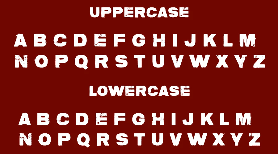
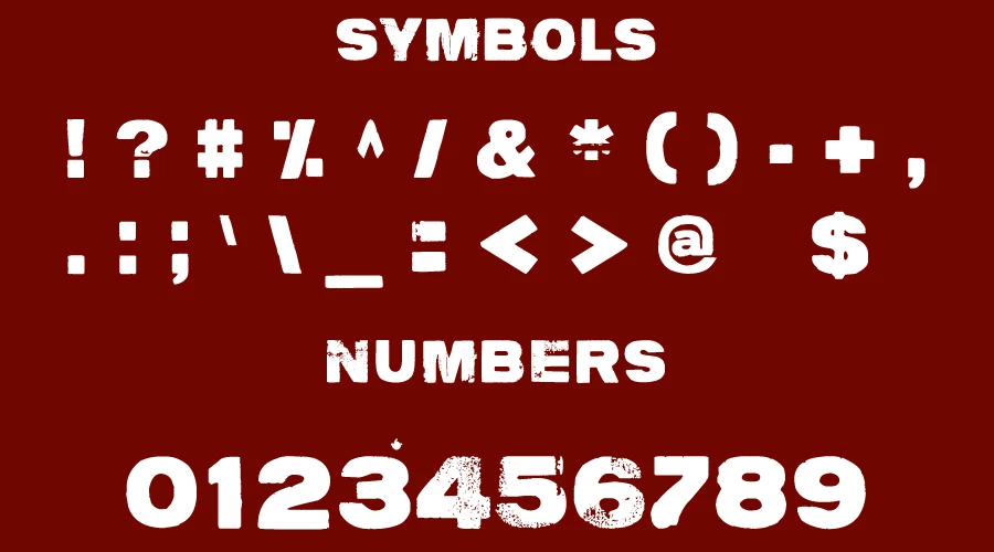
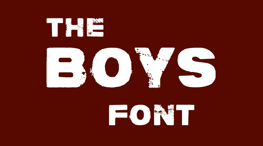
charlie dont surf | Free for personal use
What font is closest to The Boys logo?
A long-running DaFont identification thread matches the title to Charlie Don’t Surf and notes that the logo version is slightly modified. Prime Video’s official page provides the current title-art reference but does not publish a font credit or downloadable type family.
The page previously stated that Charlie Don’t Surf was simply “used in the logo” as a confirmed fact. The revised wording separates a strong visual identification from an official production claim. That distinction protects credibility while still giving designers a useful answer.
Charlie Don’t Surf
The closest match for the cracked uppercase construction and compact word shape. Use it at display sizes; the distressed details are not suitable for long body text.
Clean sans-serif pairings
Use a neutral sans serif for captions, navigation, and paragraphs. Keeping the distressed face only for titles preserves contrast and accessibility.
How to recreate The Boys-style title
- Enter a short phrase in uppercase and use the regular Charlie Don’t Surf style.
- Tighten spacing carefully while keeping counters and damaged edges visible.
- Use black, white, or saturated red based on the poster reference.
- Add distress, splatter, or slight misalignment sparingly; the font already contains texture.
- Export large enough to preserve the small holes and abrasions inside the letters.
For readable designs, pair the title with a plain sans-serif body face. This also prevents the page or poster from looking like a single dense texture.
Related font guides
- Invincible Font — compare a heavy animated-superhero title
- Superman Font — explore classic superhero display lettering
- Marvel Font — compare a clean, compact comic wordmark
License and usage notes
Copies of the designer’s readme circulated with Charlie Don’t Surf describe it as free for personal use and require a separate commercial license. Confirm the current terms with the original designer before paid client work, products, or advertising.
The Boys name, logo, characters, and official artwork are separate Amazon/Sony intellectual property. A font license does not permit confusingly similar merchandise or an official-looking series logo.
Sources checked
- Prime Video: official The Boys series page and current title artwork
- DaFont identification discussion noting Charlie Don’t Surf and logo modifications
Frequently asked questions
Charlie Don’t Surf by Juha Korhonen is the closest widely identified match. The official logo modifies the base lettering.
No official production source we found releases it that way. Treat it as a close visual match.
The circulated designer terms describe personal use as free and require separate commercial permission. Verify the current original license.
The title artwork changes spacing, arrangement, distressing, and the placement of the smaller word “THE.”
Use a clean sans serif for paragraphs and interface text so the distressed display face remains legible and impactful.
I am part of the Free Fonts Vault team, dedicated to providing you with the best experience in finding free fonts for your needs. Our team works together to ensure that we offer well-researched information on free fonts or similar alternatives. If you have any queries, please do not hesitate to contact us through our Contact page. Note: We called ourselves “The A team”.



