The Supreme brand was founded by James Jebbia in 1994 in New York City. It started as a small skateboard shop in downtown Manhattan but has since grown into a global phenomenon, known for its distinctive box logo and limited edition drops.
In this article, we will learn about the Supreme logo, what fonts it uses, and a bit more. So, let’s dive in.
What is the Supreme font?
The Supreme logo features a custom-designed font often referred to as the Supreme font. Due to the popularity of the Supreme brand, people are searching for the Supreme font, but the actual name of the font is different.
The Supreme logo font is a modified version of the Futura Heavy Oblique font.
It is a subfamily of the Future font. Paul Renner designed the font in the 1920s as a geometric sans-serif typeface.
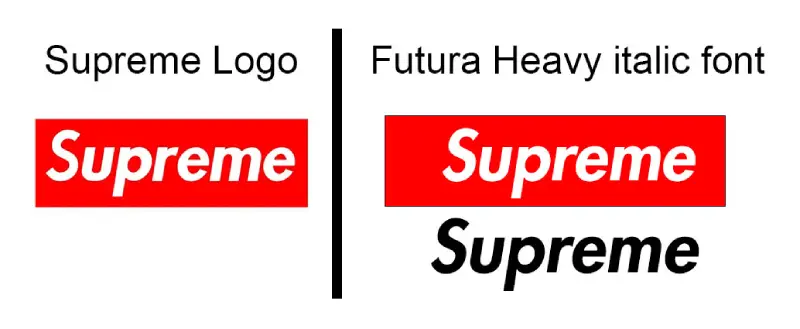
The modifications made to the Futura Heavy Oblique font for the Supreme logo include slanted and overlapping letters, as well as some slight tweaks to the shape of certain letters, such as the “E” and the “R.” The Supreme font has become a key part of the brand’s visual identity, and these changes make it look unique and recognizable. In the Supreme logo, the characters look thinner and have narrow spacing. For a comparison, please see the image below.

Because the font is associated with Supreme, it has become popular among graphic designers and artists, especially in the streetwear and hip-hop communities.
The Supreme font suits logos and titles that aim to attract mass audiences. The font is ideal for creating appealing and readable names for buildings, hotels, stores, product brands, and headlines. It is a font with a high level of usability.
Supreme font Generator
About The Supreme Logo
The Supreme logo is one of the most recognizable logos in streetwear. The word “Supreme” is in bold, italicized font, with the letters overlapping. The logo is typically found on the front or back of Supreme’s clothing and has become a symbol of the brand’s identity.

The founder of Supreme had a similar idea to that of future font designer Paul Renner. James Jebbia, who founded Supreme in 1994, liked the Futura Bold Italic variant due to its simple yet fresh appearance. As his target consumer was young, he did not want to use a compulsive font in the company logo.
The logo was created by designer Brendon Babenzien, who worked for Supreme at the time. The brand has since used the logo in various forms and colors, and it has become an iconic part of the brand’s aesthetic.
To Conclude
Supreme font aka Futura Heavy Oblique font is a great font to work with. This font can make text designs of any size beautiful. Therefore, if you want your creative piece to look lively with minimum effort, the Supreme font will do the job. Make sure to install and use the font properly on your device so that your designs won’t get lost.
You can also check out our other brand fonts for your projects, including Marlboro, Reeses Thins, Avant Grade and Tesla Font.
Thanks

I am part of the Free Fonts Vault team, dedicated to providing you with the best experience in finding free fonts for your needs. Our team works together to ensure that we offer well-researched information on free fonts or similar alternatives. If you have any queries, please do not hesitate to contact us through our Contact page. Note: We called ourselves “The A team”.


