DIN font is a sans-serif typeface that originated from the German standard DIN 1451, established by the Deutsches Institut für Normung (German Institute for Standardization) in 1931.
The font was initially designed for industrial, technical, and administrative applications, particularly for traffic signage, where legibility and clarity were paramount.
The DIN font was developed with a specific purpose: to create a highly legible, standardized typeface that could be easily reproduced using limited technical means.
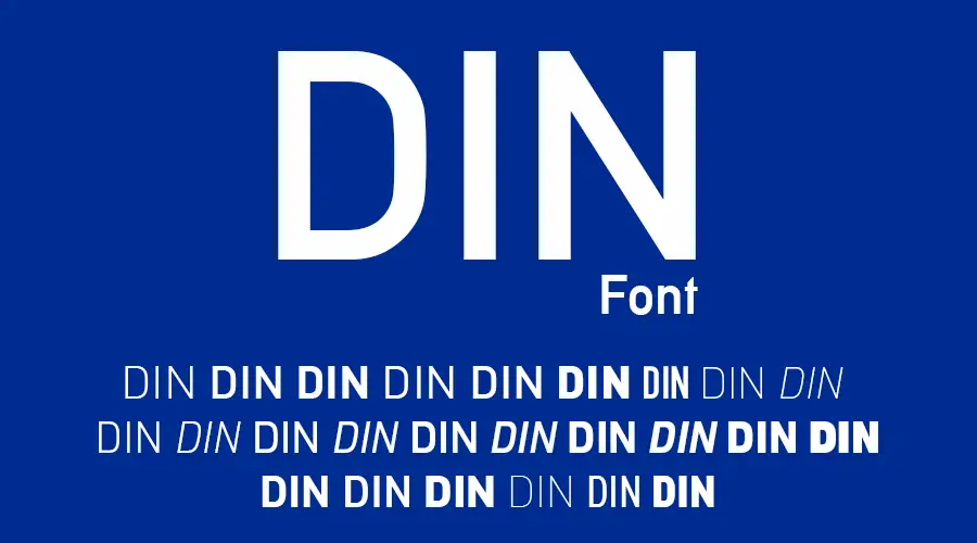
DIN Font
Din 1451alt G | Original
Din 1451 engschrift | Original
Din 1451 alt | Original
DINNextW1G Black | Original
DINNextW1G BlackItalic | Original
DINNextW1G Bold | Original
DINNextW1G BoldItalic | Original
DINNextW1G Heavy | Original
DINNextW1G HeavyItalic | Original
DINNextW1G Light | Original
DINNextW1G LightItalic | Original
DINNextW1G Medium | Original
DINNextW1G MediumItalic | Original
DINNextW1G Regular | Original
DINNextW1G UltraLight | Original
DINNextW1G UltraLightIt | Original
DIN2014 Bold | Original
DIN2014 BoldItalic | Original
DIN2014 Demi | Original
DIN2014 DemiItalic | Original
DIN2014 ExtraBold | Original
DIN2014 ExtraBoldItalic | Original
DIN2014 ExtraLight | Original
DIN2014 ExtraLightItalic | Original
DIN2014 Narrow | Original
DIN2014 NarrowBold | Original
DIN2014 NarrowDemi | Original
DIN2014 NarrowLight | Original
DIN2014 NarrowExtraBold | Original
DIN2014 NarrowExtraLight | Original
DIN2014 Regular | Original
DIN Con BlackAlternate | Original
DIN Con Bold | Original
DIN Con Light | Original
DIN Con Medium | Original
DIN Con Regular | Original
FF DIN Black | Original
FF DIN Bold | Original
FF DIN Medium | Original
FF DIN Regular | Original
How It Originated
The DIN typeface’s lineage precedes its formal standard by decades, establishing its deep connection to German industrial centralization:
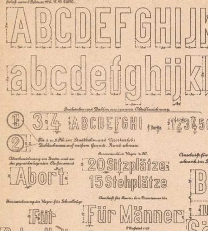
- Railway Antecedent (1905): The conceptual origin is the IV 44 design, utilized by the Royal Prussian Rail Administration across the burgeoning national railway system, necessitating a unified font.
- Formal Codification (1931–1936): After years of developmental specifications guided by Goller, the design was issued as a pre-norm in 1931 and officially released as a mandatory national norm in 1936. This legal status immediately enforced its use across German public infrastructure, earning it the moniker, the “Autobahn” typeface.
So, what is the original DIN font?
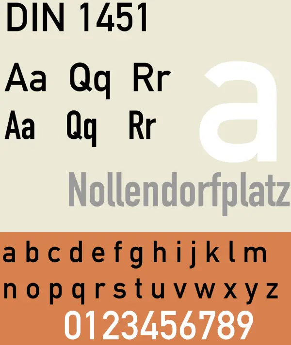
As you can learn from the history of the font, the original DIN font is the DIN 1451 font. It is still one of the most popular versions. It is a geometric sans-serif typeface with a simple and clear design, which means its letters are based on geometric shapes. It will give the font a clean and modern look.
As a result of the DIN 1451 font, other DIN fonts were also developed. Like-
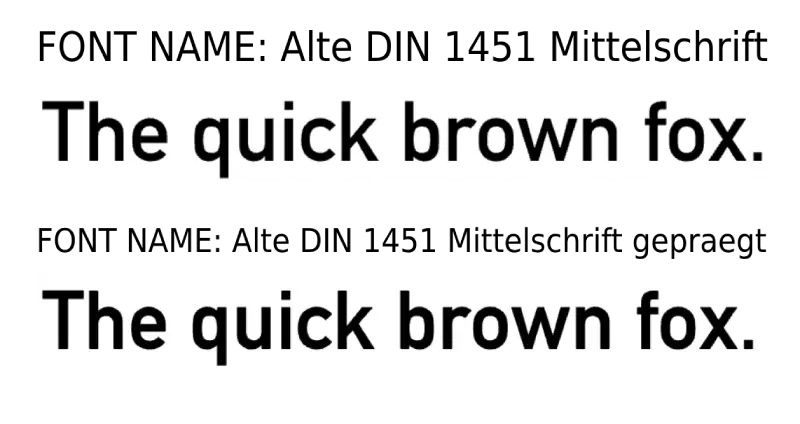
DIN 1451 Mittelschrift
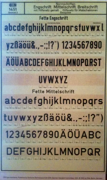
This is a heavier version of the DIN 1451 font. It is often used for signage and other applications where a bolder, more eye-catching font is needed.
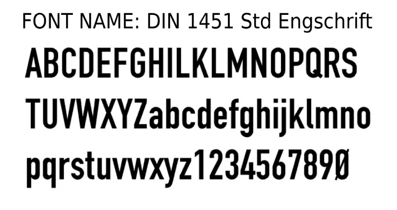
DIN 1451 Engschrift
It is a narrower version of the DIN 1451 font. It is often used for text that needs to be condensed, such as tables or charts.
DIN 1451 Telex
It is a particular version of the DIN 1451 font designed for use on telex machines. It is a very narrow font optimized for transmission over telegraph lines.
FF DIN font
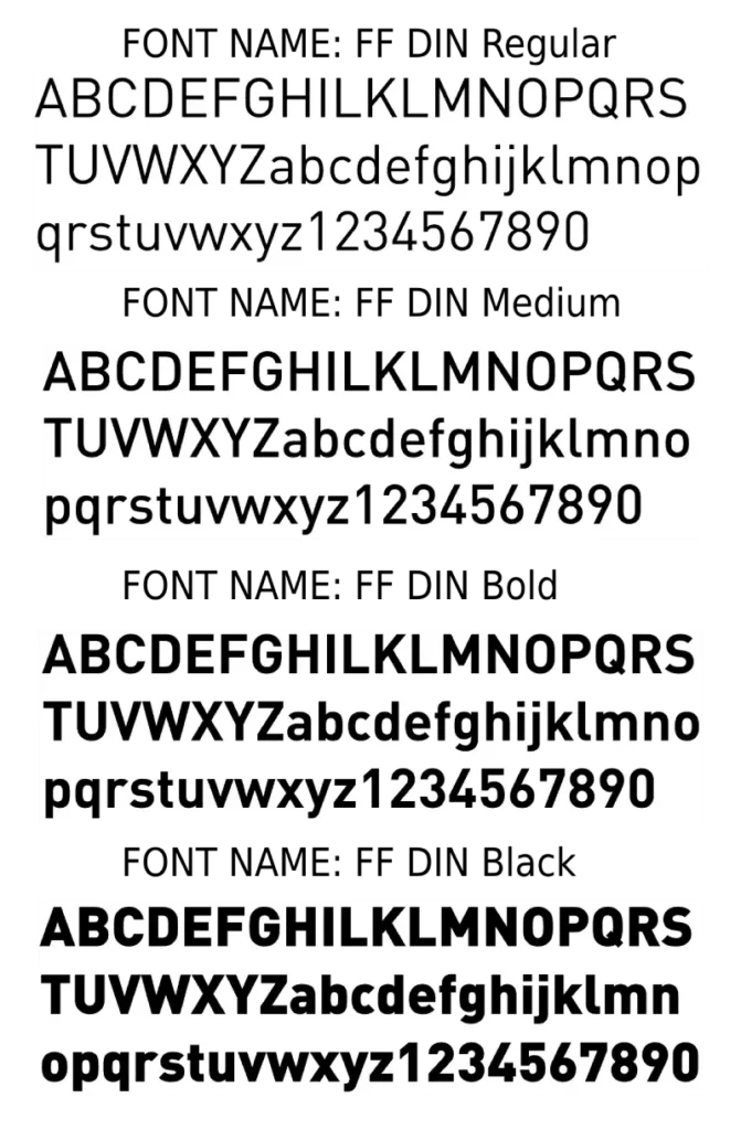
It is the modernized and most used version of DIN, which has become the most popular due to its versatility. The FF DIN font was designed by Albert-Jan Pool for Fontshop in 1995. It has more weights, styles, and languages than the original DIN font. It’s a commercial font that requires a purchase for use.
DIN Condensed Font
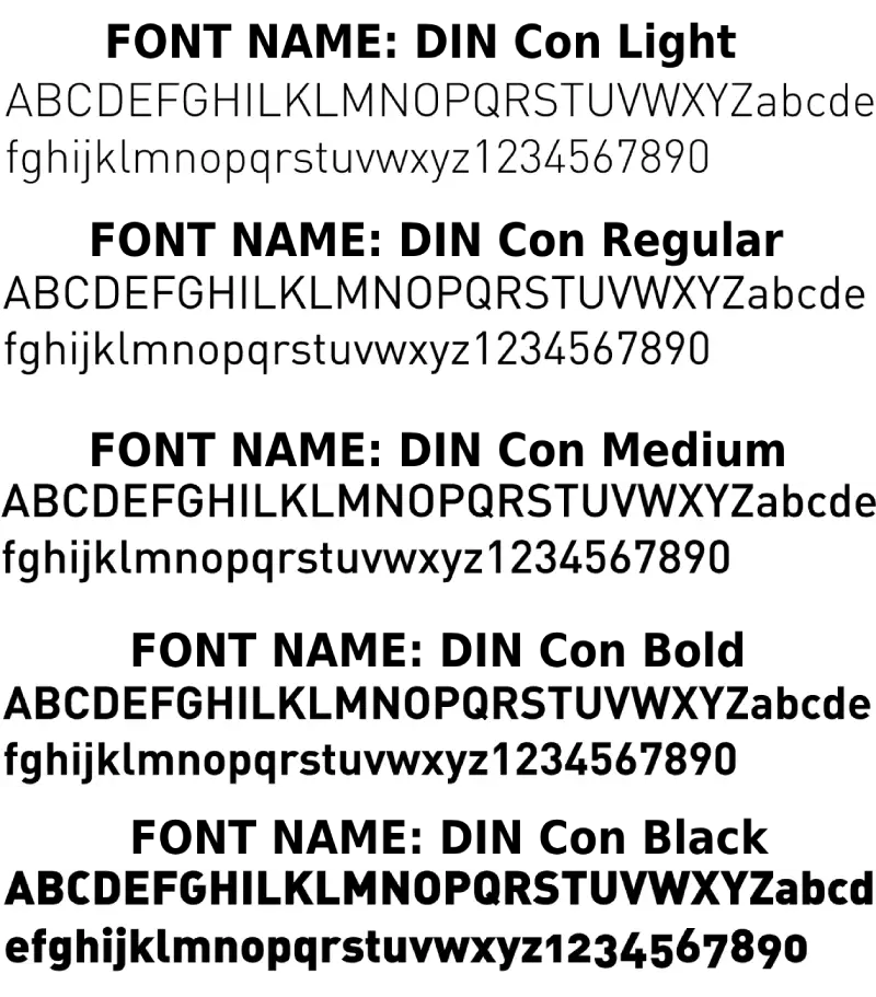
DIN Condensed is a font based on the DIN standard. The font was designed by Manvel Shmavonyan and Tagir Safayev in 1997. It is a variation on the original DIN font. DIN Condensed has a narrow width and height, making it a suitable choice for small spaces. It has four styles: regular, light, variable, and demi bold. It is a modern and elegant font ideal for various purposes, including logos, headlines, posters, and websites.
DIN 2014 Font
DIN 2014 is a modern version of DIN’s iconic font. Vasily Biryukov designed it and is available through Adobe Fonts, having been released by Paratype in 2015. It has 18 styles, from thin to black, with regular, narrow, and condensed widths. DIN 2014 is an excellent font for various purposes, including signs, logos, headlines, posters, and websites. It is straightforward to read in long texts and small sizes. It is also strong and elegant in large sizes and short texts. It supports many languages, including Latin, Cyrillic, Greek, and Vietnamese.
DIN Next Font
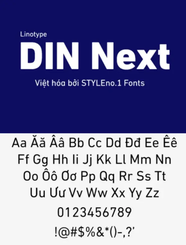
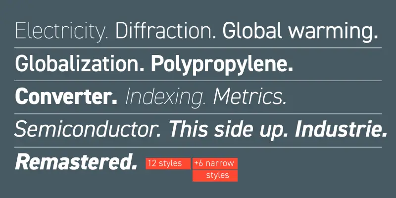
DIN Next is a font family based on the classic DIN 1451 font. Akira Kobayashi and Sandra Winter designed the font in 2009/10. It has 28 styles, from thin to black, with regular, narrow, and condensed widths. It is also strong and elegant in large sizes and with short texts.
D-DIN
A version commissioned by Datto Inc. and released under SIL Open Font License, available in 8 variants. It’s also free for both personal and commercial use under the SIL Open Font License.
Font use
The DIN font was initially designed for road and railway signage in Germany in 1936. It was based on geometric shapes with high readability and legibility. In 1967, a new font version was released, including a broader range of weights and styles.
It was also used on German car number plates from 1956 to 1995. In 1999, another update added even more weights and styles, as well as support for Unicode.
Several uses for DIN fonts, including signage, branding, editorial design, and packaging, have become increasingly popular. The font has many versions and adaptations, such as DIN 1451, DIN Next, and FF DIN.
Many Companies use DIN because it looks plain, clear, and exact. That clean style evokes images of German standards and sound engineering, conveying a subtle message of trust and order. BMW, Siemens, and Deutsche Bahn use these letters on cars, machines, and station signs for this reason, and global brands like DirecTV and Forever 21 incorporate the same letters into TV guides and shopping bags to maintain their brands’ look and reliability.
DIN history you rarely hear:
- License plates were dumped – Germany stopped using DIN 1451 on car tags in 1995 and switched to FE-Schrift, a purposely uneven font that is much harder to fake or alter.
- The Dutch said “no thanks” – their own standard, NEN 3225, was drawn by designers such as Jan van Krimpen, who wanted a friendlier, Gill-Sans-style look and openly rejected the cold, Germanic geometry.
- Maths made it smoother – When Albert-Jan Pool built FF DIN, he used clothoid curves (the same spirals you see on motorway bends) so the digital outlines are mathematically perfect, something 1930s stencils could never achieve.
- Copyright twist – The basic letter shapes are considered a “utility” and are free to copy in the U.S.. Still, the actual computer font files (such as FF DIN or DIN Next) are protected software, so each company must redraw the alphabet from scratch if it wants its own version.
The DIN font is a perfect example of how something designed for a purely practical reason can become a timeless design classic. It started as a tool to bring order to chaos on the roads of Germany and ultimately became a symbol of modern, clean design all over the world. It proves that sometimes, the simplest ideas are the most powerful.
To sum up, DIN font is a typeface with a long and rich history, dating back to the early 20th century in Germany. It is a font based on geometric shapes, offering high readability and legibility. It is a font used for various purposes, such as signage, branding, editorial design, and packaging. It is a font with many versions and adaptations. It remains a popular and relevant font today, as it is widely used in many modern design projects. DIN font is simple, straightforward, strong, and elegant. It proves that sometimes, the simplest ideas are the most powerful.
Thanks for reading.

I am part of the Free Fonts Vault team, dedicated to providing you with the best experience in finding free fonts for your needs. Our team works together to ensure that we offer well-researched information on free fonts or similar alternatives. If you have any queries, please do not hesitate to contact us through our Contact page. Note: We called ourselves “The A team”.


