Font Directory
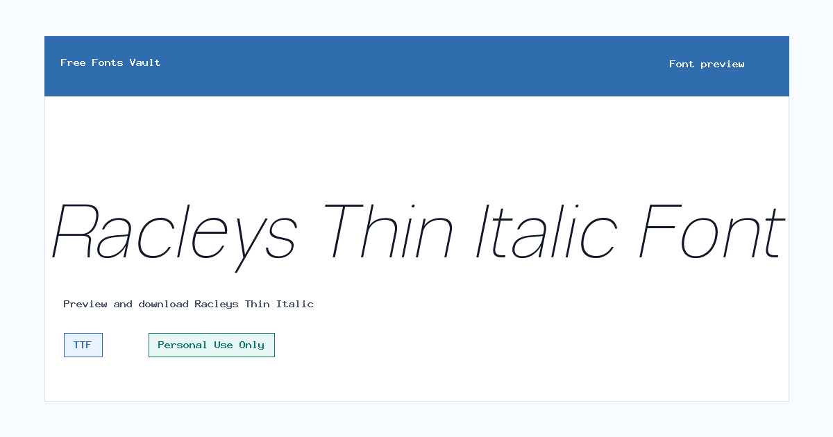
Racleys Thin Italic
Racleys Thin Italic includes 1 downloadable variant for live preview and testing.
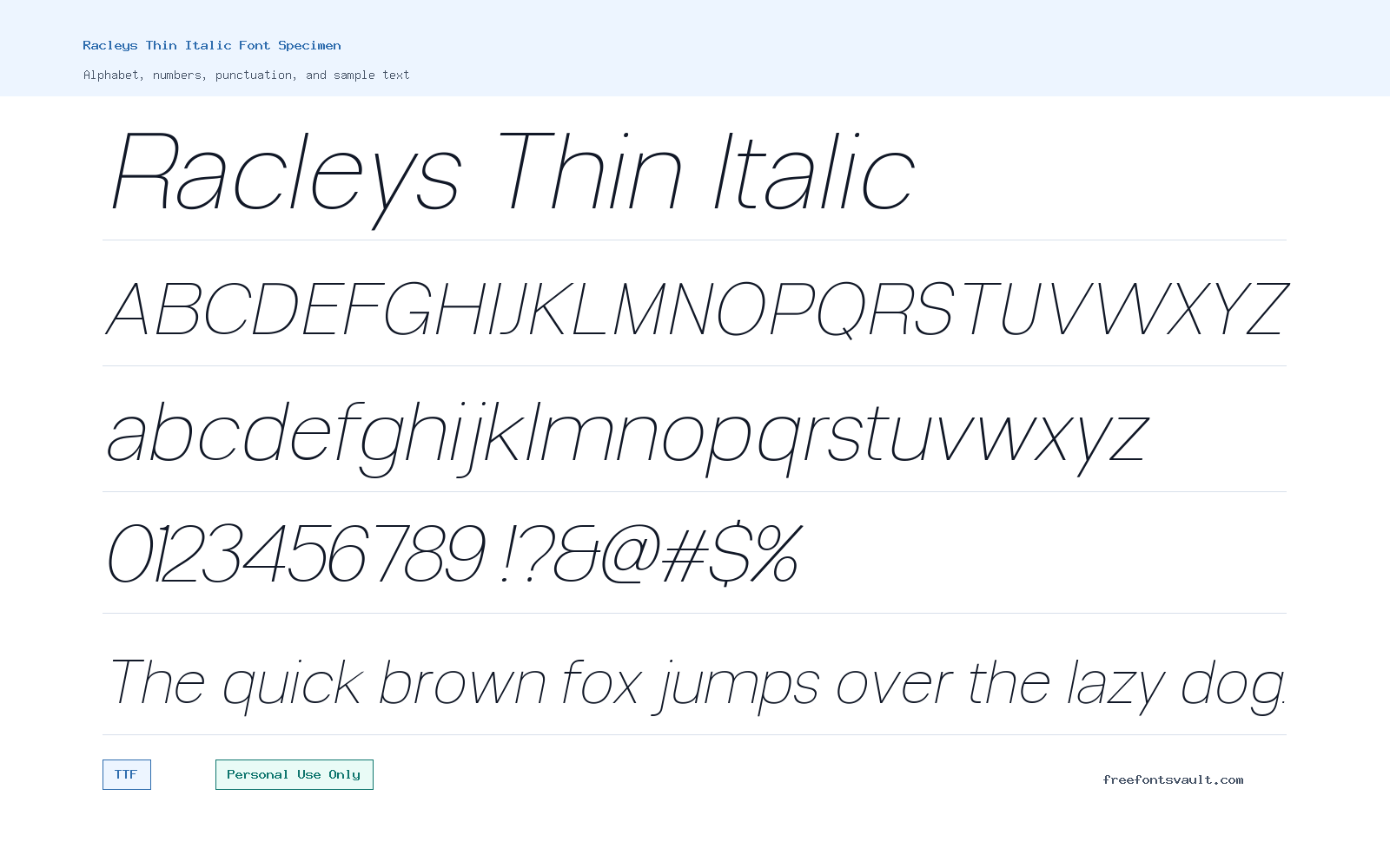
Font Specimen
Details
- Designer Glyphminds Studio (Graphicted.Co)
- License Personal use only
- Format TTF
- Variants 1 file available
Racleys Thin Italic font.
Racleys Thin Italic is a light, slanted sans serif style with a delicate look that works best when the design needs a clean line rather than a heavy display voice.
About Racleys Thin Italic
Racleys Thin Italic is the thin italic style from the Racleys Sans Serif Font Family. Its listed weight is 100, which means the strokes are very light compared with regular or bold styles. The italic angle gives the letters a forward movement, so the font can feel more polished and editorial than a straight upright thin style. Because the weight is so fine, it is best treated as a display or accent font, not as a workhorse text face for long reading. Use it where the words are short, the spacing can breathe, and the background does not fight with the letters.
For designers, Racleys Thin Italic is worth testing in logo drafts, fashion-style headlines, elegant poster text, social graphics, product mockups, and web hero sections. It can give a layout a quiet, refined tone without making the typography look loud. The thin strokes need enough size and contrast, so preview it at the actual dimensions you plan to use before committing. On dark or textured backgrounds, increase the size, add more letter spacing, or choose a calmer background so the strokes do not disappear. For logos, check every letter in the brand name carefully, especially narrow letters and punctuation, because thin italic fonts can become fragile when scaled down.
The font file is listed as a TTF, a common desktop font format supported by most design apps and operating systems. That makes it practical for trying in tools such as Photoshop, Illustrator, Affinity Designer, Canva uploads, Figma on systems where the font is installed, and other layout software that accepts local fonts. If you are preparing a website mockup, use the font first for visual testing, then confirm the license and any webfont rights before using it in a live commercial project. A personal-use license usually does not cover client work, paid products, advertising, merchandise, or public brand assets unless the rights holder grants those permissions separately.
Pairing is important with a thin italic style. Racleys Thin Italic can look best beside a simple upright sans serif that handles body text, navigation, captions, and small labels. Avoid pairing it with another decorative or very thin font in the same layout, because the page may lose hierarchy. A stronger regular sans serif, a neutral grotesque, or a plain geometric sans can give the design a steady base while Racleys Thin Italic handles the expressive details. If you use it in a poster or cover, try it for the main title or a short subtitle, then keep supporting information in a sturdier font for readability.
Features
- Thin 100-weight letterforms with an italic style for refined short-text designs.
- TTF font format for use in many common desktop design applications.
- Best suited to display typography, accents, logos, posters, mockups, and social graphics rather than dense body copy.
- Light stroke weight that benefits from generous size, clean backgrounds, and careful contrast.
- Personal Use Only license status, so commercial projects need separate permission or licensing.
Best Uses
- Logo concepts and wordmarks where the brand name is short and the font can be tested at multiple sizes.
- Poster titles, album-style artwork, invitation headings, and editorial cover text.
- Fashion, beauty, portfolio, or boutique-style web mockups that need a slim italic accent.
- Social media graphics, quote cards, and visual headers with limited wording.
- Typography experiments where designers want to compare thin italic styling with heavier supporting fonts.
License Information
Racleys Thin Italic is marked as Personal Use Only. Use it for personal projects, private drafts, and non-commercial testing unless you obtain the correct commercial license from the rights holder. Do not assume it is cleared for client work, products, advertising, logos for a business, merchandise, apps, or live websites without checking the license terms.
Designer and Foundry
The designer is listed as Glyphminds Studio (Graphicted.Co), with Graphicted.Co provided as the designer website.
Usage Tips
Use Racleys Thin Italic at larger sizes with strong contrast. It is not the safest choice for long paragraphs, small mobile text, low-resolution output, or busy image backgrounds. For a cleaner layout, pair it with a readable upright sans serif for body copy and reserve Racleys Thin Italic for headings, signatures, short labels, or selected brand accents.
FAQ
Is Racleys Thin Italic free for commercial use?
No. The license status is Personal Use Only, so commercial use needs separate permission or a proper commercial license.
What kind of font is Racleys Thin Italic?
It is a thin italic sans serif style with a very light 100 weight. It works best as an accent or display font for short text.
Can I use Racleys Thin Italic for a logo?
You can test it in logo concepts, but a business logo is usually commercial use. Confirm the license before using it for a real brand, client, product, or public identity.
Is Racleys Thin Italic good for body text?
It is better for headings and short phrases. The thin strokes and italic style may become hard to read in long paragraphs or small sizes.
What file format is included for Racleys Thin Italic?
The font variant is listed as a TTF file, which is widely supported by desktop design and layout apps.
What should I pair with Racleys Thin Italic?
Pair it with a simple upright sans serif that has stronger regular or medium weights. Let the other font handle body text and smaller details.
Family Styles

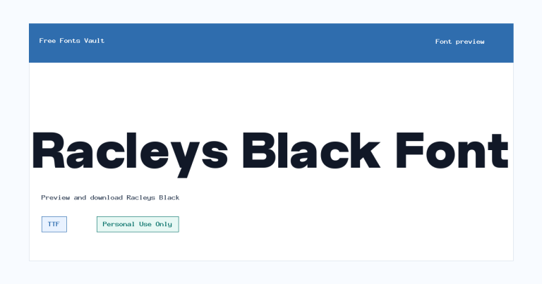
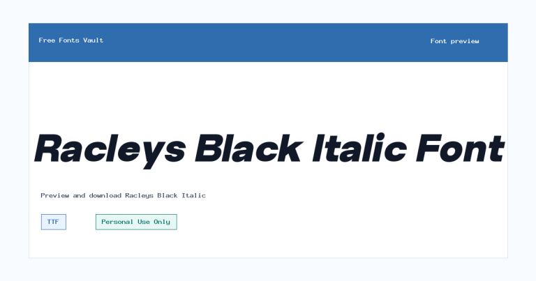
Want to browse beyond this family? Return to All Fonts for the main directory.



