Font Directory
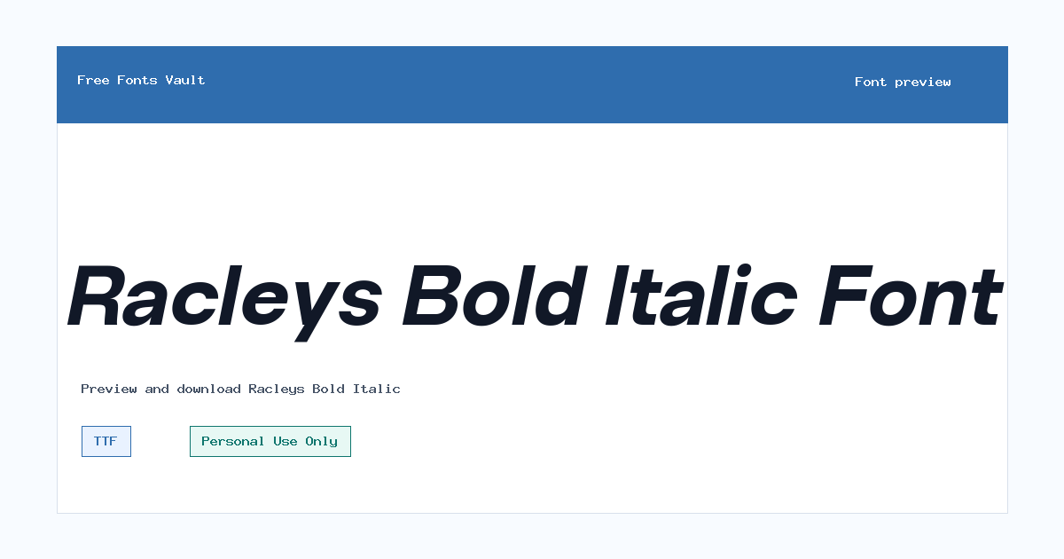
Racleys Bold Italic
Racleys Bold Italic includes 1 downloadable variant for live preview and testing.
Font Specimen
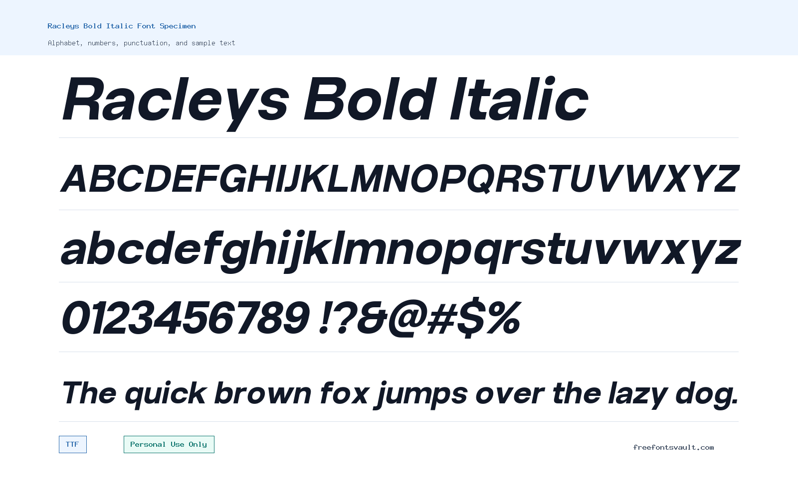
Details
- Designer Glyphminds Studio (Graphicted.Co)
- License Personal use only
- Format TTF
- Variants 1 file available
Racleys Bold Italic font.
Racleys Bold Italic is a bold italic typeface with a strong slanted stance, making it a useful choice when your design needs emphasis, motion, and a confident headline style.
About Racleys Bold Italic
Racleys Bold Italic works best as a display font rather than a long-reading text face. Its 700 weight gives words a firm presence, while the italic style adds forward movement. That combination can help short phrases feel more energetic without needing extra decoration. Use it for titles, poster lines, logo drafts, apparel mockups, social graphics, thumbnails, packaging concepts, and other places where a few words need to stand out quickly. Because the available font file is a TTF, it should be easy to test in common design apps, office tools, and many font preview tools.
When using Racleys Bold Italic, start by testing the exact words you plan to design with. Bold italic fonts can behave very differently depending on letter shapes, spacing, and word length. Short brand names, initials, badges, and compact headlines may look strong, while long paragraphs will likely feel too heavy and slanted for comfortable reading. For logo work, check spacing between angled letters and adjust kerning manually if needed. For posters and web mockups, pair it with a calmer upright sans serif or a simple serif for supporting text so the bold italic style remains the focal point. Keep the license in mind: the font is marked Personal Use Only, so commercial projects need separate permission or a suitable commercial license from the rights holder.
Designers can get the most from this font by using it with restraint. Try it at large sizes first, then reduce it only after checking readability. Slanted bold letters often need more breathing room than regular upright text, especially in all caps or tight layouts. If you are building a website mockup, use it for hero text, callouts, or promotional headings, but choose a more neutral font for body copy, navigation, captions, and forms. If you are preparing a print design, test both light and dark backgrounds. A bold italic face can look clean on high-contrast layouts, but it may lose detail if placed over busy images or textured backgrounds. For best results, keep the surrounding design simple and let the font carry the emphasis.
Features
- Bold 700 weight with an italic style for strong, forward-leaning display text.
- TTF font format for easy testing in many desktop design and preview tools.
- Suited to short, high-impact text such as headings, logo concepts, poster titles, and social graphics.
- Works well when paired with a neutral upright font for supporting copy.
Best Uses
- Poster titles and event graphics that need a bold slanted headline.
- Logo concepts, wordmarks, badges, and apparel mockups for personal projects.
- Website hero mockups, promotional banners, and short callout text.
- Social media graphics, thumbnails, quote cards, and display typography experiments.
License Information
Racleys Bold Italic is marked Personal Use Only. You can use it for personal testing and non-commercial design practice, but do not use it in paid, client, business, product, advertising, or monetized work unless you obtain the correct commercial permission from the font owner.
Designer and Foundry
The designer is listed as Glyphminds Studio (Graphicted.Co). No additional foundry information is confirmed for this page.
Usage Tips
Use Racleys Bold Italic for short display text, not long paragraphs. Test spacing carefully in logo work and headlines, especially with all caps or tight letter combinations. Pair it with a clean upright sans serif or simple serif for body text so the bold italic style does not compete with the rest of the layout.
FAQ
Is Racleys Bold Italic free for commercial use?
No. The license is marked Personal Use Only. For commercial use, you should contact the rights holder or obtain a commercial license before using it in client, business, product, or monetized work.
What file format is Racleys Bold Italic?
The available font file is in TTF format, which is commonly supported by desktop operating systems and many design applications.
What kind of designs is this font good for?
It is best for short display uses such as posters, logo drafts, title graphics, apparel mockups, banners, and social media images. It is not ideal for long body text.
Can I use Racleys Bold Italic for a logo?
You can test it in personal logo concepts, but commercial logo use requires the proper commercial permission. Also check the spacing carefully, because bold italic letterforms may need manual kerning in a wordmark.
What should I pair with Racleys Bold Italic?
Pair it with a simple upright sans serif or a restrained serif for supporting text. This keeps the layout balanced and lets Racleys Bold Italic work as the main display accent.
Is Racleys Bold Italic good for website body text?
It is better for headings, hero text, and short callouts. For paragraphs, menus, captions, and form labels, use a more neutral and readable text font.
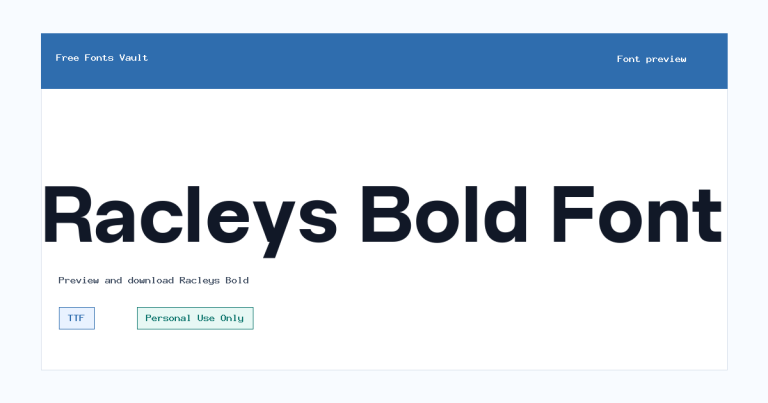
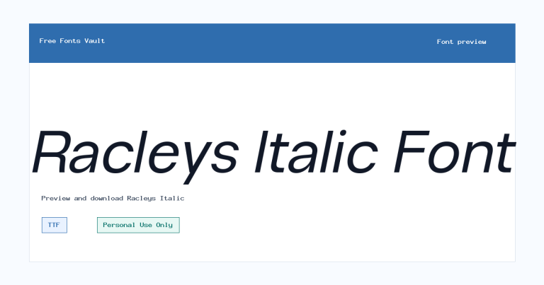
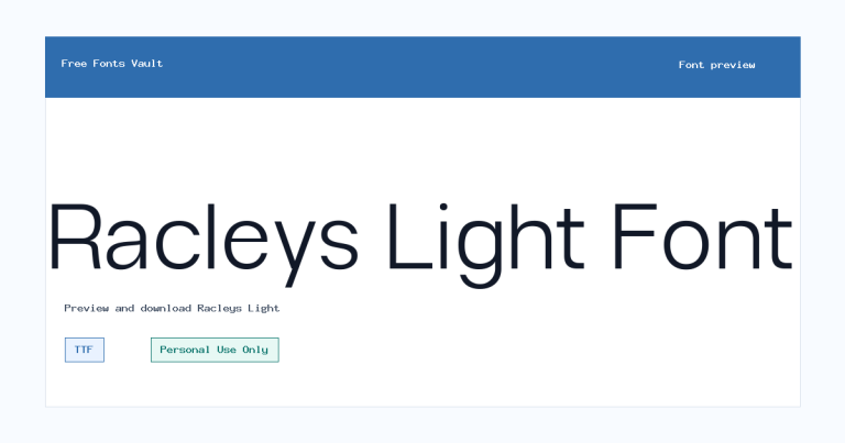
Family Styles

Want to browse beyond this family? Return to All Fonts for the main directory.



