Font Directory
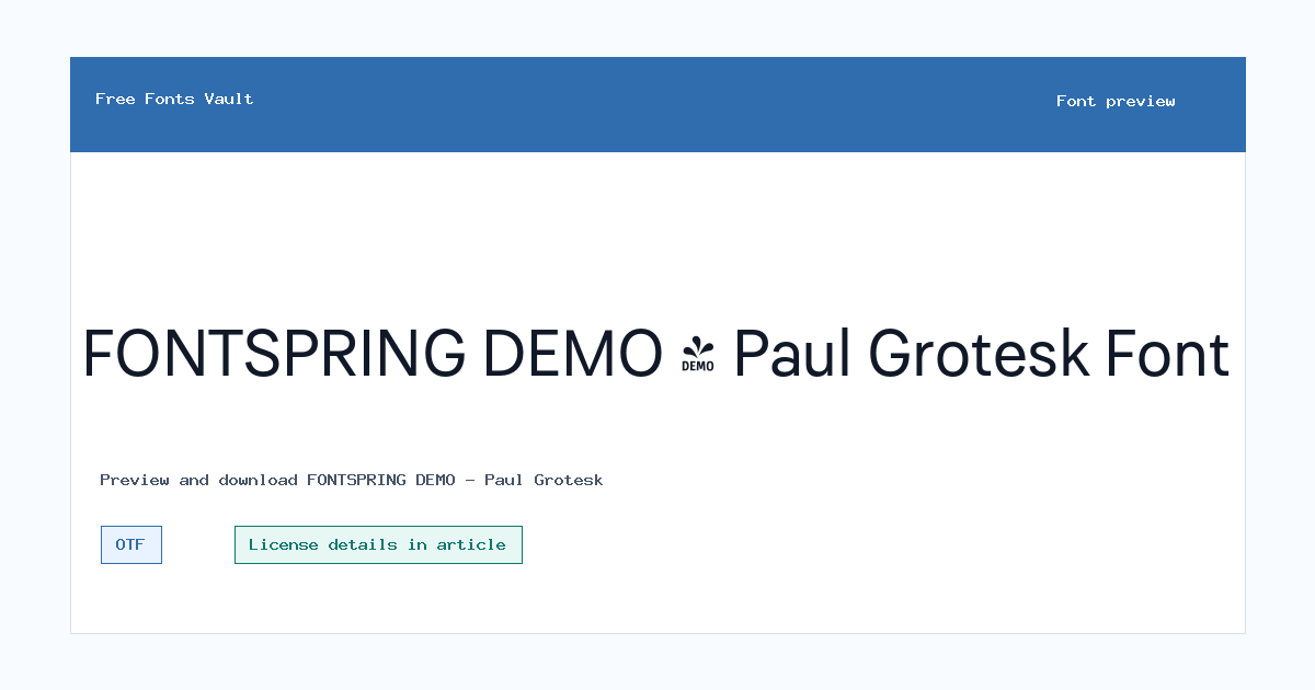
FONTSPRING DEMO - Paul Grotesk
FONTSPRING DEMO - Paul Grotesk includes 2 downloadable variants for live preview and testing.
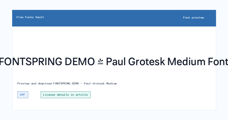
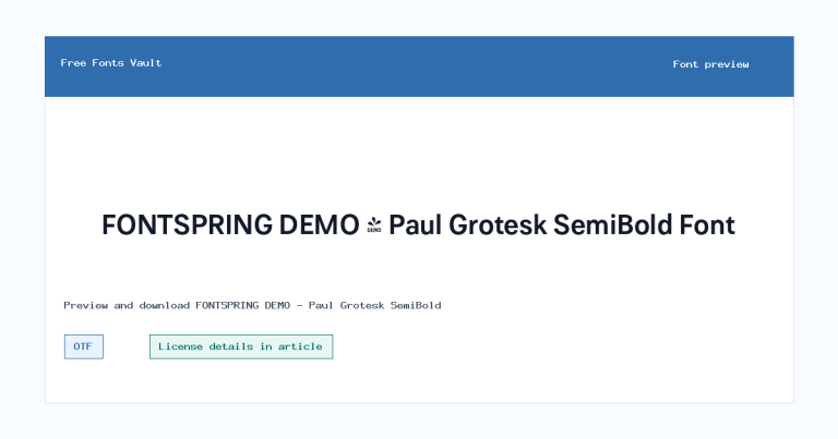
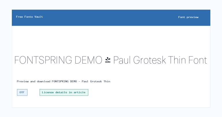
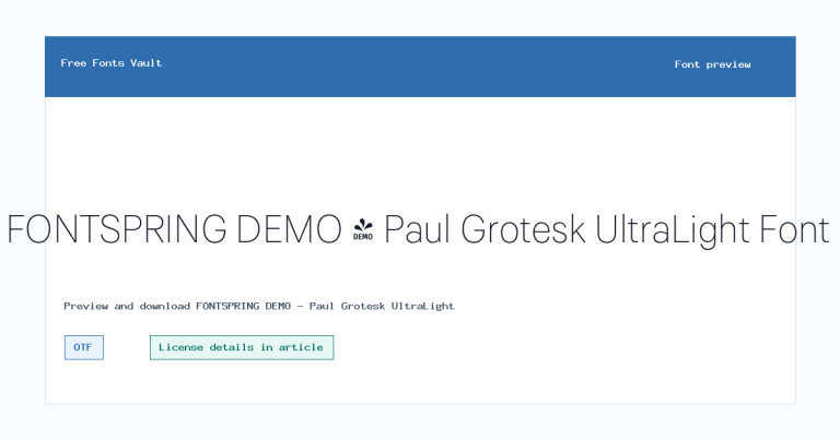
Styles in this family
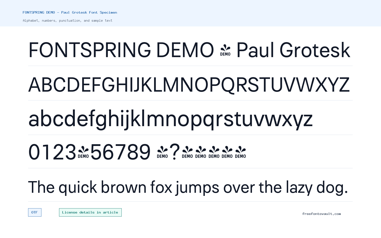
Font Specimen
Details
- Designer Fargus Meiser
- Foundry Lukas Bischoff
- Format OTF
- Variants 2 files available
FONTSPRING DEMO – Paul Grotesk font.
Paul Grotesk is listed here as “FONTSPRING DEMO – Paul Grotesk,” with OTF files for regular and bold styles. It is a practical font page for testing the family in the live preview before you decide whether it fits your design.
About Paul Grotesk Font
Paul Grotesk appears in two weights: a regular 400 style and a bold 700 style. That gives you a simple working pair for headings, short labels, buttons, and compact text blocks. Because the name uses “Grotesk,” visitors will likely approach it as a sans-serif display or text option, but the best way to judge it is to type your own words into the preview and compare the regular and bold styles side by side.
Use the regular weight when you want a calmer line of text, and switch to the bold weight when a word, heading, or navigation item needs more emphasis. Test it with uppercase words, mixed-case names, numbers, punctuation, and any special characters your project needs. If you plan to use it in longer paragraphs, check spacing and comfort at smaller sizes first, since many grotesk-style fonts work best when their rhythm is tested in real layout conditions.
Features
- OTF font format for both listed files
- Regular 400 and bold 700 styles for basic hierarchy
Best Uses
- Headlines, labels, buttons, and short interface text
- Posters, social graphics, title cards, and compact branding tests
License Information
The license field for this font is not stated. Do not assume commercial-use rights from the download name or file format. Check the license from the source or rights holder before using Paul Grotesk in client work, products, logos, ads, apps, merchandise, or any paid project.
Designer and Foundry
The designer is listed as Fargus Meiser, with Artill shown as the designer URL. The foundry field lists Lukas Bischoff.
Usage Tips
Start by previewing the regular weight for normal text and the bold weight for emphasis. Try your real headline, a sentence, numbers, and punctuation. Pair it with a quieter serif or a neutral sans only after checking that the shapes do not compete. For body text, test small sizes and line spacing before relying on it across a full page.
FAQ
Is Paul Grotesk free for commercial use?
The license information is not stated here, so commercial use should not be assumed. Check the original license terms before using it in paid or public projects.
What font files are included for Paul Grotesk?
The listed files are OTF format: paulgrotesk-regular.otf and paulgrotesk-bold.otf.
Which weights can I preview?
You can test a regular 400 style and a bold 700 style.
What is Paul Grotesk best used for?
With regular and bold styles, it is most useful for short text settings such as headings, labels, buttons, posters, title graphics, and layout mockups.
Should I use Paul Grotesk for long paragraphs?
Test it first at the size you plan to use. Check spacing, readability, punctuation, and line length before setting long body copy.
Family Styles
Want to browse beyond this family? Return to All Fonts for the main directory.



