Font Directory
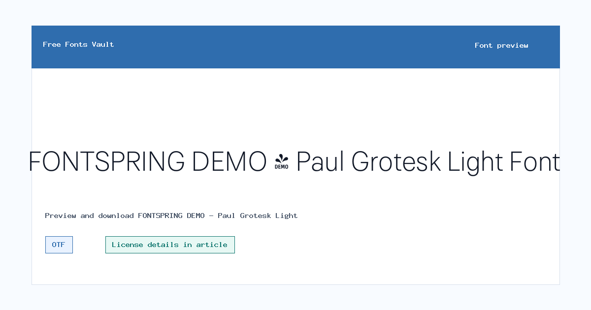
FONTSPRING DEMO - Paul Grotesk Light
FONTSPRING DEMO - Paul Grotesk Light includes 1 downloadable variant for live preview and testing.
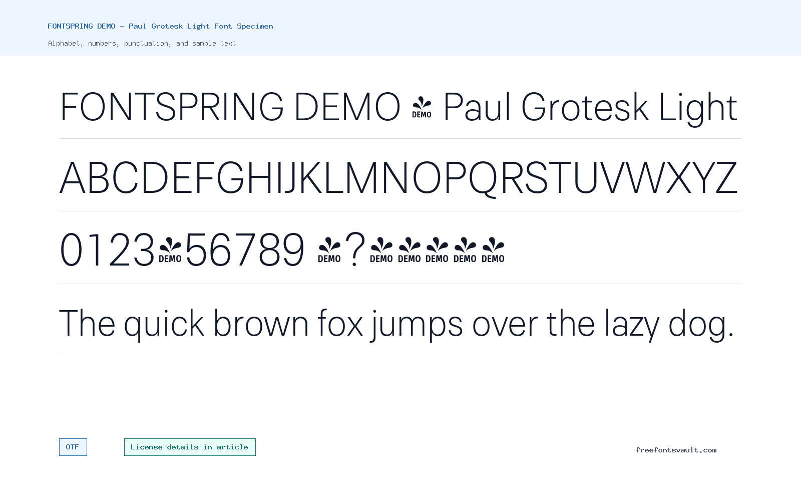
Font Specimen
Details
- Designer Fargus Meiser
- Foundry Lukas Bischoff
- Format OTF
- Variants 1 file available
FONTSPRING DEMO – Paul Grotesk Light font.
Paul Grotesk Light is a light-weight sans serif font with a clean, restrained look. Its thin structure works best when you want text to feel modern, open, and polished without making the layout feel heavy.
About Paul Grotesk Light
Paul Grotesk Light is supplied as an OTF font file with a normal style and a 300 weight. That makes it a good choice to test in headings, short labels, menus, poster text, and other places where a lighter sans serif can add space and calm to the design.
Because this is a light cut, it needs enough size and contrast to stay readable. Try it in the preview with your own text before downloading, especially if you plan to use it over images, in small navigation text, or in long paragraphs.
The name starts with FONTSPRING DEMO, so treat this cut as a trial-style download unless you already have the proper license from the original seller or rights holder. It can still be useful for mockups, layout testing, and comparing whether the Paul Grotesk tone fits a project before committing to a production font license.
Light sans serif fonts need more care than heavier styles. Keep the text large enough, avoid very pale colors on white, and test it on both desktop and mobile screens. If a headline feels too delicate, increase size, add spacing carefully, or pair the light title with a stronger supporting font.
Features
- Light 300 weight for a thin, clean sans serif appearance
- OTF format suitable for common desktop design and font-preview use
- Demo-named font file, so production rights should be checked before client or business use
- Works well when white space, restraint, and a modern editorial tone are important
Best Uses
- Minimal headings, section titles, and short display text
- Brand mockups, UI labels, posters, and clean editorial layouts
- Landing-page mockups, portfolio headings, navigation studies, and clean title systems
- Design drafts where you need to compare a light geometric-style sans serif against heavier alternatives
License Information
The file name and font name indicate a FONTSPRING DEMO cut, and the exact license terms are not shown with this font entry. Use it for previewing and testing only until you confirm the official license. Do not assume commercial, client, logo, app, webfont, or product rights from the download alone.
Designer and Foundry
Paul Grotesk Light is credited to Fargus Meiser and Lukas Bischoff, with artill referenced in the font copyright information.
Usage Tips
Use Paul Grotesk Light at larger sizes or with strong contrast. For body copy, pair it with a regular or medium-weight sans serif so longer text stays comfortable to read. Test real menu labels, numbers, and punctuation before using it in navigation or interface mockups.
FAQ
Is Paul Grotesk Light free for commercial use?
The license information is not listed, so commercial use is not confirmed. Check the official license or purchase source before using it in client, business, or product work.
What file format is included?
The font file is in OTF format.
What weight is Paul Grotesk Light?
It is listed as a light 300 weight with a normal style.
What is this font best used for?
It is best for short text such as headings, labels, posters, clean layouts, and design previews where a thin sans serif style fits.
Why does the name say FONTSPRING DEMO?
That wording usually means the file is intended for preview or evaluation. Confirm the full Fontspring or foundry license before using the font in finished commercial work.
Family Styles
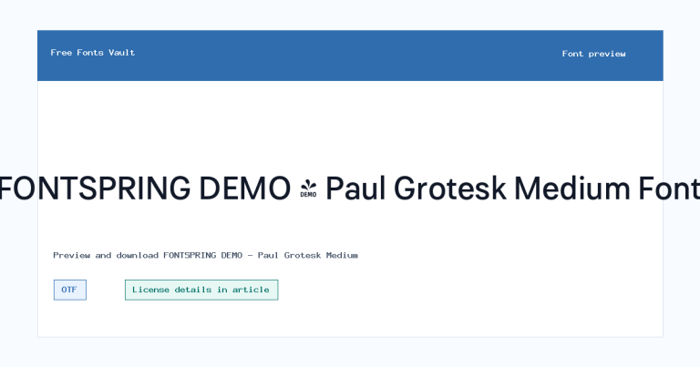
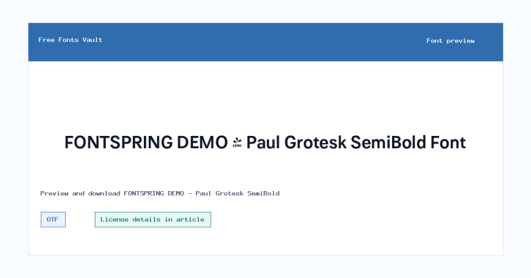
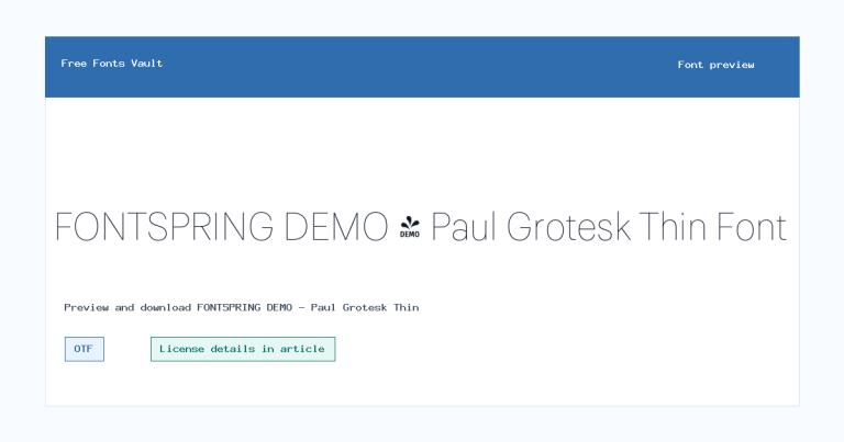
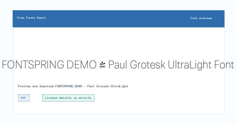
Want to browse beyond this family? Return to All Fonts for the main directory.



