Font Directory
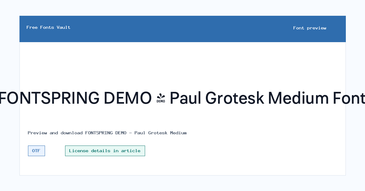
FONTSPRING DEMO - Paul Grotesk Medium
FONTSPRING DEMO - Paul Grotesk Medium includes 1 downloadable variant for live preview and testing.
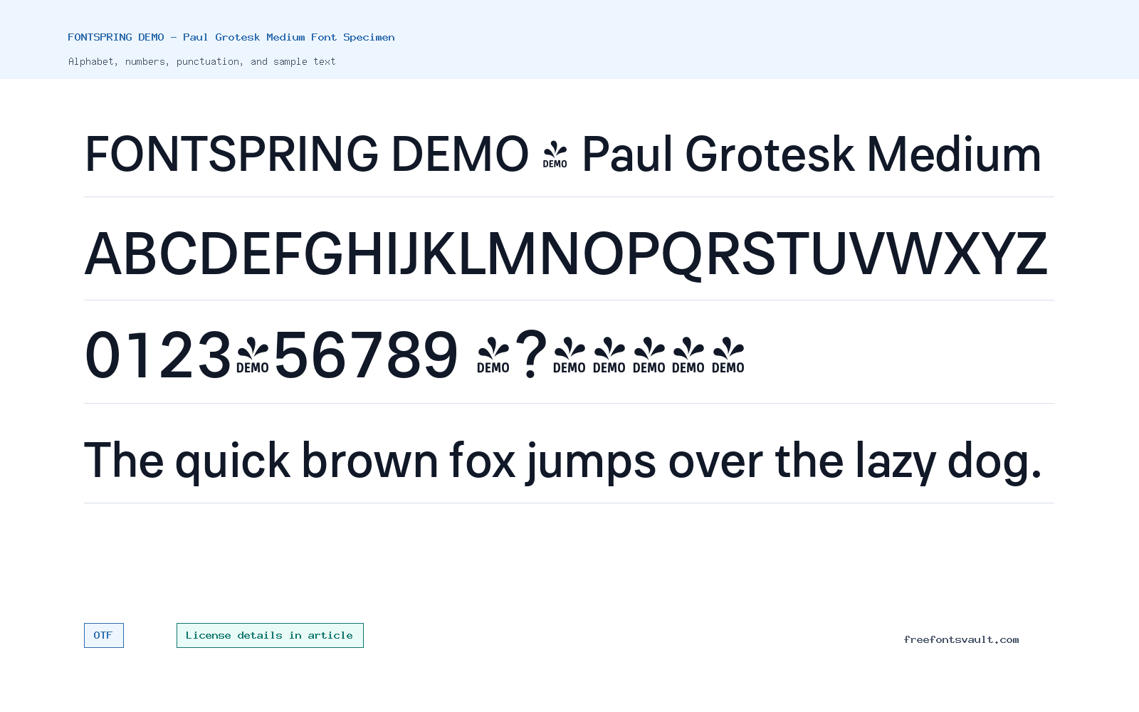
Font Specimen
Details
- Designer Fargus Meiser
- Foundry Lukas Bischoff
- Format OTF
- Variants 1 file available
FONTSPRING DEMO – Paul Grotesk Medium font.
Paul Grotesk Medium is a clean, modern grotesk-style font in OTF format, offered here in a medium 500 weight for preview and download.
About Paul Grotesk Medium
Paul Grotesk Medium has the practical feel visitors expect from a contemporary sans serif: simple letter shapes, steady spacing, and enough weight to hold up in titles, navigation labels, short headings, and interface-style text. The medium weight gives it more presence than a regular cut without becoming heavy or compressed, so it can work well when you need a balanced sans serif that stays clear at display sizes.
Use the preview tool to test the words you actually plan to set, especially names, menu items, headlines, and short brand phrases. Grotesk fonts can look very different depending on letter combinations, punctuation, and spacing, so check uppercase, lowercase, numbers, and common symbols before downloading. For longer reading, pair it with a calm text face and keep the size comfortable; for posters or web headings, give it enough whitespace so the clean structure can stand out.
Because this file is marked as a Fontspring demo, treat it as a trial cut for layout testing unless your license says otherwise. It is useful for comparing headline weight, button rhythm, and brand-name spacing before choosing a final commercial font package.
In practical layouts, Paul Grotesk Medium can sit between body copy and heavy display text. It has enough weight for navigation and compact headings, but it should still be checked in dense paragraphs because a medium weight can become dark if the line length is long.
Features
- OTF font file format
- Medium 500 weight with normal style
- Demo-labeled file, so licensing should be checked before finished use
- Balanced medium weight for clean headlines, labels, and UI-style text
Best Uses
- Headlines, titles, and short display text
- Website navigation, UI labels, posters, and clean branding tests
- Brand-name tests, app screens, landing page headings, and clear navigation labels
License Information
The license terms are not stated in the available font details. Do not assume commercial-use rights. Check the download package, the foundry, or the original distributor for the exact license before using Paul Grotesk Medium in client work, products, logos, merchandise, apps, or advertising.
Designer and Foundry
The font details name Fargus Meiser as designer and Lukas Bischoff as foundry.
Usage Tips
Try Paul Grotesk Medium first in short text settings where a clear sans serif is useful. Test spacing at your target size, compare it against a lighter or heavier companion font if available, and confirm the license before distributing any finished work.
FAQ
What kind of font is Paul Grotesk Medium?
It is a clean sans serif font in a medium 500 weight. It is best tested for headings, labels, and short display text.
What file format is included?
The downloadable font file is in OTF format.
Can I use Paul Grotesk Medium commercially?
The license terms are not stated here, so commercial use should not be assumed. Check the original license information before using it in paid or public projects.
Who designed Paul Grotesk Medium?
The font details name Fargus Meiser as the designer.
What should I test in the preview?
Test your real headline, brand name, numbers, punctuation, and mixed-case text. This helps you judge spacing, weight, and readability before downloading.
Why does this page mention Fontspring DEMO?
That wording usually means the file may be intended for testing. Use it for previewing first and check the original license before using it in client or commercial work.
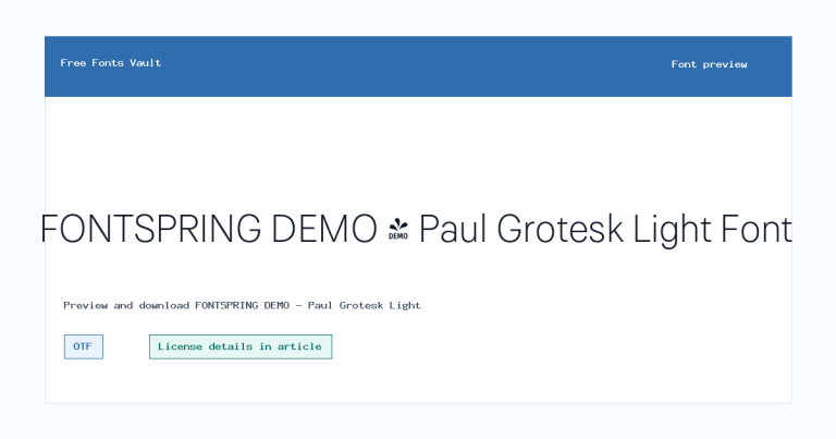
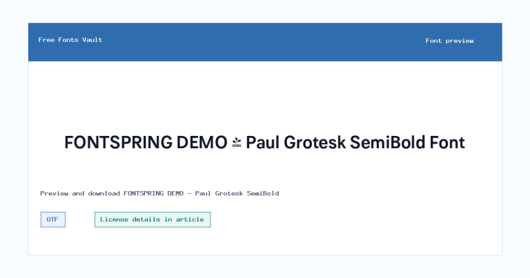
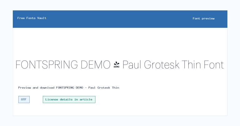
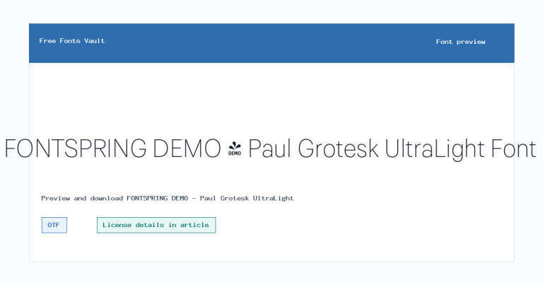
Family Styles
Want to browse beyond this family? Return to All Fonts for the main directory.



