Font Directory
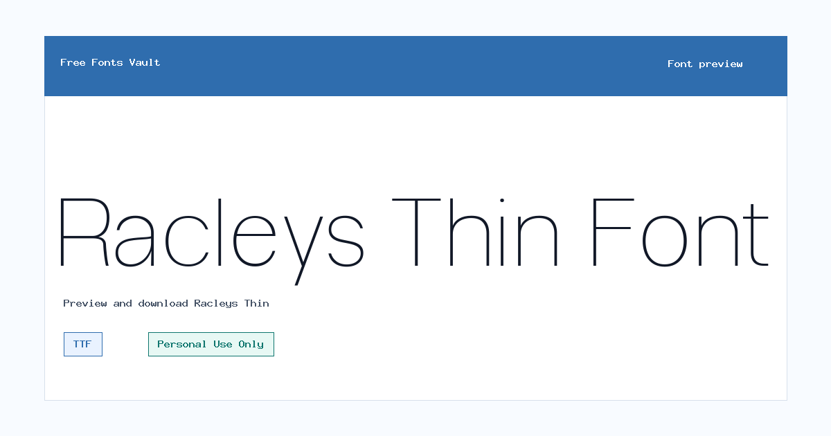
Racleys Thin
Racleys Thin includes 1 downloadable variant for live preview and testing.
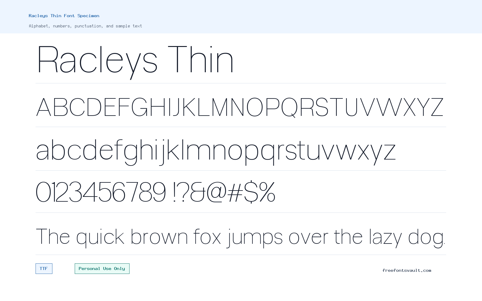
Font Specimen
Details
- Designer Glyphminds Studio (Graphicted.Co)
- License Personal use only
- Format TTF
- Variants 1 file available
Racleys Thin font.
Racleys Thin is a light-weight sans serif font with a clean, narrow presence that works best when you want text to feel quiet, modern, and uncluttered.
About Racleys Thin
Racleys Thin uses a very light font weight, so its strength is subtlety rather than impact. It is a good choice for designers testing refined headings, elegant nameplates, poster details, product mockups, social graphics, and simple logo concepts where the typography should look sleek without feeling heavy. Because the weight is thin, it can give short words and compact phrases a polished look, especially when there is enough spacing around the letters.
This is not the kind of font to rely on for long body copy or small text on busy backgrounds. Thin strokes can disappear when reduced too much, printed on textured material, or placed over high-detail images. Use the preview tool to test the exact word, brand name, title, or phrase you plan to design with. Try it at the real size you need, then check the spacing, contrast, and legibility before using it in a finished layout.
Features
- Thin sans serif styling suited to clean headings, refined display text, and minimal layouts.
- TTF font file format with normal style and a very light 100 weight.
Best Uses
- Logo drafts, brand name experiments, fashion-style headers, and elegant title treatments.
- Posters, web mockups, social graphics, packaging concepts, and portfolio visuals where the text is large enough to stay readable.
License Information
Racleys Thin is marked as Personal Use Only. Use it for personal projects, previews, practice work, and non-commercial design tests unless you confirm and obtain the proper commercial license from the rights holder or designer. Do not assume it is free for client work, business branding, products for sale, advertising, or monetized projects.
Designer and Foundry
The designer is listed as Glyphminds Studio, also associated with Graphicted.Co.
Usage Tips
For the best result, use Racleys Thin in larger sizes with generous contrast. Keep backgrounds simple, avoid placing it over detailed photos without a solid overlay, and consider increasing letter spacing for short uppercase words. Pair it with a sturdier sans serif for paragraphs, labels, menus, or captions so the overall design remains readable. If you use it in a logo concept, test how the mark looks at small sizes before committing to it.
FAQ
Is Racleys Thin free for commercial use?
No. The license information marks Racleys Thin as Personal Use Only, so commercial use needs separate permission or a proper commercial license.
What file format is included for Racleys Thin?
The font file is in TTF format, which is commonly used on desktop systems and in many design applications.
What weight is Racleys Thin?
Racleys Thin is listed with a 100 font weight, which is a very light style.
Can I use Racleys Thin for a logo?
You can test it for personal logo concepts, but the Personal Use Only license means commercial logos or client branding require the correct commercial permission. Also check legibility at small sizes because thin strokes can become hard to read.
What kinds of designs suit Racleys Thin?
It suits short display text, refined headings, poster titles, web mockups, social media graphics, packaging concepts, and minimal layouts where the type can be shown large enough.
Is Racleys Thin good for body text?
It is better for headings and short phrases. For paragraphs or interface text, pair it with a more readable regular-weight sans serif.
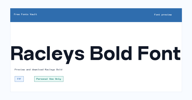
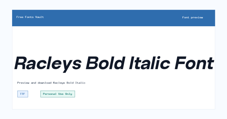
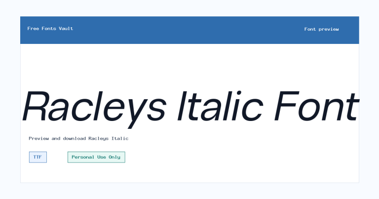
Family Styles

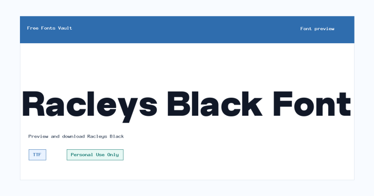
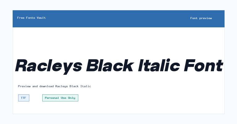
Want to browse beyond this family? Return to All Fonts for the main directory.



