Font Directory
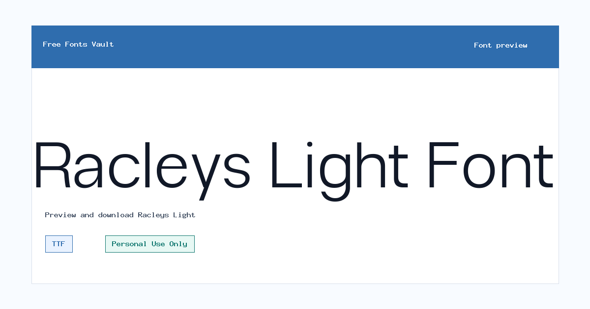
Racleys Light
Racleys Light includes 1 downloadable variant for live preview and testing.
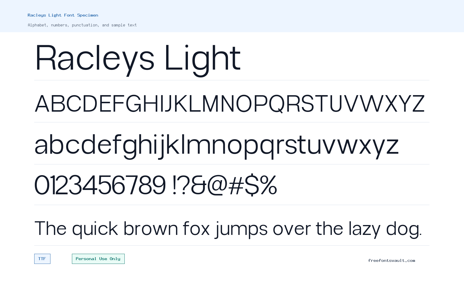
Font Specimen
Details
- Designer Glyphminds Studio (Graphicted.Co)
- License Personal use only
- Format TTF
- Variants 1 file available
Racleys Light font.
Racleys Light is a light-weight sans serif font with a clean, simple look for designers who need a restrained type style for personal design projects.
About Racleys Light
Racleys Light uses a normal upright style with a 300 font weight, so it is best read as the lighter member of the Racleys family rather than a heavy headline face. Its thin weight can give titles, labels, and short blocks of text a neat modern feel without making the layout look crowded. Because the available file is a TTF font, it should work in most common desktop design apps, including layout, image-editing, and presentation tools that support TrueType fonts. The font is especially useful when you want a softer sans serif tone for a clean preview, a quiet poster heading, a simple nameplate, or a minimal branding concept.
Use Racleys Light where spacing and contrast matter. Light fonts can look elegant at larger sizes, but they may lose clarity when used very small, on busy images, or in low-contrast color combinations. For logos and wordmarks, test the font in the exact words you plan to use, then check whether thin strokes remain visible on dark backgrounds, mockup photos, and compressed social images. For posters and web mockups, it can work well for section titles, short taglines, menu labels, and clean hero text. If you need long paragraphs, pair it with a more readable body font and keep Racleys Light for display accents, headings, or short supporting text.
Features
- Light 300-weight sans serif style for clean titles, labels, and minimal display text.
- TrueType font format suitable for common desktop design and preview tools.
- Normal upright style, making it practical for simple layouts without italic or decorative effects.
- Useful for short text settings where a calm, thin sans serif look is preferred.
- Works best with careful spacing, strong contrast, and moderate-to-large display sizes.
Best Uses
- Personal logo concepts and wordmark drafts
- Poster headings and event graphics
- Minimal web design mockups
- Social media quote cards and title images
- Presentation covers and section dividers
- Clean packaging or label concept previews
- Portfolio layouts that need light sans serif headings
- Short taglines, navigation labels, and UI-style mockups
License Information
Racleys Light is marked as Personal Use Only. You can use it for personal previews, practice designs, school projects, and non-commercial mockups, but commercial use needs separate permission or a proper commercial license from the rights holder. Do not use it in client work, paid branding, merchandise, advertising, apps, websites, or products for sale unless you have confirmed commercial rights.
Designer and Foundry
The designer is listed as Glyphminds Studio (Graphicted.Co), with Graphicted.Co given as the related designer website.
Usage Tips
Install the TTF file, then test Racleys Light in the preview box or your design app before committing to a layout. Start with larger sizes for headings and logos, increase letter spacing only when it improves clarity, and avoid placing the light strokes over detailed images. For pairing, choose a sturdier sans serif or a readable serif for body copy so Racleys Light can stay focused on display text. In web mockups, check the font against both desktop and mobile sizes because thin fonts can become harder to read on small screens.
FAQ
Is Racleys Light free for commercial use?
No. The license information marks Racleys Light as Personal Use Only. For commercial use, contact the rights holder or obtain a commercial license before using it in paid or public-facing work.
What type of font is Racleys Light?
Racleys Light is a light-weight sans serif font. The available style is normal and uses a 300 weight, which makes it better suited to clean display text than dense paragraph copy.
What file format is included for Racleys Light?
The available font file is in TTF format, a common TrueType format supported by many desktop design, document, and preview applications.
Can I use Racleys Light for a logo?
You can test it for personal logo concepts and non-commercial drafts. If the logo is for a client, business, product, channel, store, or any commercial project, confirm the correct license first.
Is Racleys Light good for body text?
It may work for very short supporting text, but the light weight is usually better for headings, labels, and display use. For long reading, pair it with a more robust body font.
How should I pair Racleys Light with another font?
Pair it with a clearer, heavier sans serif or a simple serif for paragraphs. Let Racleys Light handle titles or accents, and use the companion font for smaller text and longer reading.
Why does a light font need extra testing?
Thin strokes can disappear at small sizes, on low-resolution images, or over complex backgrounds. Always test contrast, size, and spacing in the final design context.
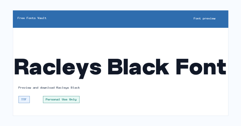
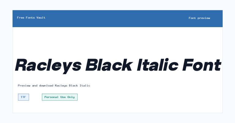
Family Styles

Want to browse beyond this family? Return to All Fonts for the main directory.



