Font Directory
Factory Sans Black
Factory Sans Black includes 1 downloadable variant for live preview and testing.
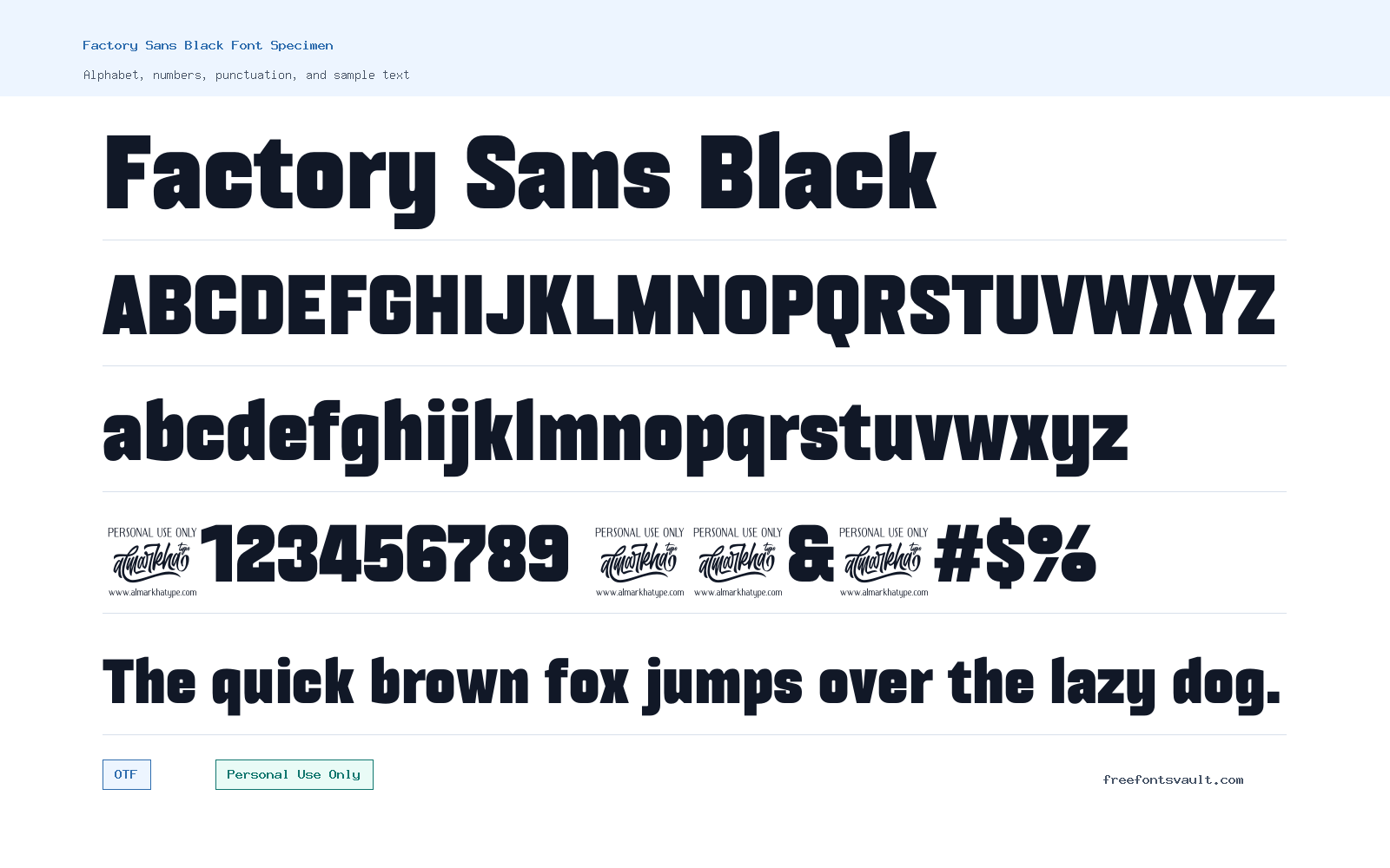
Font Specimen
Details
- Designer Rivo Dwi Adriansyah, Abdul Malik Wisnu, Almarkhatype Team
- License Personal use only
- Format OTF
- Variants 1 file available
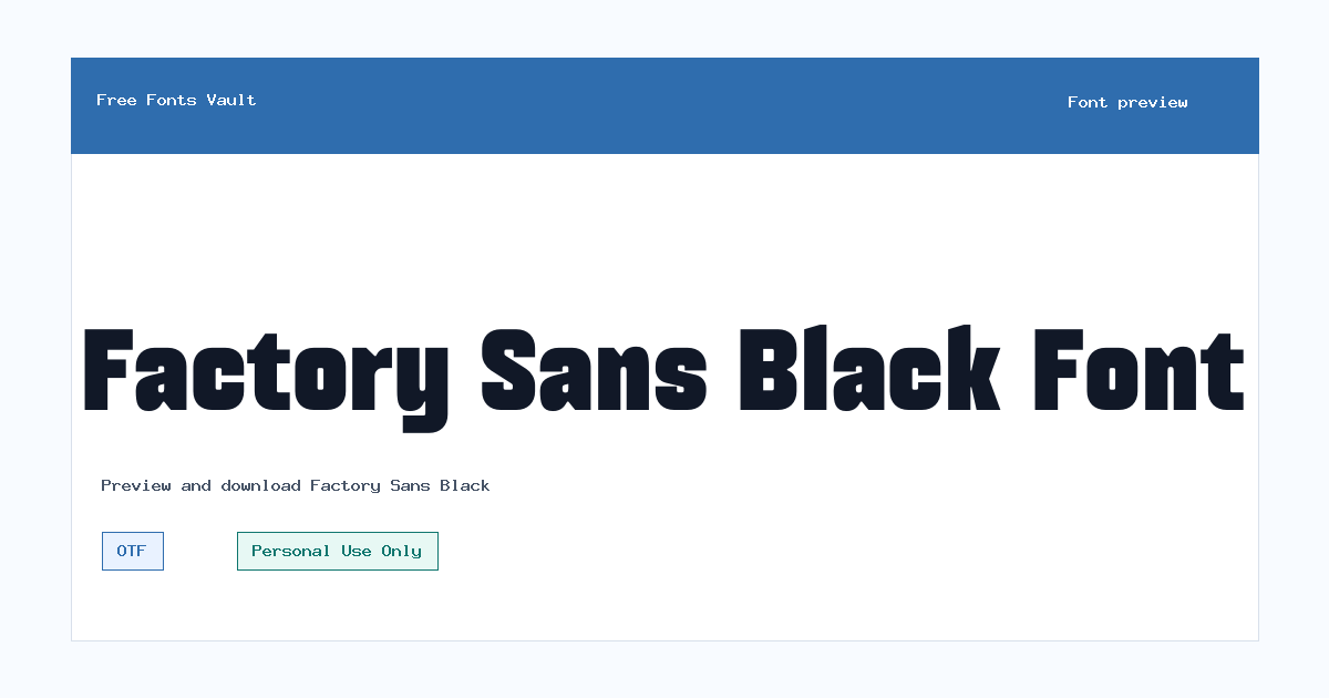
Factory Sans Black font.
Factory Sans Black is a heavy sans serif font made for strong display work. Its 900 weight gives text a solid, compact presence, making it useful when you need a headline, logo draft, poster title, or web mockup to feel direct and confident.
About Factory Sans Black
Factory Sans Black is the boldest kind of sans serif style: thick, clean, and built around impact rather than quiet reading. The available font file is an OTF format, with a normal style and a 900 weight. That makes it best suited for short words, names, titles, and large-size typography where the shape of each letter can be seen clearly. It is not the kind of font you would normally choose for long paragraphs, body copy, or dense UI text, because very heavy weights can quickly feel crowded when used in small sizes.
For designers, Factory Sans Black can work well as a starting point for personal poster concepts, social graphics, music artwork, packaging mockups, title cards, and bold branding sketches. In logo work, it may help test a strong wordmark direction, especially for short brand names or initials. Keep the layout simple and give the letters enough spacing around them. Because the weight is very dark, it can dominate a composition, so it often works best with a lighter supporting typeface, generous margins, and a limited color palette. Before using it in any public or client project, check the license carefully, because the listed license is Personal Use Only.
When previewing the font, try both uppercase and lowercase text if the preview tool supports it. Heavy sans fonts can behave very differently depending on letter combinations. Test words with narrow letters, round letters, and repeated vertical strokes, such as “minimum,” “factory,” “poster,” and your own project name. This helps you see whether the spacing feels open enough for the size you plan to use. If you are designing a logo draft, also test the word at small sizes to make sure it stays recognizable when reduced.
Factory Sans Black is also useful for web and app mockups when you need a strong hero heading or campaign-style title. Use it sparingly: one headline, one callout, or one key phrase will usually have more effect than applying it across an entire layout. For pairing, look for a simple sans serif in regular or medium weight for descriptions, buttons, and captions. A neutral serif can also work if you want contrast, but avoid pairing it with another very heavy or decorative font unless the design is intentionally loud. The goal is to let Factory Sans Black carry the visual weight while the supporting font handles readability.
Features
- Heavy 900-weight sans serif style for bold display typography
- OTF font format suitable for common desktop design projects
- Normal style with a strong black-weight appearance
- Best used at larger sizes where the thick letterforms have room to breathe
- Practical for personal-use posters, title treatments, logo drafts, and web hero mockups
Best Uses
- Poster headlines and event graphics
- Personal logo concepts and wordmark sketches
- Bold web hero titles and landing page mockups
- Album art, cover concepts, and social media graphics
- Packaging mockups and short promotional phrases
- Typography experiments where a strong sans serif weight is needed
License Information
Factory Sans Black is listed as Personal Use Only. Use it for personal projects, testing, previews, and non-commercial design practice unless you obtain a suitable commercial license from the rights holder. Do not treat it as free for commercial work based on this listing.
Designer and Foundry
The credited designers are Rivo Dwi Adriansyah, Abdul Malik Wisnu, and the Almarkhatype Team. No foundry URL or designer link is listed here, so users should verify licensing and purchase options from an official source before commercial use.
Usage Tips
Use Factory Sans Black for short, high-impact text rather than long reading sections. Increase tracking slightly if letters feel tight, keep line lengths short, and pair it with a lighter, simpler typeface for supporting copy. In logo and poster work, test the font in black, white, and one-color layouts before adding effects, because the heavy weight already carries strong visual impact.
FAQ
Is Factory Sans Black free for commercial use?
No commercial-use permission is confirmed here. The listed license says Personal Use Only, so you should not use it in paid, client, product, advertising, or business projects unless you obtain a commercial license.
What type of font is Factory Sans Black?
Factory Sans Black is a heavy sans serif display font. The available style is normal with a 900 weight, which is commonly used for bold headlines and large text.
What file format is included?
The available font file is in OTF format. OTF fonts are commonly supported by major design apps and operating systems.
What is Factory Sans Black best used for?
It is best for short display text such as poster titles, logo drafts, web hero headings, social graphics, packaging mockups, and bold typographic compositions.
Can I use Factory Sans Black for body text?
It is not ideal for long body text. Because the font weight is very heavy, it works better in large sizes and short phrases where readability can be controlled.
Who designed Factory Sans Black?
The font is credited to Rivo Dwi Adriansyah, Abdul Malik Wisnu, and the Almarkhatype Team.
What should I pair with Factory Sans Black?
Pair it with a lighter sans serif for clean layouts, or a restrained serif if you want contrast. Avoid using another very heavy display font beside it unless you are creating a deliberately bold design.
Family Styles
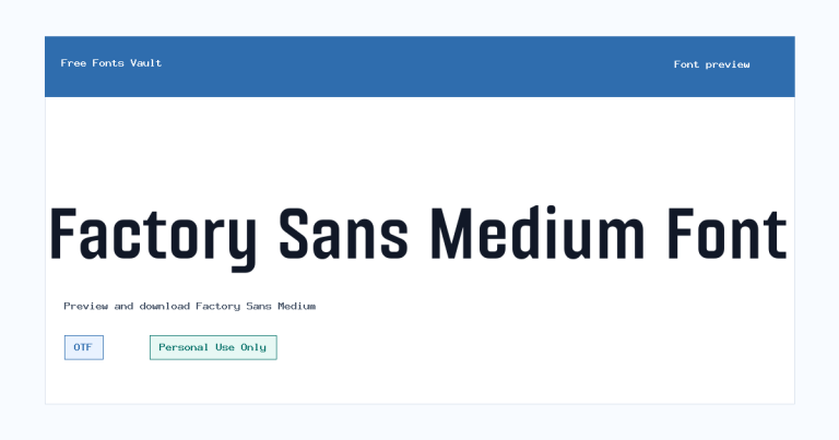
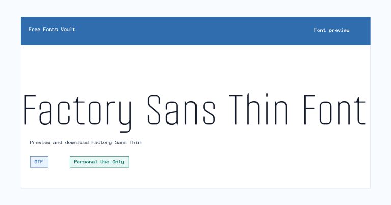
Want to browse beyond this family? Return to All Fonts for the main directory.



