Font Directory
Factory Sans
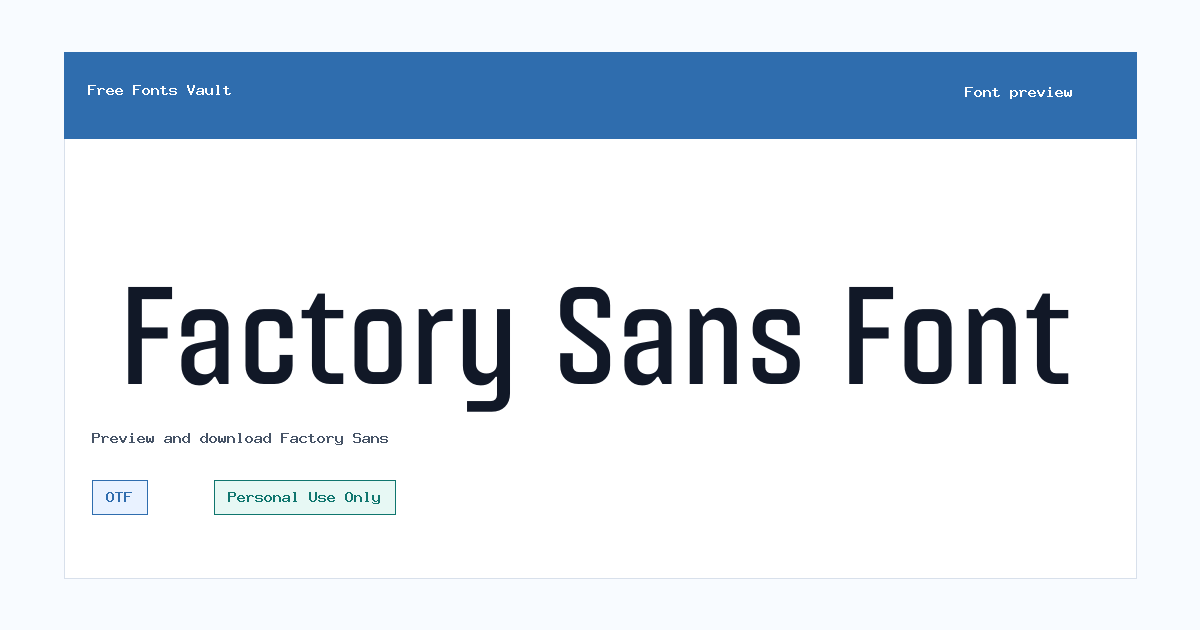
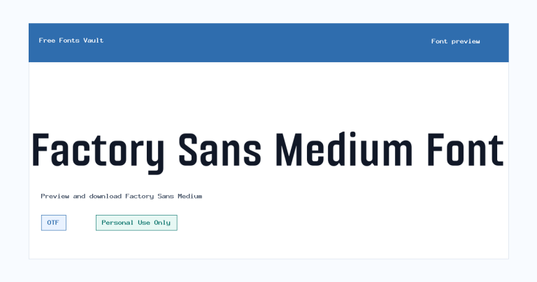
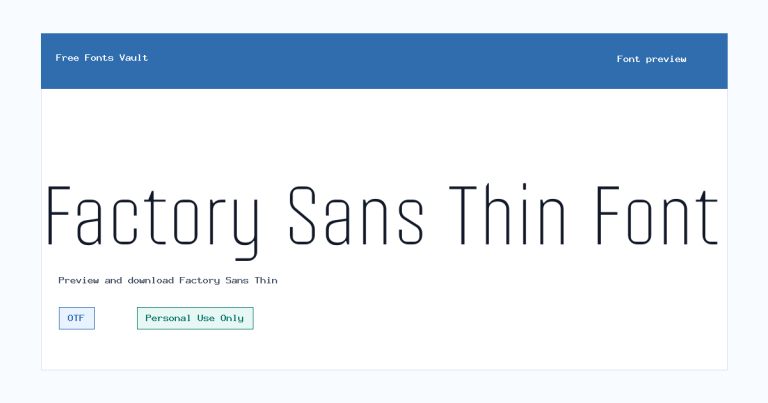
Factory Sans includes 2 downloadable variants for live preview and testing.
Styles in this family
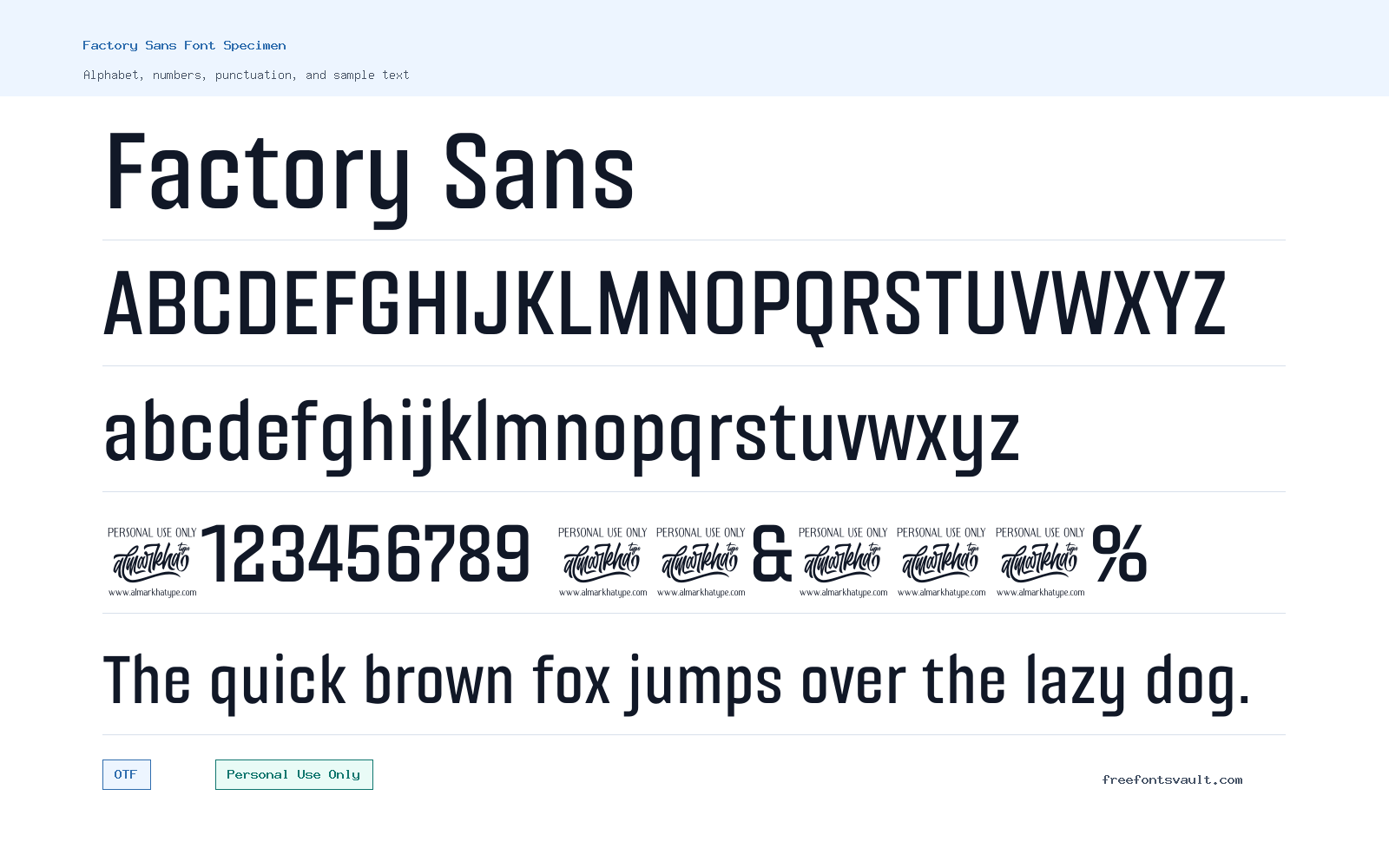
Font Specimen
Details
- Designer Rivo Dwi Adriansyah, Abdul Malik Wisnu, Almarkhatype Team
- License Personal use only
- Format OTF
- Variants 2 files available
Factory Sans font.
Factory Sans is a sans serif font family for personal projects, offered in Regular and Bold OTF styles. It is a practical choice to test when you need clean lettering for headings, posters, logo drafts, social graphics, or layout mockups, but its license should be checked carefully before any client or commercial use.
About Factory Sans
Factory Sans keeps the focus on straightforward sans serif lettering rather than decorative effects. Because the family includes both Regular and Bold weights, it can handle simple hierarchy in a design: use the Regular style for short supporting text and the Bold style for titles, labels, callouts, or stronger brand-style treatments. The name suggests an industrial or workmanlike feel, but the safest way to judge the font is to type your own words in the preview and look at the spacing, proportions, capitals, numerals, and punctuation. This is especially important for names, logos, packaging drafts, and poster headlines, where a few letters can change the whole tone of the design.
For designers, Factory Sans is best approached as a short-text display and branding test font rather than a fully verified body-text system. Try it first in the exact setting you plan to use: a logo wordmark, a large poster headline, a web hero title, a product label, or a social media graphic. Check whether the Bold style holds up at large sizes without feeling too heavy, and whether the Regular style remains clear at smaller sizes. If you are building a website mockup, test it in buttons, navigation labels, section headings, and card titles before using it for long paragraphs. Since the available files are OTF, the font is suitable for many desktop design apps, but web use may require conversion or a separate webfont license depending on the project and license terms.
Factory Sans can work well in clean layouts where the typography needs to stay direct. Pair it with a calm serif for editorial contrast, a neutral sans for longer reading, or a simple monospace if you want a more technical layout. Avoid pairing it with another strong display sans unless the two fonts have clearly different roles; two similar headline fonts can make a design look unfocused. In a logo draft, keep the wordmark simple at first, then test letter spacing, all caps versus title case, and black-and-white use before adding color or effects. For posters and banners, the Bold style may be useful for the main message while the Regular style can support dates, locations, or smaller details.
The main caution is licensing. Factory Sans is marked as Personal Use Only. That means it is appropriate for personal experiments, school work, unpaid mockups, or private design exploration, but not automatically cleared for business branding, paid client work, product packaging, advertising, monetized websites, merchandise, apps, or other commercial projects. If you want to use it in a public or revenue-related project, contact the rights holder or find the official license path before release.
Features
- Sans serif family with Regular and Bold styles for simple typographic hierarchy.
- OTF font files, suitable for testing in many desktop design and layout applications.
- Useful for short text such as headlines, logo drafts, labels, posters, and web mockup titles.
- Personal-use licensing needs careful attention before client, brand, product, or commercial work.
Best Uses
- Personal logo concepts and wordmark experiments
- Poster headlines and event-style graphics
- Social media quote cards, banners, and thumbnails
- Website hero titles, navigation mockups, and landing page drafts
- Packaging or label concepts for non-commercial presentation work
- Brand direction boards and typography exploration
License Information
Factory Sans is marked as Personal Use Only. Use it for personal design tests and non-commercial projects unless you obtain a proper commercial license or written permission from the rights holder. Do not assume it is cleared for paid client work, logos, products, merchandise, advertising, apps, or monetized websites.
Designer and Foundry
Factory Sans is credited to Rivo Dwi Adriansyah, Abdul Malik Wisnu, and the Almarkhatype Team.
Usage Tips
Preview the font with your exact project text before downloading. Test both Regular and Bold, check spacing in short words and long names, and view the design at the final size. For logos, try black-and-white first. For posters and web mockups, use Bold for the main headline and Regular for smaller supporting text. For long paragraphs, pair it with a font that is comfortable for reading and reserve Factory Sans for headings or short interface text.
FAQ
Is Factory Sans free for commercial use?
No commercial-use permission is confirmed. The license is marked Personal Use Only, so use it only for personal or non-commercial work unless you obtain a commercial license or written permission.
What styles are included with Factory Sans?
Factory Sans has Regular and Bold styles. Both are normal upright styles, which makes them useful for simple title-and-support typography.
What file format does Factory Sans use?
The font files are in OTF format. OTF fonts usually work in common desktop design tools, but web projects may need additional webfont files and proper licensing.
Can I use Factory Sans for a logo?
You can test it in personal logo drafts, but do not use it for a commercial brand, client logo, product identity, or public business mark unless the license owner allows that use.
Is Factory Sans good for body text?
It is safer to test Factory Sans first for headings, labels, and short text. For long reading, pair it with a proven text font and check readability at small sizes.
What should I check in the preview?
Type your real project words, including capitals, numbers, punctuation, and any unusual letter combinations. Compare Regular and Bold, then check whether spacing and weight still look balanced at your final size.
Family Styles
Want to browse beyond this family? Return to All Fonts for the main directory.



