Font Directory
Readant Thin
Readant Thin includes 2 downloadable variants for live preview and testing.
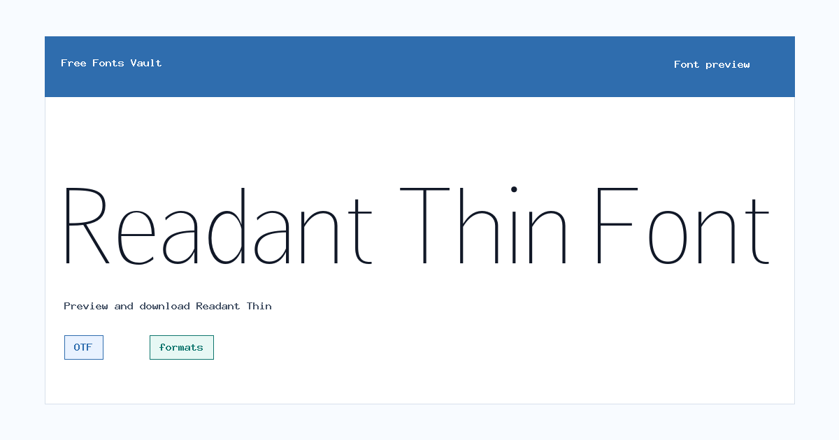
Styles in this family
Font Specimen

Details
- Designer Rastype
- License formats
- Format OTF
- Variants 2 files available
Readant Thin font.
Readant Thin is a light, humanist sans serif style from the Readant family, made for clean text with a soft modern feel. Its thin weight works best where space, restraint, and quiet hierarchy matter more than heavy impact.
About Readant Thin
Readant is described as a contemporary humanist sans serif with open letterforms, balanced proportions, and a warm, clear texture. This download focuses on the Thin weight, including an upright style and an oblique companion. The very light strokes give headings, labels, and short interface text a refined look, while the humanist structure keeps it from feeling too cold or mechanical.
Use Readant Thin for short headlines, app mockups, website sections, dashboard labels, portfolio layouts, and minimal branding tests. Because the weight is 100, avoid using it for long paragraphs, very small text, or low-contrast color combinations. Try it at larger sizes in the preview first, then test the oblique style for secondary labels, captions, or gentle emphasis.
A practical way to use this cut is to let it handle the lightest layer of a layout. It can set section labels, quiet hero subtitles, product names, or thin menu text while a heavier companion font carries paragraphs and calls to action. That keeps the page readable without losing the refined Readant look.
Features
- Thin 100 weight with upright and oblique OTF files
- Humanist sans serif style with open forms and clean spacing
- Works best with generous contrast, open spacing, and short text
Best Uses
- Minimal website headings and UI labels
- App screens, dashboards, portfolios, and short display text
License Information
Treat this download as personal-use or demo-use only. The license field is not reliable, and Readant is also sold through official font marketplaces. For client work, business use, apps, websites, logos, or products, get a proper license from an official seller before using the font publicly.
Designer and Foundry
Readant is credited to Muhammad Taufik and Rastype Studio in marketplace listings. This page names Rastype in the font data, so use the official license package if you need exact credit for legal or client documentation.
Usage Tips
Thin fonts need enough size and contrast. Use Readant Thin for short text, test it on both light and dark backgrounds, and switch to a heavier Readant style if body text or small UI copy looks too faint. Avoid placing it over busy photos unless the text has a clear backing color.
FAQ
Is Readant Thin free for commercial use?
No commercial-use permission is confirmed. Use it for personal testing only unless you purchase or obtain a valid commercial license.
What files are included?
The download includes OTF files for Readant Thin upright and Readant Thin Oblique.
What kind of font is Readant Thin?
It is a thin humanist sans serif style with a clean, modern look and open letterforms.
Where does Readant Thin work best?
It works best in short headings, interface labels, app mockups, dashboard screens, and minimal web layouts. It is not ideal for long body text at small sizes.
Similar Fonts
Want to browse beyond this family? Return to All Fonts for the main directory.



