Font Directory
Readant Thin Cond
Readant Thin Cond includes 2 downloadable variants for live preview and testing.
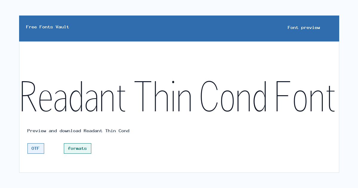
Styles in this family
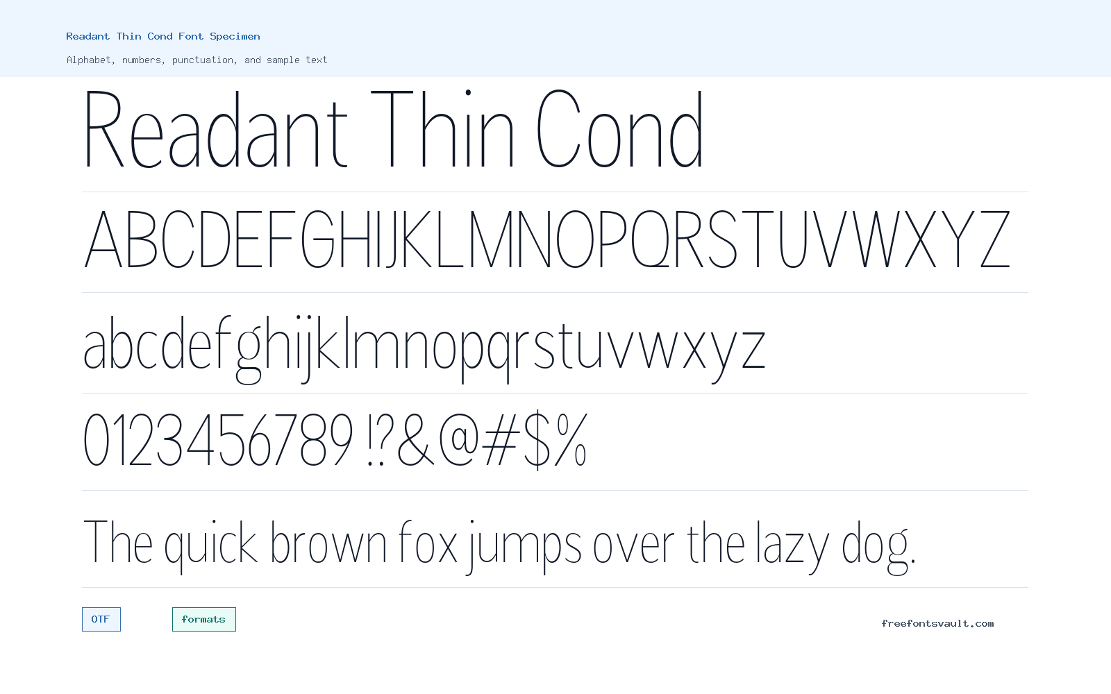
Font Specimen
Details
- Designer Rastype
- License formats
- Format OTF
- Variants 2 files available
Readant Thin Cond font.
Readant Thin Cond is a narrow, very light sans serif style from the Readant family. Its slim strokes and condensed width make it useful when you want a clean modern look without taking up much horizontal space.
About Readant Thin Cond
Readant is a contemporary humanist sans serif with open letterforms, balanced proportions, and careful spacing. This Thin Condensed cut keeps that clean sans structure but uses a weight 100 design, giving text a delicate, space-saving feel. The file set includes an upright OTF and an oblique OTF, so you can test both straight and slanted text in previews.
Because this is a thin condensed style, it works best in larger sizes where the strokes remain clear. Try it for headings, short labels, poster text, editorial accents, UI mockups, portfolio layouts, or branding drafts. Avoid using it for long paragraphs, small body text, or low-contrast backgrounds, where the fine strokes may become hard to read.
Features
- Thin condensed sans serif style with weight 100
- Upright and oblique OTF font files
- Narrow proportions for compact headlines and labels
- Clean humanist sans direction based on Readant family research
Best Uses
- Minimal headings and title text
- Website and app interface mockups
- Posters, covers, and editorial accents
- Branding drafts that need a slim modern sans
- Short labels where horizontal space is limited
License Information
Treat this download as personal-use or demo-use only. The license metadata is not reliable, and the local category is Personal Use. For client work, business use, products, apps, websites, or any commercial project, get a proper license from an official marketplace or the rights holder.
Designer and Foundry
Readant is credited to Muhammad Taufik and Rastype Studio in marketplace listings. This page names Rastype in the font data, so use the official license package if you need exact credit for legal or client documentation.
Usage Tips
Test Readant Thin Cond with your real words before using it in a layout. It is strongest for short text at medium to large sizes. Increase letter spacing slightly if all-caps text feels tight, and use strong background contrast to keep the thin strokes readable. For dense navigation or small labels, compare it with a heavier Readant style before deciding.
FAQ
Is Readant Thin Cond free for commercial use?
No commercial-use permission is confirmed. Use it for personal testing only unless you obtain a proper commercial license.
What font format is included?
The font files are in OTF format.
Does Readant Thin Cond include an italic style?
It includes an oblique style, which gives you a slanted companion to the upright Thin Condensed font.
What is Readant Thin Cond best used for?
It is best for short display text such as headings, labels, posters, UI concepts, and clean editorial accents.
Can I use it for body text?
It is not the best choice for long body text. The thin strokes and condensed width are easier to read in short text and larger sizes.
Similar Fonts
Want to browse beyond this family? Return to All Fonts for the main directory.



