Font Directory
Maximo
Maximo includes 1 downloadable variant for live preview and testing.
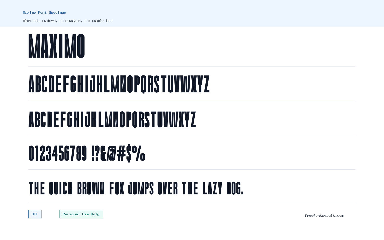
Font Specimen
Details
- Designer Nurinto
- Foundry Almairatype Studio
- License Personal use only
- Format OTF
- Variants 1 file available
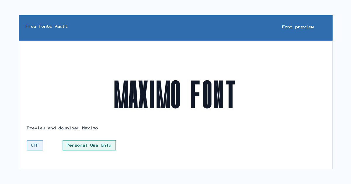
Maximo font.
Maximo is a bold, condensed sans serif font with a tall, compact look that works best when you need strong headline text in a small amount of space.
About Maximo Font
Maximo has a narrow, upright structure with heavy strokes and very little visual softness. In the preview, the letters appear tall and tightly built, with a strong vertical rhythm that gives words a poster-like presence. The Regular style is not light or neutral in the usual body-text sense; it reads more like a display face made for short, direct wording. The uppercase letters feel especially forceful, while the lowercase keeps the same condensed shape and dense weight. This makes Maximo a practical choice for titles, cover text, social graphics, logo drafts, packaging concepts, and bold web mockup headings where the words need to stand out quickly.
Because the design is condensed and dark, Maximo is strongest in short lines rather than long paragraphs. Try it for one-word logos, event posters, sports-style layouts, music artwork, label mockups, and large hero text. It can also work for navigation labels or section headers if you give the letters enough spacing and keep the text brief. At smaller sizes, the heavy narrow shapes can begin to close up, so test your exact words in the preview before using it in a final layout. If your design needs a full reading font, pair Maximo with a more open sans serif or a plain serif for body copy. Let Maximo handle the attention-grabbing part, and let the companion font handle the reading.
For logo work, Maximo can be useful when you want a compact wordmark with a strong vertical feel. The narrow letterforms help long names fit into banners, badges, thumbnails, and poster headers without losing too much impact. It is also a good font to test in black-and-white layouts because the weight carries well without relying on effects. If you add outlines, shadows, gradients, or texture, keep the treatment simple so the letter shapes do not become crowded.
In web and app mockups, Maximo is better as a display accent than a full interface font. Use it for campaign titles, landing-page hero text, sale banners, card headers, or editorial section names. Increase tracking slightly when using all caps, especially if the text contains many narrow letters side by side. Leave extra line height if you stack multiple words. The font can look powerful in centered compositions, but it also works well aligned left with generous white space around it.
Features
- Bold condensed sans serif style with tall, narrow letterforms
- Regular OTF font file with upright, non-italic styling
- Heavy display weight suited to short headlines and compact title layouts
- Strong uppercase presence for posters, banners, thumbnails, and logo drafts
- Includes letters, numbers, and common punctuation visible in the font file
- Best used at medium to large sizes where the condensed shapes stay readable
Best Uses
- Poster headlines and event graphics
- Logo concepts and compact wordmarks
- Album covers, sports graphics, and bold social posts
- Website hero text, landing-page banners, and section titles
- Packaging mockups, labels, badges, and display typography
- Short editorial titles where a narrow font helps save horizontal space
License Information
Maximo is marked as Personal Use Only. Use it for personal projects, previews, and non-commercial experiments unless you have permission or a commercial license from the rights holder. Do not assume it is free for client work, merchandise, advertising, business branding, apps, or monetized content.
Designer and Foundry
Maximo is credited to Nurinto, with Almairatype Studio listed as the foundry.
Usage Tips
Use Maximo for short, high-impact text. For all-caps settings, try adding a little letter spacing so the narrow forms do not feel too tight. Avoid long paragraphs, small captions, and dense UI text. Pair it with a clean, open sans serif such as a neutral grotesk for modern layouts, or with a readable serif if you want a stronger contrast between headline and body copy.
FAQ
Is Maximo free for commercial use?
No. The license information marks Maximo as Personal Use Only. For commercial projects, get the proper license or written permission from the rights holder.
What kind of font is Maximo?
Maximo is a bold condensed sans serif display font. It has tall, narrow letters and a heavy upright style, making it better for headlines than long reading text.
What file format is included?
The listed font file is in OTF format, which is commonly supported by modern design apps and operating systems.
Can I use Maximo for a logo?
You can test it in personal logo concepts, but commercial logo use needs a proper commercial license. Its condensed weight can work well for compact wordmarks and bold title marks.
Is Maximo good for body text?
It is not ideal for body text. The letters are narrow and heavy, so readability is better in short headings, posters, banners, and display settings.
What should I pair with Maximo?
Pair it with a simpler, more open font for body copy. A neutral sans serif keeps the layout modern, while a readable serif can add contrast without competing with the headline.
Should I use Maximo in all caps?
All caps can suit the font well, especially for posters and labels. Add a little tracking if the words look too tight, and test the result at the final size.
Similar Fonts
Want to browse beyond this family? Return to All Fonts for the main directory.



