Font Directory
Moving
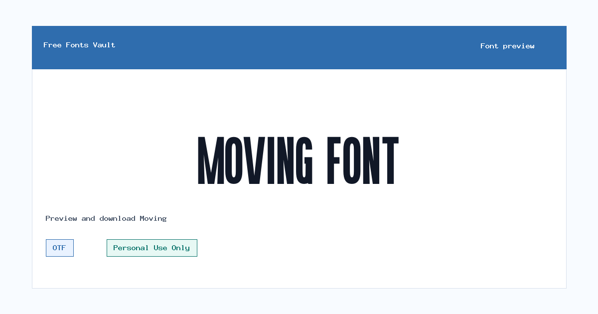
Moving includes 1 downloadable variant for live preview and testing.
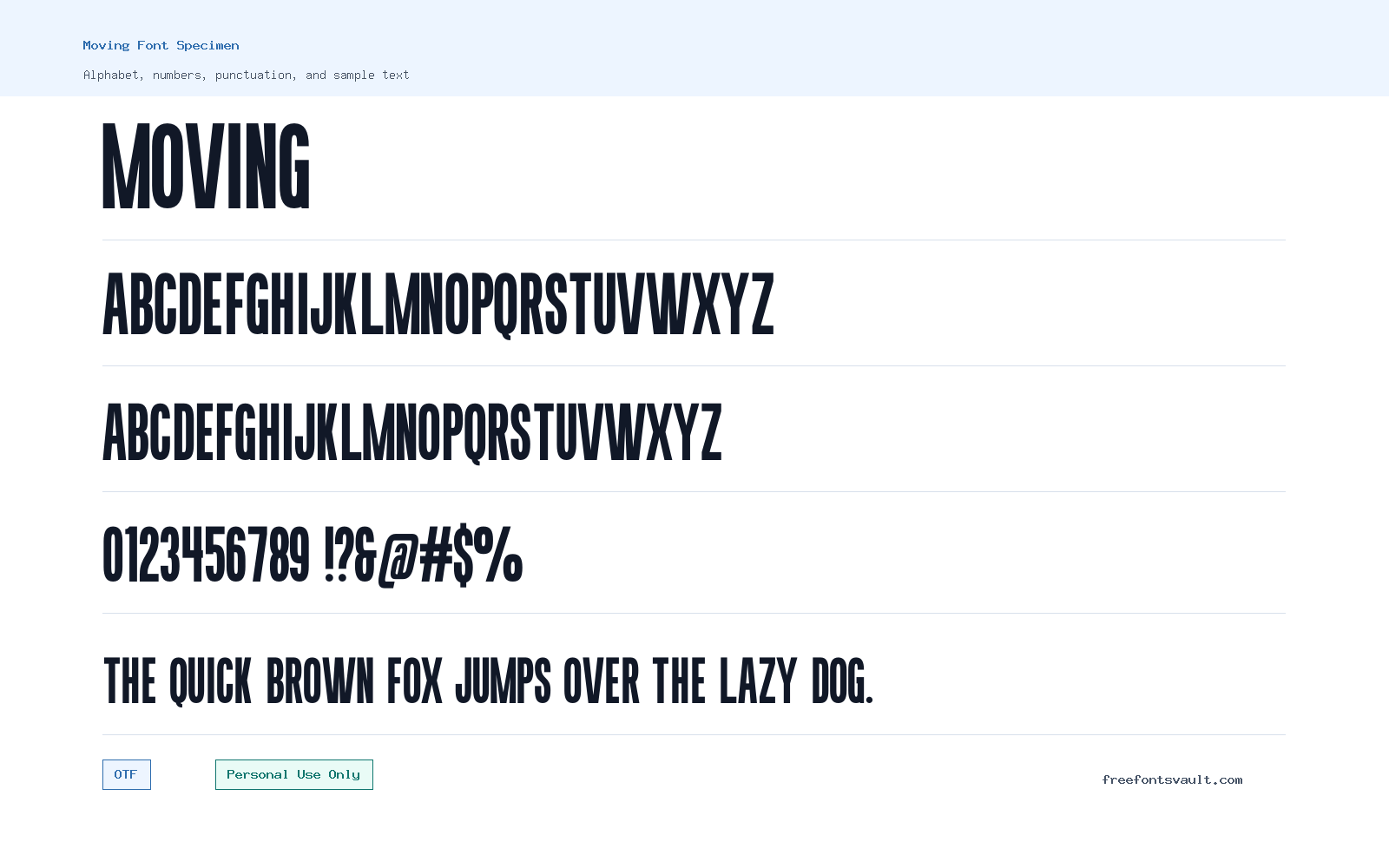
Font Specimen
Details
- Designer Nurinto
- Foundry Almairatype Studio
- License Personal use only
- Format OTF
- Variants 1 file available
Moving font.
Moving is a sans serif font family with a regular OTF style, suited to visitors who want a clean display typeface to test in titles, logos, posters, and web mockups. It is marked for Personal Use Only, so treat it as a try-before-you-license font for non-commercial projects.
About Moving Font
Moving is a normal-weight sans serif font designed by Nurinto and associated with Almairatype Studio. The available style is Regular, with an OTF file format and a 400 weight setting. Because the family name is short and direct, it can work well in design tests where the type itself needs to feel simple, modern, and easy to place. Try it first in the preview box with the exact words you plan to use, especially if your design depends on a short brand name, a headline, or a poster title.
For logo work, Moving is best approached as a starting point for personal concept drafts rather than a finished commercial brand asset. Set a few different letter combinations, check spacing around rounded and straight forms, and see whether the word still reads clearly when scaled down. In posters or social graphics, test it with short lines instead of long paragraphs. A regular sans serif style can look tidy in headings, labels, mockup navigation, and simple promotional layouts, but readability depends on size, spacing, contrast, and the background you place it on.
If you are building a web mockup, Moving can be useful for hero headings, section titles, menu experiments, app screens, or landing-page concepts. Since only one regular style is listed, plan your hierarchy with size, color, spacing, and weight contrast from another typeface. Avoid relying on Moving alone for a full design system unless you only need a single display style. Pair it with a neutral text face for body copy, such as a readable humanist or grotesque sans serif, and keep the supporting font quieter so the headline treatment does not feel crowded.
The practical way to judge Moving is to preview real content, not placeholder text. Type a product name, event title, YouTube thumbnail phrase, poster headline, or menu label. Look for even rhythm, clear word shape, and comfortable spacing. If the design uses all caps, compare it with title case. If the font will sit over photography, test it on both light and dark areas. For print-style layouts, increase tracking slightly if the letters feel tight, but do not stretch the font horizontally or vertically because that can weaken the original proportions.
Features
- Regular sans serif style in OTF format
- Normal 400 weight suitable for headlines, mockups, and short display text
- Designed by Nurinto and associated with Almairatype Studio
- Simple single-style family, easy to test in previews and concept layouts
- Marked as Personal Use Only
Best Uses
- Personal logo concepts and brand-name experiments
- Poster titles and event graphics
- Website hero headings and landing-page mockups
- Social media graphics, thumbnails, and short captions
- App interface mockups, menus, and clean section labels
- Typography practice, school projects, and non-commercial design drafts
License Information
Moving is marked as Personal Use Only. Use it for personal tests, previews, drafts, and non-commercial design work unless you have a separate commercial license or direct permission from the rights holder. Do not use it for client branding, paid products, advertising, merchandise, apps, websites, or business materials without confirming commercial-use rights.
Designer and Foundry
Moving is credited to Nurinto, with Almairatype Studio listed as the foundry. No designer website or license page URL is listed for the font details, so commercial licensing should be confirmed through the creator or foundry before professional use.
Usage Tips
Use Moving where a clean sans serif headline or short text setting is needed. Start with larger sizes, then test the same words at small sizes to check clarity. For pairings, use a calm body font and let Moving handle the display role. Keep line lengths short, add spacing only when needed, and avoid using it for dense paragraphs unless your own readability test confirms it works.
FAQ
Is Moving font free for commercial use?
No. Moving is marked as Personal Use Only. You should not use it in commercial work unless you obtain a proper commercial license or permission from the rights holder.
Who designed the Moving font?
Moving is credited to Nurinto, with Almairatype Studio listed as the foundry.
What font format is available for Moving?
The available Moving font file is in OTF format.
What style of font is Moving?
Moving is listed as a regular, normal-weight sans serif font. It is best tested in short text such as titles, logo concepts, posters, and interface mockups.
Can I use Moving for a logo?
You can test it in personal logo concepts, but commercial logo work needs proper licensing. Always confirm rights before using it for a real brand, client, product, or business.
Is Moving good for body text?
Moving is more practical for short display use than long reading. For paragraphs, pair it with a dedicated text font and keep Moving for headings or labels.
What should I check in the preview before downloading?
Preview your real project words, check uppercase and title case, test spacing, and view the font at both large and small sizes. This helps you see whether the letters stay clear in your layout.
Similar Fonts

Want to browse beyond this family? Return to All Fonts for the main directory.



