Font Directory
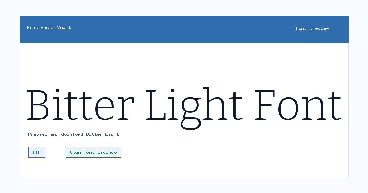
Bitter Light
Bitter Light includes 1 downloadable variant for live preview and testing.
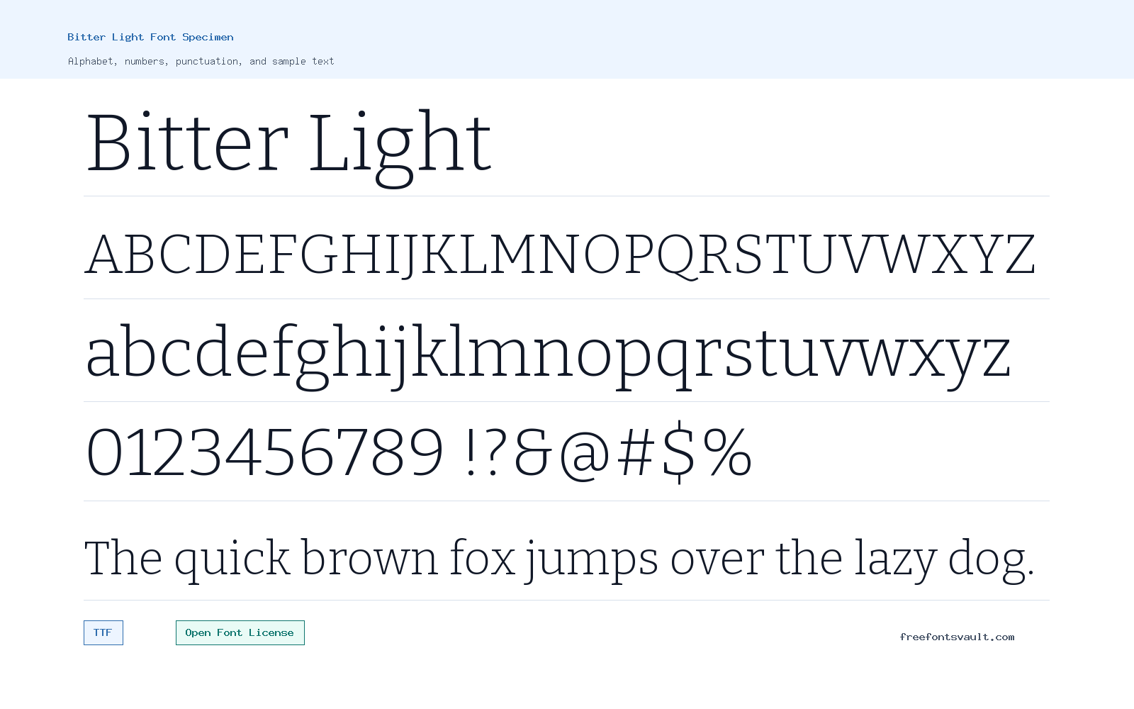
Font Specimen
Details
- Designer Sol Matas, and Bitter project Authors
- Foundry Sol Matas
- License Open Font License
- License URL scripts.sil.org/OFL
- Format TTF
- Variants 1 file available
Bitter Light font.
Bitter Light is a light serif font with a clean, readable structure and a softer weight than the regular Bitter style. It is a good choice when you want a serif look that feels clear without becoming heavy on the page.
About Bitter Light
Bitter Light uses a 300 weight, giving the letters a slimmer appearance while keeping the familiar serif rhythm. The lighter stroke makes it useful for elegant headings, short introductions, pull quotes, and display text where a full-weight serif might feel too strong. Because it is still a serif, it keeps a traditional reading texture, but the light weight gives it a more open feel.
Use the preview tool to test Bitter Light at the size you plan to use. Light fonts can look refined in large text, but they may lose contrast at very small sizes or on low-resolution screens. For body text, try it with generous line spacing and check readability carefully. For headings, title blocks, editorial layouts, and calm branding drafts, it can work well when paired with a simple sans serif or a darker serif weight for contrast.
Features
- Light 300-weight serif style for softer headings and display text
- TTF font file format for broad desktop and web design compatibility
Best Uses
- Editorial headings, pull quotes, and article intros
- Clean website titles, posters, and refined short text
License Information
Bitter Light is licensed under the SIL Open Font License, Version 1.1. This generally allows use, modification, and redistribution under the OFL terms, but you should read the full license before using it in a project.
Designer and Foundry
Bitter Light is credited to Sol Matas and the Bitter project Authors, with Sol Matas listed as the foundry.
Usage Tips
Test Bitter Light in the preview before downloading, especially for small text. Its light weight is best used where the font has enough size and contrast to stay clear. Light weights need careful contrast. Bitter Light can look polished in headings and quiet editorial layouts, but it may become faint on low-contrast backgrounds or small mobile screens. Test paragraph-sized text before committing, and consider a heavier Bitter weight if readability is more important than delicacy. It can be especially useful for refined titles, captions, and introductions where the surrounding design is simple enough to let the lighter strokes remain visible.
FAQ
What kind of font is Bitter Light?
Bitter Light is a light-weight serif font. The available file is a normal-style TTF with a 300 weight.
Is Bitter Light free for commercial use?
The font is licensed under the SIL Open Font License 1.1. That license commonly permits commercial use, but you should review the OFL terms to make sure your planned use follows the license.
What is Bitter Light best used for?
It is best for headings, intros, pull quotes, posters, and other short text where a lighter serif style can stay readable.
Can I use Bitter Light for body text?
You can test it for body text, but light fonts need enough size, spacing, and contrast. Check the preview carefully before using it for long reading.
What format is included?
The available font file is Bitter-Light.ttf in TTF format.
Family Styles
Want to browse beyond this family? Return to All Fonts for the main directory.



