Font Directory
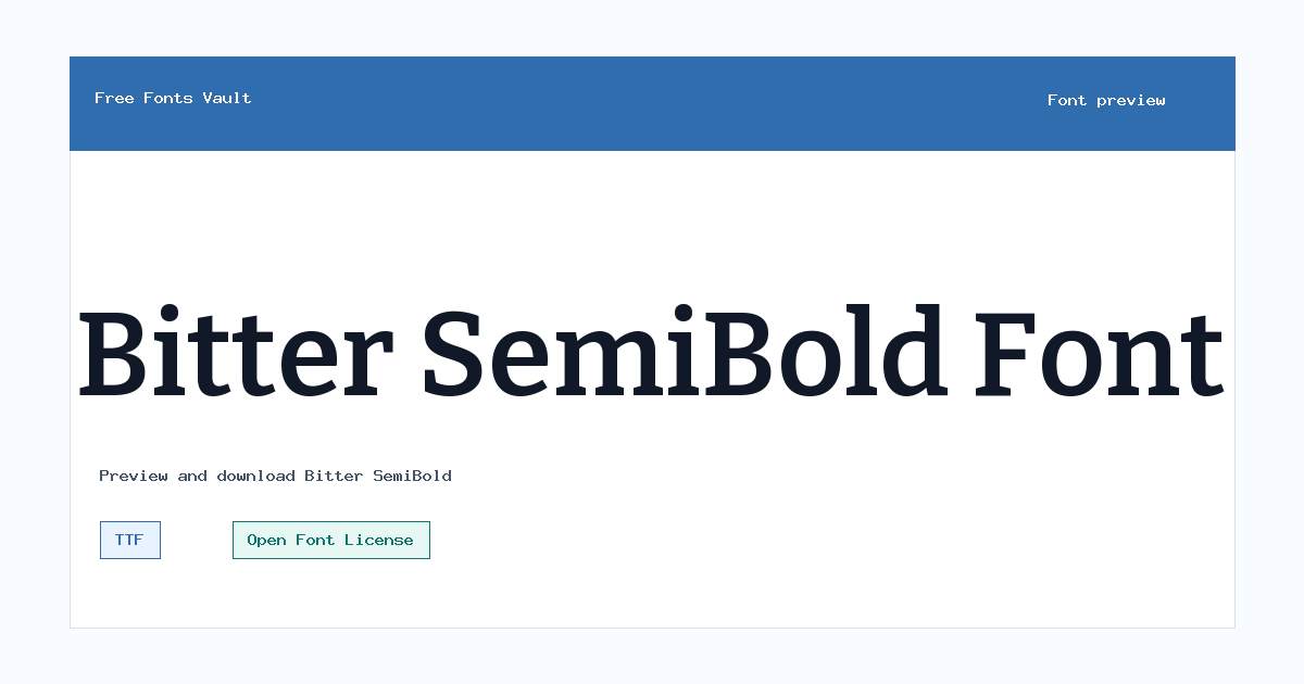
Bitter SemiBold
Bitter SemiBold includes 1 downloadable variant for live preview and testing.
Font Specimen
Details
- Designer Sol Matas, and Bitter project Authors
- Foundry Sol Matas
- License Open Font License
- License URL scripts.sil.org/OFL
- Format TTF
- Variants 1 file available
Bitter SemiBold font.
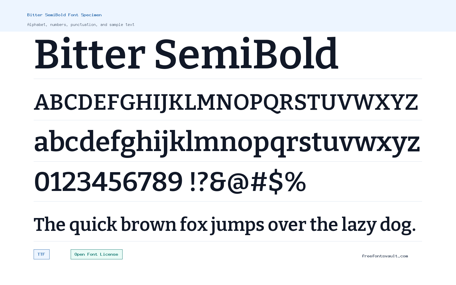
Bitter SemiBold is a strong serif font with a heavier text weight, useful when you want clear emphasis without moving into a full bold style.
About Bitter SemiBold
Bitter SemiBold belongs to the Bitter family and is offered here as a TTF font file. Its 700 weight gives headings, labels, and short blocks of text a firmer presence than a regular serif. The style is normal rather than italic, so it keeps a straightforward reading rhythm while adding more visual weight.
Use Bitter SemiBold when you need a serif that can stand out in titles, section headings, pull quotes, navigation labels, or highlighted text. In longer paragraphs, test it carefully in the preview first: a semibold weight can feel dense if used for every line. It usually works best as a companion weight for emphasis, especially beside a lighter regular text face from the same family or another simple body font.
Bitter SemiBold sits between a sturdy reading serif and a stronger display style. It has enough weight for headings, card titles, pull quotes, and emphasized labels, while still feeling more text-friendly than an ultra-heavy slab. That balance makes it useful when a design needs authority without losing readability.
Features
- TTF font file for broad desktop and web design compatibility
- Normal serif style with a 700 weight for stronger emphasis
Best Uses
- Headlines, subheadings, and article section titles
- Pull quotes, callouts, buttons, labels, and short display text
License Information
Bitter SemiBold is licensed under the SIL Open Font License, Version 1.1. You can use it under the terms of that license, but check the OFL text if you plan to modify, redistribute, bundle, or embed the font in a product.
Designer and Foundry
The designer is listed as Sol Matas, with the Bitter project Authors also credited. The foundry is listed as Sol Matas.
Usage Tips
Try Bitter SemiBold in the preview with your real words before downloading. It is best for short text where the heavier serif weight adds structure. For body copy, compare it at smaller sizes and with normal line spacing to make sure the page still feels easy to read. Try Bitter SemiBold for section titles, article headers, and highlighted phrases. Keep paragraphs in a lighter Bitter style or another readable text font so the SemiBold weight can stand out clearly.
FAQ
What format is Bitter SemiBold?
The available font file is in TTF format.
What weight is Bitter SemiBold?
The font is listed with a 700 weight, which is commonly used for bold or semibold emphasis depending on the family design.
Is Bitter SemiBold italic?
No. The listed style is normal, not italic.
Can I use Bitter SemiBold for commercial work?
The font is licensed under the SIL Open Font License 1.1. That license is generally intended for broad use, but you should read the license terms for your specific use, especially for redistribution, modification, or bundling.
What is Bitter SemiBold best used for?
It is a good choice for headings, short callouts, labels, buttons, and other places where a serif needs more weight than regular text.
What makes Bitter SemiBold useful?
It gives headings more presence than regular text while keeping the practical serif character that makes the Bitter family easy to scan.
Family Styles
Want to browse beyond this family? Return to All Fonts for the main directory.



