Font Directory
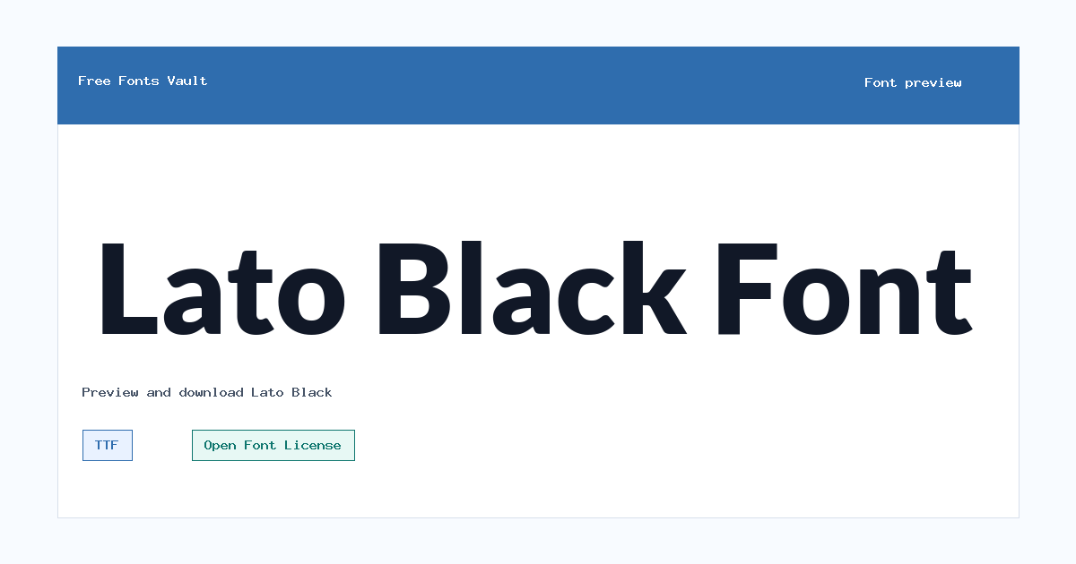
Lato Black
Lato Black includes 2 downloadable variants for live preview and testing.
Styles in this family
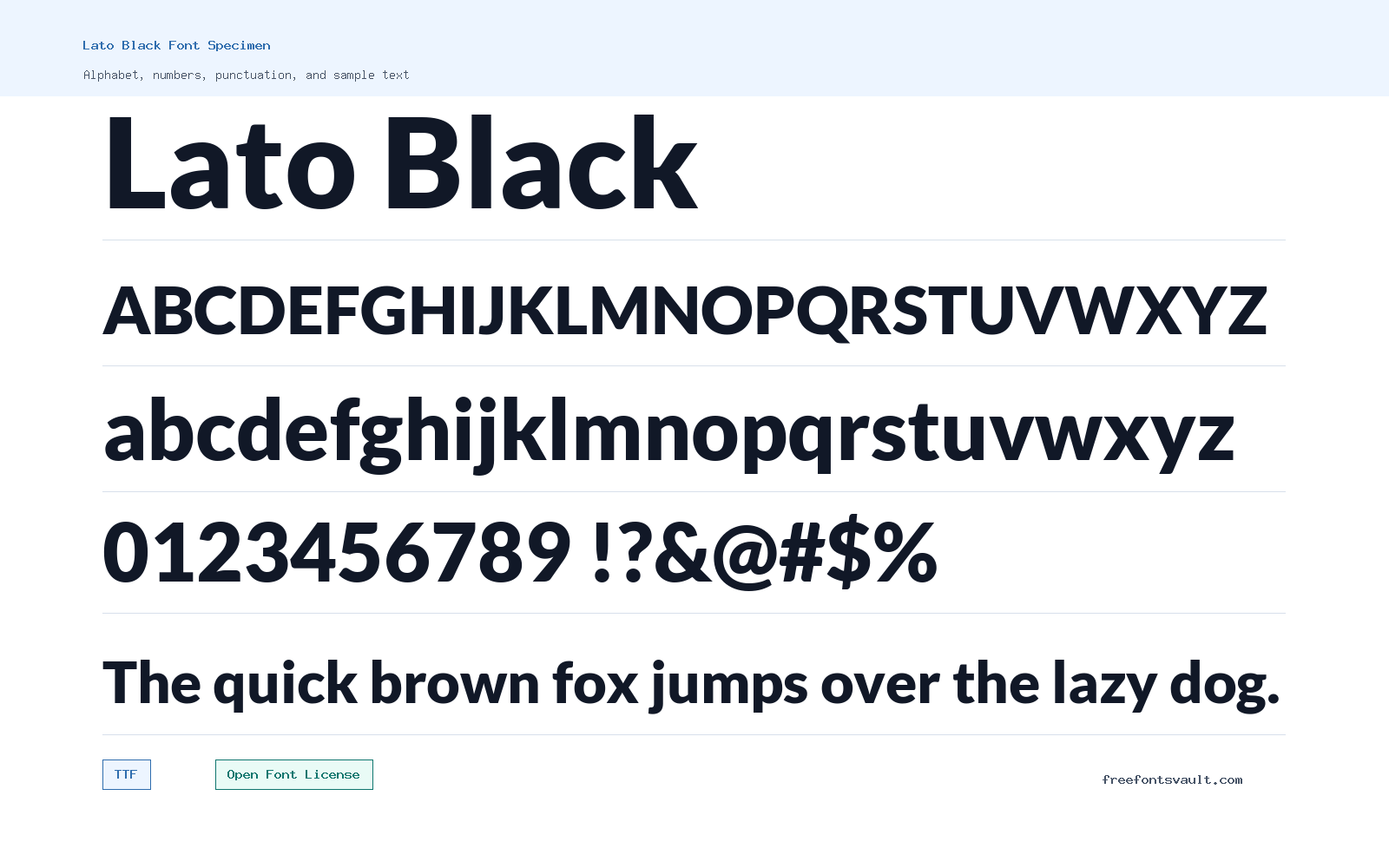
Font Specimen
Details
- Designer Lukasz Dziedzic
- Foundry tyPoland Lukasz Dziedzic
- License Open Font License
- License URL scripts.sil.org/OFL
- Format TTF
- Variants 2 files available
Lato Black supplies upright and italic heavy styles with approachable humanist details for strong headlines, campaign graphics, emphasis text, and bold interface labels.
Lato Black is a heavy 900-weight style from the Lato family, made for strong headlines, bold labels, and short text that needs clear visual weight.
About Lato Black
Lato Black has the solid presence you expect from a black-weight sans serif, with a clean normal style and a matching italic style. Its heavy strokes make it useful when the text needs to stand out quickly, especially in titles, banners, navigation labels, and compact display settings.
Use the preview tool to test real words, not only sample alphabets. At this weight, Lato Black works best in short bursts rather than long paragraphs. Try it at different sizes, check spacing between letters, and compare the regular and italic styles if you need emphasis without changing the whole design.
For web or social graphics, compare Lato Black at both desktop and mobile sizes. Heavy weights can look excellent in a hero headline but too dense in smaller cards. Use the italic style for a short accent, not as the main reading style.
Features
- Includes TTF files for Lato Black regular and Lato Black Italic
- Heavy 900 weight suited to headlines, display text, and short emphasis
Best Uses
- Bold website headings, hero titles, and section headers
- Posters, labels, buttons, social graphics, and short display text
License Information
Lato Black is licensed under the SIL Open Font License, Version 1.1, with the Reserved Font Name "Lato." Review the OFL terms if you plan to modify, rename, bundle, or redistribute the font.
Designer and Foundry
The font is credited to Lukasz Dziedzic, with tyPoland Lukasz Dziedzic listed as the foundry.
Usage Tips
For best results, use Lato Black where a strong heading or short callout is needed. Avoid setting long body copy in this weight, because dense black strokes can reduce reading comfort in paragraphs. Pair it with a lighter Lato style or another simple text face for longer reading sections. For print pieces, check Lato Black after exporting the design, not only inside the editor. Very heavy letters can fill in at small sizes, so keep important information large enough and leave lighter fonts for secondary copy. If a headline wraps to two lines, check the line break carefully. Lato Black has enough weight to command attention, but awkward wrapping can make a short title feel heavier than intended.
FAQ
What file formats are included for Lato Black?
The available files are TTF fonts: Lato-Black.ttf and Lato-BlackItalic.ttf.
Is Lato Black a bold font?
Yes. The listed weight is 900, which is commonly used for black or extra-heavy display styles.
Does Lato Black include an italic style?
Yes. The available variants include a normal Black style and a Black Italic style.
Can I use Lato Black for commercial work?
The license listed is the SIL Open Font License 1.1. That license generally allows broad use, but you should review the OFL terms, especially if you modify, rename, or redistribute the font.
What is Lato Black best used for?
It is best for short, high-impact text such as headings, posters, labels, buttons, and social media graphics rather than long paragraphs.
Source, testing, and related tools
Test Lato Black above with the exact words, numerals, and punctuation required by your project. The parent family is documented in the official Google Fonts source record and the corresponding SIL Open Font License record. Build a treatment in the Font Generator, compare possible companions in the Font Pairing Studio, or browse fonts by style.
Family Styles
Want to browse beyond this family? Return to All Fonts for the main directory.



