Font Directory
Lato Light
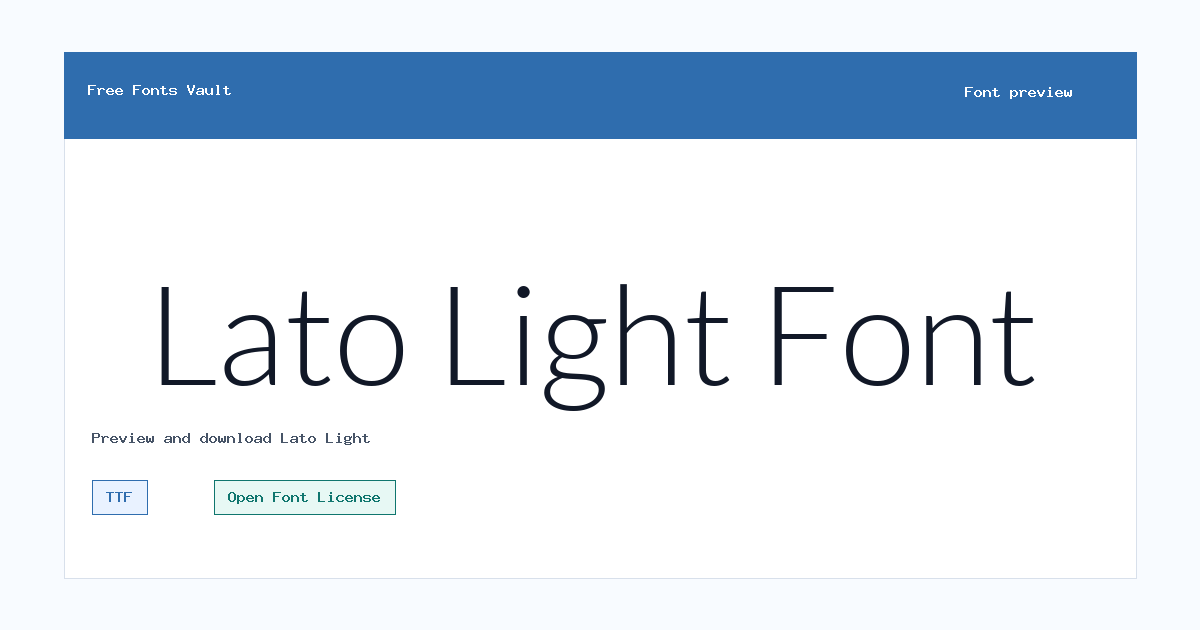
Lato Light includes 2 downloadable variants for live preview and testing.
Styles in this family
Font Specimen
Details
- Designer Lukasz Dziedzic
- Foundry Lukasz Dziedzic
- License Open Font License
- License URL scripts.sil.org/OFL
- Format TTF
- Variants 2 files available
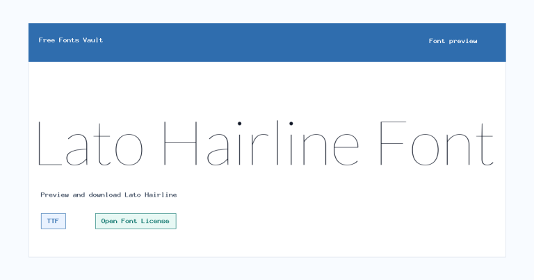
Lato Light font.
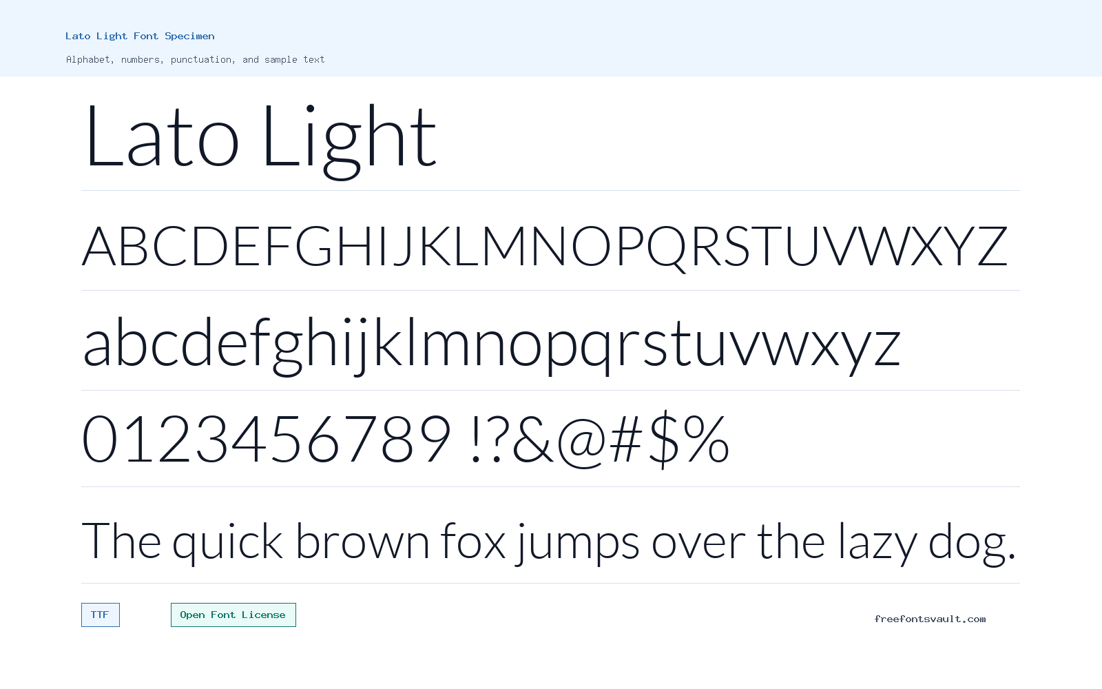
Lato Light is a thin, clean sans serif style from the Lato family. It gives text a lighter voice while keeping the straightforward structure that makes Lato useful for screen and print previews.
About Lato Light
Lato Light uses a 300 font weight, so it feels open and restrained rather than heavy. The normal style works well for headings, short descriptions, captions, interface labels, and clean editorial layouts where you want a calm sans serif look. Because it is a light cut, it is best tested at the exact size you plan to use; very small text or low-contrast colors can make thin strokes harder to read.
The download includes both upright and italic TTF files. The italic is useful for emphasis, quotes, bylines, or short supporting text, while the upright style is better for main display lines. Try it in the preview with your own words, especially if you plan to use it for long titles, navigation, or body copy. Pairing it with a regular or bold weight from the same family can help create clearer hierarchy.
Lato Light includes upright and italic TTF files, so it is best tested as a pair. Use the upright style for clean titles or labels, then try the italic file for captions, quotes, or short emphasis where a softer voice helps.
Features
- Light 300-weight sans serif style
- Includes upright and italic TTF files
Best Uses
- Clean headings, captions, and short editorial text
- Minimal web layouts, UI labels, quotes, and lightweight branding drafts
License Information
Lato Light is licensed under the SIL Open Font License, Version 1.1. The license text also includes the Reserved Font Name "Lato," so keep the OFL terms in mind if modifying or redistributing the font.
Designer and Foundry
Lato Light is credited to Lukasz Dziedzic, with tyPoland Lukasz Dziedzic named in the copyright and license information.
Usage Tips
Use Lato Light where a refined, low-weight sans serif is needed, but avoid relying on it for tiny text or pale color combinations. For stronger readability, increase size, improve contrast, or pair it with a heavier Lato style. Light weights need contrast. Avoid placing Lato Light on busy backgrounds or tiny mobile labels unless the preview stays easy to read.
FAQ
Is Lato Light free to use?
The font is licensed under the SIL Open Font License 1.1. That generally allows broad use, but redistribution, modification, and naming must follow the OFL terms, including the Reserved Font Name notice.
What files are included with Lato Light?
The available files are Lato-Light.ttf and Lato-LightItalic.ttf, both in TrueType format.
What weight is Lato Light?
Lato Light is listed as weight 300, which is a light style. It is thinner than regular text weight and works best when there is enough size and contrast.
Can I use Lato Light for body text?
You can test it for body text, but light fonts can become harder to read at small sizes. For long paragraphs, compare it with a regular weight before choosing.
Family Styles
Want to browse beyond this family? Return to All Fonts for the main directory.



