Font Directory
Tusker Grotesk 5500 Medium
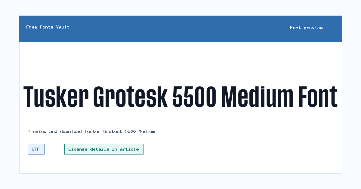
Tusker Grotesk 5500 Medium includes 1 downloadable variant for live preview and testing.
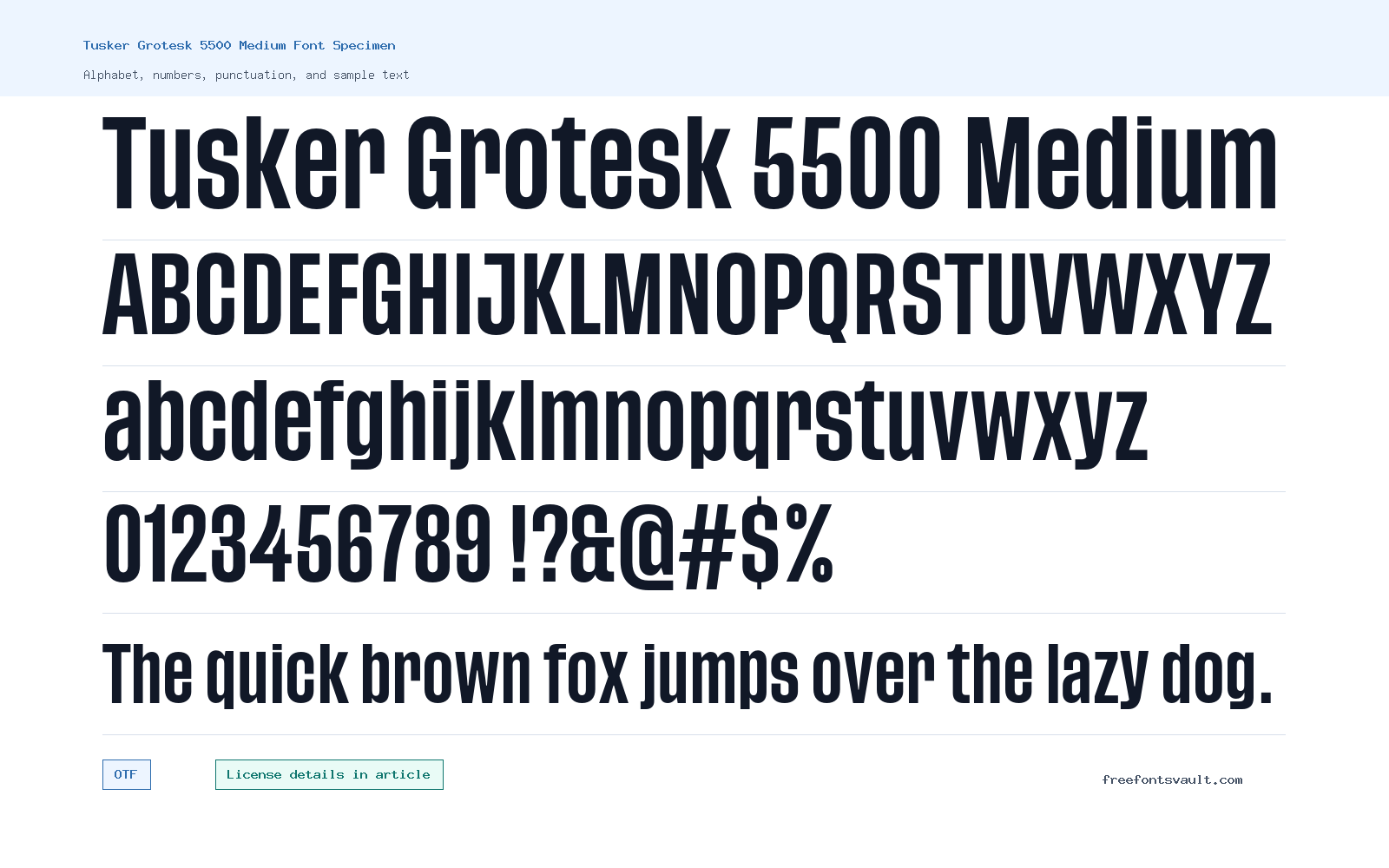
Font Specimen
Details
- Designer Lewis McGuffie
- Foundry Lewis McGuffie
- Format OTF
- Variants 1 file available
Tusker Grotesk 5500 Medium font.
Tusker Grotesk 5500 Medium is a normal-style OTF font with a medium weight, useful for visitors who want a strong grotesk look without moving into an extra-heavy style.
About Tusker Grotesk 5500 Medium
Tusker Grotesk 5500 Medium sits in the middle of the weight range, with the supplied font file marked as weight 500. That makes it a practical choice when you want text to feel firm and direct, but not as dense as a black or condensed display cut. Use the preview box to test short words, names, headings, numbers, and punctuation, because grotesk styles can change character quickly depending on the text size and spacing.
This font is best approached as a display and short-copy option first. Try it for title treatments, poster-style lines, navigation labels, section headers, packaging mockups, and bold website hero text. For longer paragraphs, test carefully at the actual size you plan to use. A medium grotesk can look clean in short blocks, but it may feel too forceful or tight if used for long reading sections. If your design needs body copy, pair it with a quieter serif or neutral sans font and let Tusker Grotesk 5500 Medium handle the main visual emphasis.
Features
- OTF font file format for broad desktop design-app support.
- Normal style with a 500 medium weight, suitable for headline and short-text testing.
- Single regular variant, which keeps font selection simple for quick previews.
- Grotesk-style presentation that works best when spacing, case, and size are tested in the live preview.
Best Uses
- Headlines, hero text, and poster-style typography.
- Logos or wordmarks in personal mockups, with license review before any real brand use.
- Short labels, menus, and section titles where a firm sans-serif tone is useful.
- Editorial graphics, social images, and display layouts that need a compact, direct voice.
License Information
The license field for Tusker Grotesk 5500 Medium is not stated here. Do not assume commercial-use permission from the download alone. If you plan to use it in client work, branding, products, advertising, apps, templates, merchandise, or any paid project, confirm the license with the designer or an official seller first.
Designer and Foundry
Tusker Grotesk 5500 Medium is credited to Lewis McGuffie, with the foundry also listed as Lewis McGuffie.
Usage Tips
Start by previewing your exact wording in uppercase, lowercase, numbers, and punctuation. Check the spacing at both large and small sizes, then compare it beside any body font you plan to use. For web or app work, confirm that your license allows that use and test performance after converting or serving the font in the format your project requires.
FAQ
Is Tusker Grotesk 5500 Medium free for commercial use?
The commercial-use status is not stated here. Treat it as license-unknown until you confirm permission from the designer or an official licensing source.
What format is the Tusker Grotesk 5500 Medium font file?
The downloadable font file is listed as an OTF file.
What weight is Tusker Grotesk 5500 Medium?
The variant is marked with font weight 500, which is commonly treated as a medium weight.
Who designed Tusker Grotesk 5500 Medium?
The designer is listed as Lewis McGuffie.
Can I use this font for a logo?
You can test it in logo mockups, but do not use it for a real brand project until the license clearly allows that kind of use.
Is Tusker Grotesk 5500 Medium good for body text?
It is better to test it first in short text and headings. For long paragraphs, compare readability at the final size and consider pairing it with a calmer body font.
Similar Fonts
Want to browse beyond this family? Return to All Fonts for the main directory.



