Font Directory
Slightly Eroded
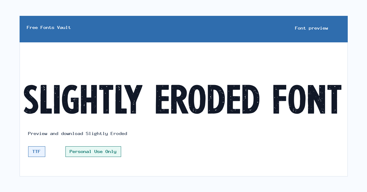
Slightly Eroded includes 1 downloadable variant for live preview and testing.
Font Specimen
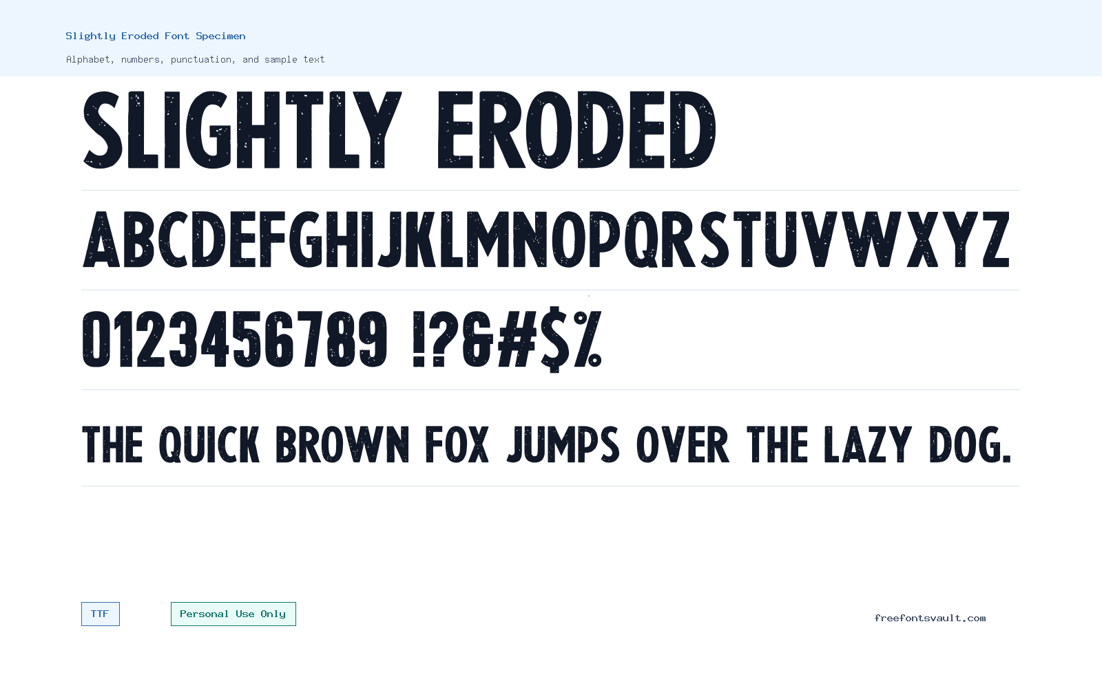
Details
- License Free for personal us ONLY
- Format TTF
- Variants 1 file available
Slightly Eroded font.
Slightly Eroded is a distressed display font with rough edges, broken texture, and an aged surface. It is made for designs that should feel worn, gritty, handmade, or imperfect rather than polished and corporate.
About Slightly Eroded Font
The download uses a TrueType file named Slightly-Eroded.ttf. Its style is upright and light in weight, but the eroded texture gives it more visual bite than a clean light font. That contrast makes it useful for large titles, band-style graphics, horror or grunge layouts, distressed labels, stickers, poster art, and personal logo experiments.
Preview your exact words before downloading. Distressed fonts can change character from word to word because the broken edges affect spacing, counters, and stroke weight. Short words usually work best. If you need a full layout, let Slightly Eroded handle the headline and use a plain serif or sans serif for dates, paragraphs, buttons, and small print.
Features
- TTF font file named Slightly-Eroded.ttf.
- Distressed edge texture for rough display typography.
- Light 300 weight with upright normal styling.
- Best for large short text where the worn detail can stay visible.
Best Uses
- Grunge posters, music artwork, horror-style headings, and bold personal graphics.
- Distressed labels, stickers, apparel mockups, and rough title treatments.
- Social media images or cover art where a weathered text effect fits the mood.
- Pairing with a clean companion font for captions and longer reading text.
License Information
Slightly Eroded is marked as free for personal use only. That is fine for personal mockups, experiments, and non-commercial designs, but it does not clear client work, paid products, merchandise, ads, logos, templates, apps, or public brand use. Contact IMAGEX or the rights holder if you need a commercial license.
Designer and Foundry
Slightly Eroded is credited to IMAGEX, with imagex-fonts.com listed as the designer website. Use that credit for basic attribution, and check the designer page if you need purchase terms or a formal license for commercial work.
Usage Tips
Use high contrast and keep the text large enough for the eroded detail to show. Avoid placing it over busy images unless you add a solid shadow, outline, or background panel. If the word becomes hard to read, reduce the phrase length or pair it with a cleaner supporting typeface. For best results, compare it against a clean version of the same phrase. If the distressed face slows the message down, keep it for one word or a short title and let simpler typography carry the rest of the layout.
FAQ
Is Slightly Eroded free for commercial use?
No. The license is personal use only, so commercial work needs separate permission or a proper license.
What format is Slightly Eroded?
The downloadable file is a TTF font named Slightly-Eroded.ttf.
Who designed Slightly Eroded?
The font is credited to IMAGEX.
Is Slightly Eroded good for paragraphs?
No. It is better for short display text because the distressed texture can slow reading in long copy.
Where does Slightly Eroded work best?
Use it for large posters, rough title graphics, music artwork, personal logos, labels, and distressed social images.
Browse More Fonts
Want to browse beyond this family? Return to All Fonts for the main directory.



