Font Directory
SerpentineEF
SerpentineEF includes 1 downloadable variant for live preview and testing.
Font Specimen
Details
- Designer Elsner+Flake Designstudios
- Format OTF
- Variants 1 file available
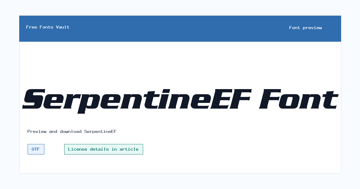
SerpentineEF font.
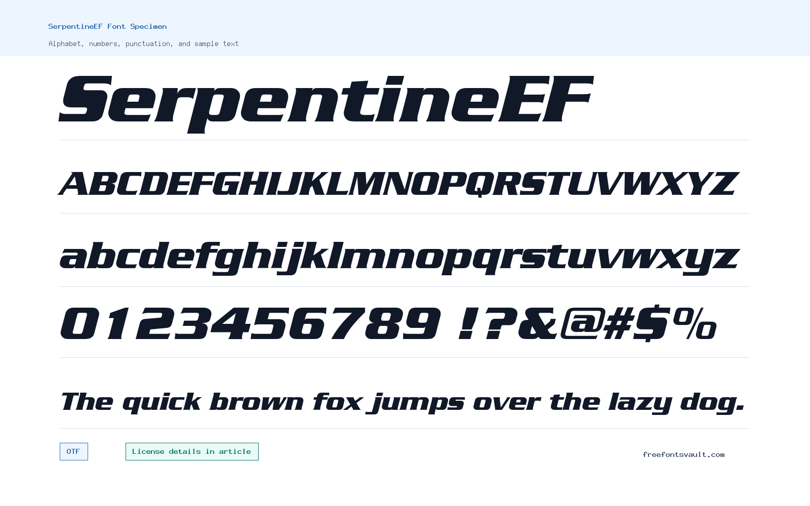
SerpentineEF is a bold italic display font for short, high-impact text. The downloadable style is SerpentineEF Bold Italic in OTF format, so it is best tested in headlines, title graphics, labels, and other places where a strong slant and heavy weight can stand out without needing long paragraphs.
About SerpentineEF Font
SerpentineEF Bold Italic has the practical character of a display face: it is heavy, angled, and built for emphasis. The bold weight gives words a firm block of color, while the italic style adds forward motion. That combination works best when the text is brief. Try it with names, short taglines, numbers, event titles, gaming-style graphics, poster headers, or compact navigation labels. Avoid judging it only from a single word; type a few uppercase and lowercase samples, then test punctuation, numbers, and spacing so you can see how it behaves in real use.
Because the available file is an OTF font, it should be convenient for many desktop design apps and modern font managers. For web use, check your site setup and convert only if your license allows it. This is not the kind of font to use for long reading, body copy, legal text, captions, or small mobile paragraphs. Its strength is attention, not quiet readability. Use it with a simple supporting sans serif for descriptions, buttons, and smaller text. If your design already has many angles, shadows, gradients, or busy textures, keep the rest of the layout restrained so the font does not fight with the artwork.
Features
- Bold italic OTF style with a strong slant for short display text, title treatments, and graphic headings.
- Better suited to emphasis than body copy; test spacing, numbers, and mixed-case words in the preview before downloading.
Best Uses
- Posters, banners, game-style headers, sports graphics, labels, stickers, and short title artwork.
- Logo drafts, mockups, social images, and personal design experiments where the text is brief and bold.
License Information
The license is not clearly stated in the local font details. Third-party listings are not fully consistent, and one related listing describes Serpentine BoldItalic as free for personal use. Treat SerpentineEF as personal-use-only unless you have a separate license that allows commercial work, client projects, web embedding, merchandise, apps, or redistribution.
Designer and Foundry
The font details name Elsner+Flake Designstudios as the designer. A commercial font listing also connects Serpentine EF with Elsner+Flake.
Usage Tips
Use SerpentineEF Bold Italic where a few words need weight and movement. Keep line lengths short, increase spacing if letters feel crowded, and pair it with a plain text font for supporting information. Always check the license before using it in public or paid work.
FAQ
Is SerpentineEF free for commercial use?
Commercial use is not cleared by the listed license information. Use it only for personal testing unless you have a license that specifically allows commercial projects.
What font format is included?
The listed file is SerpentineEF-BoldItalic.otf, so the available download is an OTF font file.
What style of SerpentineEF is available?
The available style is Bold Italic, with a font weight listed as 700 and an italic style.
Is SerpentineEF good for body text?
It is better for short display text. The bold italic style can become tiring in paragraphs, captions, or small interface text.
Who designed SerpentineEF?
Elsner+Flake Designstudios is named as the designer in the font details.
How should I preview this font before downloading?
Try your actual project words, then test numbers, punctuation, uppercase text, and mixed-case text. This helps you catch spacing and readability issues before using it in a design.
Browse More Fonts
Want to browse beyond this family? Return to All Fonts for the main directory.



