Font Directory
Scoremark Cond
Scoremark Cond includes 1 downloadable variant for live preview and testing.
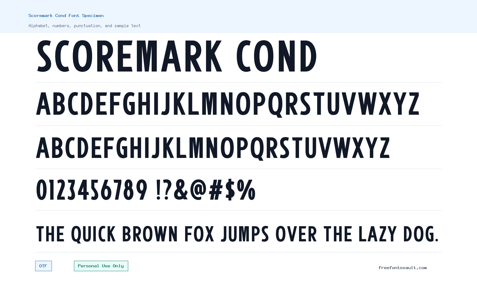
Font Specimen
Details
- Designer Dida Ahluddin
- Foundry ahweproject
- License Personal use only
- Format OTF
- Variants 1 file available
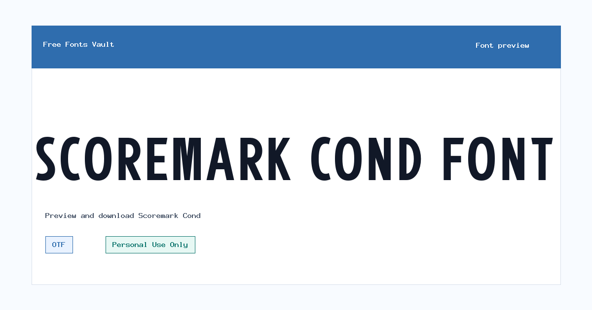
Scoremark Cond font.
Scoremark Cond is a condensed display font with a narrow, upright shape that works best when you need bold lettering without taking up much horizontal space.
About Scoremark Cond Font
Scoremark Cond is a display-style typeface designed for short, attention-grabbing text. Its condensed proportions make it useful for titles, compact headers, poster lines, sports-style layouts, badges, packaging concepts, and logo drafts where space is tight but the words still need visual weight. Because the available font file is an OTF format, it should work in most common design apps, including Photoshop, Illustrator, Affinity Designer, Inkscape, and many desktop publishing tools.
This is not the kind of font you choose for long paragraphs or body copy. The narrow letterforms are better suited to short words, names, labels, and headline settings. If you are testing it in the preview box, try uppercase words, brand names, event titles, jersey-style text, and poster headlines. Also test the exact phrase you plan to use before downloading, because condensed fonts can feel crowded when the text has many narrow letters or repeated vertical strokes.
Features
- Condensed display shape for compact headlines and title designs
- OTF font file format suitable for many desktop design applications
- Normal style with 400 weight listed for the available regular variant
- Best suited to short text rather than paragraph reading
- Useful for previewing logo ideas, posters, badges, labels, and web mockups
Best Uses
- Poster headlines and event graphics
- Logo drafts and wordmark experiments
- Sports-style titles, badges, and team-name concepts
- Website hero headings and UI mockups
- Packaging labels, stickers, and social media graphics
- Compact display text where a wide font would take too much space
License Information
Scoremark Cond is marked as Personal Use Only. Use it for personal projects, tests, previews, and non-commercial design experiments unless you confirm and obtain the proper commercial license from the designer or foundry. Do not assume it is cleared for client work, products for sale, brand identity, advertising, merchandise, apps, games, or business use.
Designer and Foundry
Scoremark Cond is credited to designer Dida Ahluddin and the foundry name ahweproject. The designer website listed for this font is http://www.ahweproject.com.
Usage Tips
Use Scoremark Cond where the text can stay short and strong. It can work well for logo sketches, poster titles, web hero mockups, and bold label designs, but it needs spacing checks. Try adding a little letter spacing for all-caps words, and avoid using it for small navigation text or long descriptions. For pairing, keep the supporting typeface simple: a clean sans-serif works well for descriptions, dates, captions, or button text while Scoremark Cond handles the main title.
FAQ
Is Scoremark Cond free for commercial use?
No. The license information marks Scoremark Cond as Personal Use Only. For commercial use, contact the designer or foundry and confirm the correct license before using it in paid, client, business, product, or advertising work.
What kind of font is Scoremark Cond?
Scoremark Cond is a condensed display font. It is better for headlines, logos, posters, badges, and short titles than for long reading text.
What file format is included for Scoremark Cond?
The available font file is an OTF file: ScoremarkDemo-Condensed.otf. OTF fonts are commonly supported by major desktop design and layout applications.
Can I use Scoremark Cond for a logo?
You can test it in personal logo concepts and mockups, but the listed license is Personal Use Only. If the logo is for a business, client, product, channel, shop, or public brand, get commercial permission first.
Is Scoremark Cond good for website headings?
It can work well in website mockups or personal web projects when used for large headings. Keep the text short, check spacing carefully, and pair it with a simpler font for body text.
What should I pair with Scoremark Cond?
Pair it with a plain sans-serif for paragraphs, menus, captions, and supporting information. Let Scoremark Cond handle the main display text so the page does not feel too crowded.
Similar Fonts
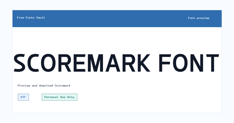
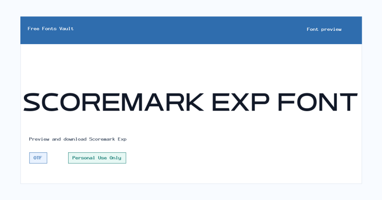
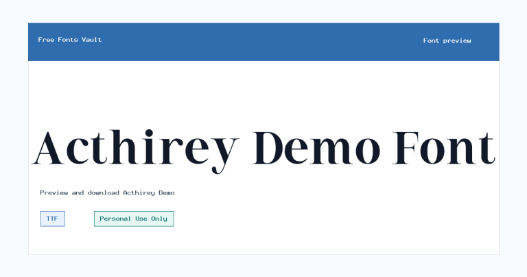
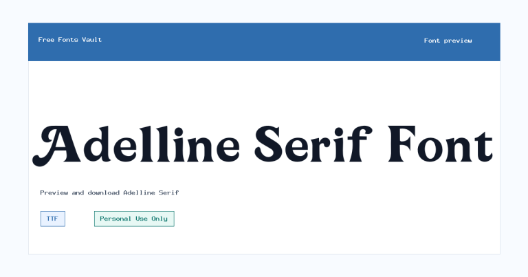
Want to browse beyond this family? Return to All Fonts for the main directory.



