Font Directory
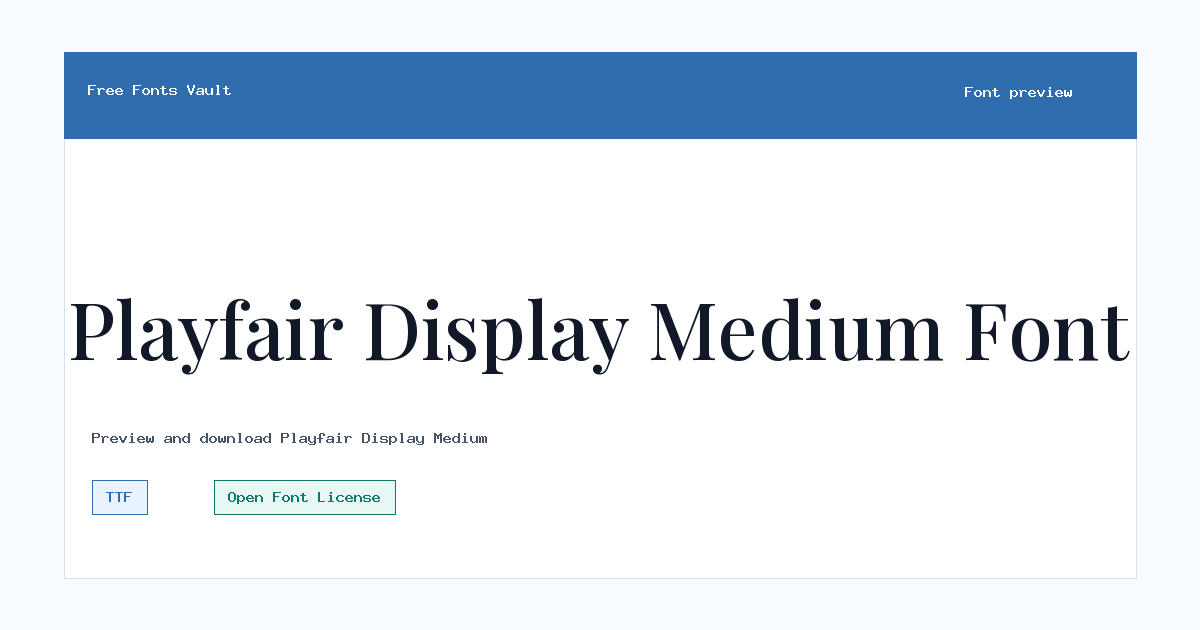
Playfair Display Medium
Playfair Display Medium includes 1 downloadable variant for live preview and testing.
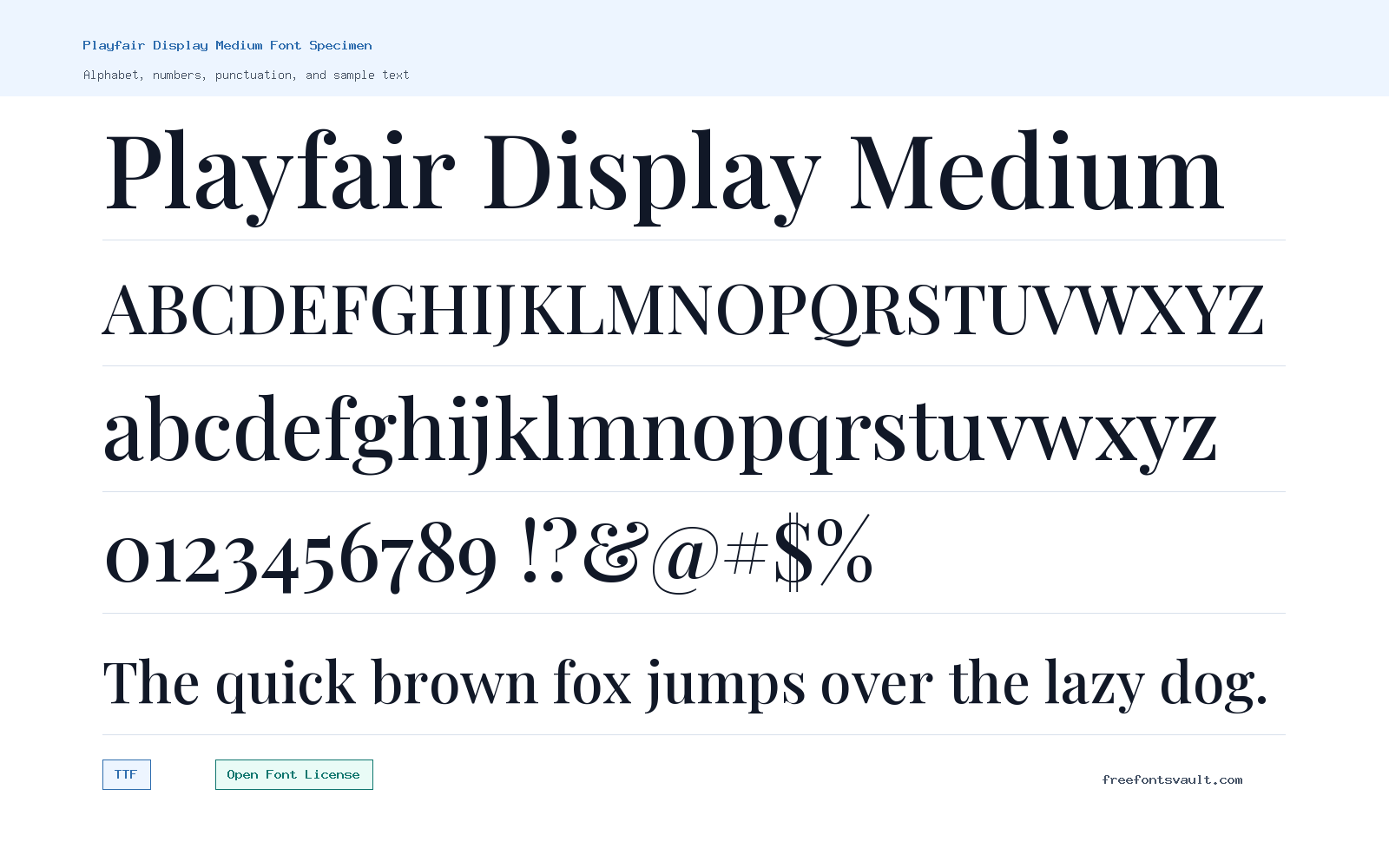
Font Specimen
Details
- Designer Claus Eggers Sørensen
- Foundry Claus Eggers Sørensen
- License Open Font License
- License URL scripts.sil.org/OFL
- Format TTF
- Variants 1 file available
Playfair Display Medium font.
Playfair Display Medium is the 500-weight upright style from the Playfair Display family. It gives headlines a refined serif look with clear contrast between thick and thin strokes, making it a strong choice when regular weight feels too light but bold feels too heavy.
About Playfair Display Medium
Playfair Display is a serif typeface designed by Claus Eggers Sørensen. Google Fonts lists the family as a Didone serif, while Font Squirrel describes it as a transitional serif suited to titling, headlines, and display typography. The Medium style sits between Regular and SemiBold, so it can add presence without making the text feel overly dark.
Use Playfair Display Medium for larger text where its contrast and sharp details have room to show. It works well for article titles, magazine-style headings, invitations, quote graphics, and short branding text. For long paragraphs, test line spacing and size carefully; display serifs with fine details can lose comfort when set too small. Pair it with a simpler body font if you want the heading to stand out clearly.
Playfair Display Medium has enough contrast for elegant display use while staying less forceful than a bold style. It is a good candidate for editorial headings, quotes, and title treatments where the serif details should feel refined without getting too fragile.
Features
- Medium 500 upright style for stronger headings without full bold weight
- TTF font file format for broad desktop and design-app support
- High-contrast serif appearance suited to display typography
- Part of the wider Playfair Display family, which includes multiple weights and italics
Best Uses
- Editorial headlines and blog title typography
- Invitations, quote cards, and refined social graphics
- Logos or wordmarks that need a crisp serif tone
- Large preview text where contrast and hairline details remain visible
License Information
Playfair Display Medium is licensed under the SIL Open Font License, Version 1.1. Use it under the OFL terms, and review the license if you plan to modify, redistribute, or bundle the font with a project.
Designer and Foundry
Playfair Display is credited to Claus Eggers Sørensen, who is also listed as the foundry for this font entry.
Usage Tips
Try the font in the preview with real words, mixed case, and punctuation before downloading. Keep it at display sizes for the best result, and add enough line spacing if you use it in multi-line headings. Preview it with real punctuation and longer words. High-contrast display serifs can need extra care in small sizes, tight columns, or low-resolution exports.
FAQ
Is Playfair Display Medium a serif font?
Yes. Playfair Display is listed as a serif family, and the Medium style keeps that high-contrast serif look.
What weight is Playfair Display Medium?
The font file is an upright Medium style with a 500 weight.
Can I use Playfair Display Medium for body text?
You can test it for short passages, but it is better suited to headings and display text. For long reading, pair it with a simpler body typeface and check readability at smaller sizes.
What license does Playfair Display Medium use?
It uses the SIL Open Font License, Version 1.1. Read the OFL terms if you plan to modify, redistribute, or package the font.
What file format is included?
The listed font file is PlayfairDisplay-Medium.ttf, a TrueType font file.
Is Playfair Display Medium good for paragraphs?
It is primarily useful for display text. For body copy, test readability carefully or pair it with a dedicated text font.
Browse More Fonts
Want to browse beyond this family? Return to All Fonts for the main directory.



