Font Directory
OPTIVanityFair
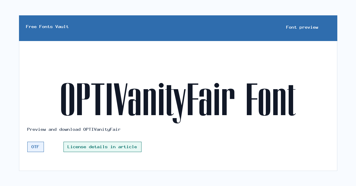
OPTIVanityFair includes 1 downloadable variant for live preview and testing.
Font Specimen
Details
- Designer Giampietro Bubola
- Foundry Castcraft Software, Inc.
- Format OTF
- Variants 1 file available
OPTIVanityFair font.
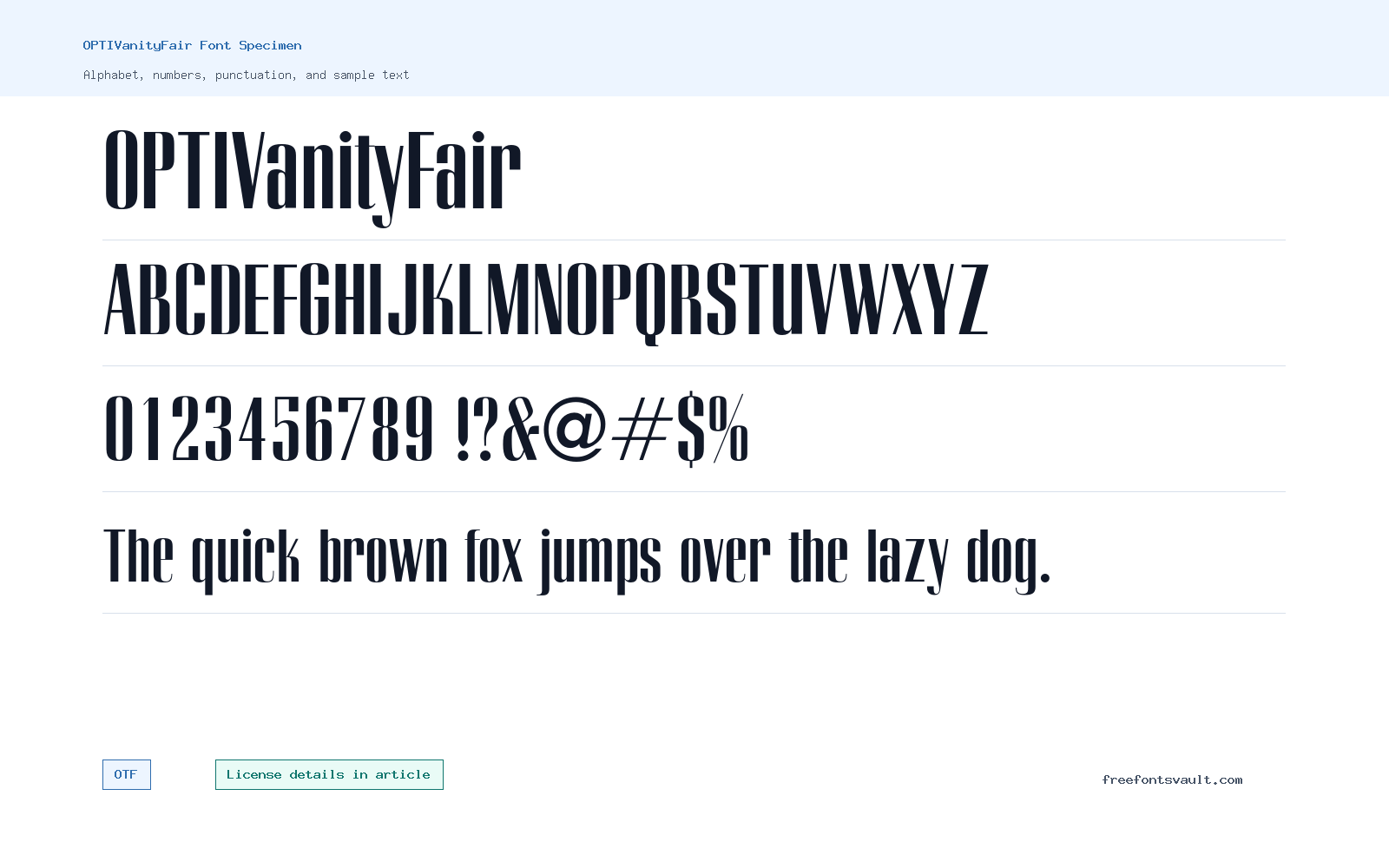
OPTIVanityFair is a high-contrast serif display font with tall, narrow shapes and fine hairline details. It is strongest in short, large settings where the editorial look can stay crisp.
About OPTIVanityFair Font
This font has the kind of polished magazine-title feel that works for covers, invitations, posters, boutique labels, and short brand mockups. The contrast between thick and thin strokes gives it style, but it also means small sizes need care. Thin details can fade in compressed images, low contrast layouts, or long paragraphs.
The listed file is OPTI-Vanity-Fair-Conde-Nast.otf, an OTF font with normal style and 400 weight. The metadata names Giampietro Bubola and Castcraft Software, Inc., and the copyright text says the design was redesigned by Giampietro Bubola for Castcraft Software, Inc. Use those details as attribution clues, not as a license grant.
Because the design relies on very fine contrast, the preview should be checked in the same environment where the finished graphic will appear. A large desktop preview can look clean while a small social thumbnail or compressed image may soften the hairlines. Keep the wording short and let the font act as the display accent.
Features
- OTF font file with regular 400 weight and normal upright style.
- High-contrast serif design with narrow, editorial-style capitals.
- Best suited to display typography, not dense reading text.
- Fine hairline details need good size, contrast, and clean backgrounds.
- Pairs well with a plain sans serif or quiet serif for support copy.
- Best results come from short words, careful spacing, and high-contrast color choices.
Best Uses
- Editorial-style titles, magazine-inspired headers, and cover mockups.
- Posters, invitations, fashion graphics, boutique labels, and name treatments.
- Short display words where elegant contrast is more important than speed reading.
- Logo concepts after checking license terms for branding use.
- Large social graphics or title cards with simple backgrounds.
- Testing elegant title treatments before choosing a licensed production font.
License Information
License terms are not stated for this entry. Do not assume commercial-use permission for paid projects, client work, logos, products, apps, web embedding, templates, merchandise, or redistribution. Check the original font package or source terms before using OPTIVanityFair publicly.
Designer and Foundry
The metadata names Giampietro Bubola and Castcraft Software, Inc., and the copyright line says the design was redesigned by Giampietro Bubola for Castcraft Software, Inc. If exact attribution is important, confirm it from a reliable source.
Usage Tips
Preview your exact title at the final size. Keep backgrounds simple, avoid very small text, and give the letters enough spacing. For paragraphs or captions, pair OPTIVanityFair with a more readable companion font so the high-contrast style remains the accent. Also check accented characters, punctuation, and numbers if your final design uses dates, prices, names, or multilingual text.
FAQ
What kind of font is OPTIVanityFair?
It is a high-contrast serif display font with narrow, editorial-style letterforms.
What file format is included?
The listed file is an OTF font named OPTI-Vanity-Fair-Conde-Nast.otf.
Can I use OPTIVanityFair commercially?
Commercial-use permission is not confirmed. Check the license from the original font package or source before using it in paid or public projects.
Who is credited for OPTIVanityFair?
The metadata names Giampietro Bubola and Castcraft Software, Inc.; confirm exact attribution from a reliable source if needed.
Is OPTIVanityFair good for body text?
No. It is better for short titles and display text. Use a simpler font for paragraphs.
Similar Fonts
Want to browse beyond this family? Return to All Fonts for the main directory.



